Flexbox in CSS
What is Flexbox?
In CSS, we use Flexbox, a layout model that offers us a variety of ways to arrange the element and helps us align the element in CSS. With Flexbox's help, we can design responsive and dynamic webpage or user interface layouts.
In CSS, we can control the sizing alignment and positioning of elements within a container regardless of the order in which they are in the HTML document. It introduces flex containers and flex items as its two main parts.
Flex containers are created by changing an element's display property to flex or inline-flex. The container is used as the parent element for the flex items and transforms into a flexible box or flex container. A flex container's direct child elements are transformed into flex items.
After a container has been designated as a flex container, you can apply several properties to regulate how its child flex items are laid out. There are some characteristics of Flexbox:
- Flex-direction: with the help of flex-direction, we can arrange the element in any direction, like a row, a column, and a row reverse or a column reverse.
- Justify-content: Determines how flex items are aligned horizontally within the container using the justify-content property.
- Align-items: Defines the vertical alignment of flex items inside the container.
- Flex-wrap: It specifies whether or not flex items should wrap across multiple lines or remain on a single line.
- Align-content: When the cross-axis has extra space, align-content regulates how the flex lines are aligned.
With the help of flex items, we can use flex-grow, flex-shrink, and flex-basis, which help to regulate how they can expand, contract, and resize the container because they have their own unique identity lie flex items.
Modern web browsers support Flexbox widely, and it is frequently used to create responsive and adaptable layouts in CSS. It makes it easier to create intricate layouts and makes it possible to achieve consistent alignment and positioning on various screens and devices.
Features of Flexbox in CSS
Flexbox, also known as the CSS Flexible Box Layout, offers many potent features for producing responsive and adaptable layouts. Here are some of its main characteristics:
- Directional flexibility: Flexbox allows you to choose the direction in which flex items are arranged inside a flex container. The flex-direction property allows you to select a horizontal (row) or vertical (column) layout.
- Automatic Sizing: Flexbox automatically modifies the size of flex items to fit the available space inside the container. Using the flex-grow, flex-shrink, and flex-basis properties, you can regulate how much an item grows and shrinks.
- Alignment control: Flexbox provides thorough control over alignment for the cross-axis (vertical) and main axis (horizontal). The properties justify-content, align-items, align-self, and align-content can all be used to align items.
- Flexible Line Wrapping: If the container's width cannot fit the flex items, Flexbox enables them to wrap onto multiple lines. The flex-wrap property allows you to manage this behavior.
- Order Control: Flexbox enables you to change the order of flex items without changing the HTML structure. The visual display order of items can be changed using the order property.
- Flexible Spacing: Flexbox offers properties like margin and padding to enable flexible spacing between flex items. Additionally, justify-content distributes space between and around items using its space-between and space-around values.
- Nested Layouts: Because Flexbox supports nesting, you can use nested flex containers to build intricate layouts. This makes it possible for you to create complex and effective designs quickly.
- Responsive Flexbox: Flexbox makes it easier to create responsive designs by automatically adjusting the layout based on the available space. Complex media queries and calculations for element positioning and sizing are no longer necessary.
Due to these features, Flexbox is a potent tool for building dynamic and adaptable layouts, eliminating the need for workarounds and hacks that were previously necessary to accomplish the same goals using conventional CSS layout techniques.
Example
Let's take a simple example of Flexbox in CSS so we can understand what's a flexbox:
Output:
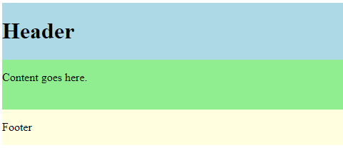
This example has a straightforward layout with a header, content section, and footer. To create a flexible container, the display property of the container has been set to flex.
The flex-direction property is set to column to arrange the sections vertically within the container. The height property sets the container's height to 200 pixels, but you can change it to suit your needs.
A flex property is given to each section so that they can manage their size inside the container. In this instance, the content has flex: 2, while the header and footer have flex: 1. This indicates that the content section will occupy a space twice as tall as the header and footer.
Why We Use Flexbox in CSS?
There are several uses for Flexbox.
- Flexible and Responsive Layouts: Layouts that are both flexible and responsive can be easily created with Flexbox. It makes it simple to divide space between elements, automatically change their sizes, and take care of wrapping and alignment. As a result, designing for various screen sizes and devices is simpler.
- Alignment and Centering: Flexbox offers strong horizontal and vertical alignment and centering capabilities. Within a container, you can easily center them, evenly distribute the space, or align them as needed. Because of this, achieving consistent alignment and positioning across various elements is made simple.
- Controlling the order of elements: Flexbox enables you to rearrange elements visually without altering the HTML code. The order property allows you to modify the order in which elements are displayed. This adaptability helps move design elements around or change how the content flows.
- Nesting and complex layouts: Flexbox supports nesting, which enables you to build complex layouts by nesting flex containers inside one another. This gives you more control over the positioning and arrangement of elements when creating multi-dimensional layouts.
- Reduced dependency on hacks: Flexbox helps reduce the need for numerous CSS workarounds and hacks that were previously necessary to achieve specific layouts. CSS code complexity is decreased by giving users a simpler, more effective way to manage element behavior and positioning.
- Cross-browser Compatibility: Flexbox is widely supported by contemporary browsers, including top desktop and mobile browsers. This makes it a dependable and consistent method of developing layouts that function on various platforms.
Overall, Flexbox makes building complex, responsive, and flexible layouts in CSS easier. Web developers can achieve visually appealing designs while increasing their code's efficiency and maintainability thanks to its features and properties.
Limitation of Flexbox in CSS
Flexbox is a strong layout module, but there are some drawbacks to be aware of:
- Limited Two-Axis control: Flexbox primarily functions in a single dimension, either horizontally or vertically. Limited Two-Axis Control. Although you have full control over the alignment and positioning within that axis, it does not simultaneously give you total control over the horizontal and vertical axes. CSS Grid might be better for more complicated layouts that call for control over both axes.
- Lack of Grid-like Alignment: Flexbox needs built-in functionality for generating grid-like layouts with predetermined row and column sizes. Flexbox does allow for some grid-like behavior when flex containers are nested. Still, it necessitates additional workarounds and may need to be more flexible and user-friendly than CSS Grid.
- Lack of Native Support for Consistent Gutter and Gap Creation: Flexbox lacks native support for creating consistent gutters and gaps between flex items. Using margins or padding to achieve equal spacing between items is frequently necessary, but doing so can result in inconsistent spacing or other undesirable outcomes. CSS Grid offers better control over gutters and spaces between grid cells.
- Lack of Control Over Content Overflow: Flexbox does not explicitly allow control over content overflow within flex containers. If there is more content than there is room for, it might overflow and mess up the layout. To effectively manage content overflow, you should use additional strategies like setting overflow properties or combining Flexbox with other layout strategies.
|
 Home
Home CSS
CSS HTML
HTML XHTML
XHTML JavaScript
 Bootstrap
 jQuery
 PHP
PHP XML
XML JSON
JSON Python
 C++
C++ Java
Java C#
C# SQL
SQL Interview Q
 For Videos Join Our Youtube Channel: Join Now


