 Home
Home CSS
CSS HTML
HTML XHTML
XHTML JavaScript
 Bootstrap
 jQuery
 PHP
PHP XML
XML JSON
JSON Python
 C++
C++ Java
Java C#
C# SQL
SQL Interview Q
CSS GradientWhat is Gradient?The term "CSS gradient" describes a Cascading Style Sheets (CSS) method that enables seamless transitions between two or more colors. It enables you to add a gradient effect to different CSS properties, including text, borders, and backgrounds. With CSS gradients, you can specify a gradual blending of colors in either a circular or elliptical shape (radial-gradient) or across a specific direction. The gradient is defined by defining at least two color stops or the hues that will be mixed together. For Example: An illustration of a linear gradient that changes from blue to green is shown below: The 'to right' keyword is used in this example's use of the linear-gradient() function to specify the gradient's direction. "Blue" and "Green" are the gradient's beginning and ending colors. Additionally, you can specify more color stops to produce more intricate gradients. IllustrationAn illustration of a radial gradient with three color stops is as follows: In this instance, a circular gradient is made using the radial-gradient() function. The color "red," "yellow," and "green" stand in for the color stops, while the keyword "circle" specifies the shape. You can create various visual effects and transitions by adjusting CSS gradients' direction, shape, and color stops. They are a potent tool for creating aesthetically pleasing websites because contemporary web browsers widely support them. Why We Use Gradient in CSS?With the help of gradient, we can design a website even better. Some of the main reasons for using CSS gradients are:
Overall, CSS gradients give web designers a wealth of creative options, enabling them to give their designs depth, dimension, and visual interest. They aid in the development of distinctive and visually appealing user interfaces that improve the web user experience. ExampleAn HTML program using CSS gradients for background and text effects is shown here as an example: Explanation: The CSS classes gradient-background and gradient-text are used in this example. The div element with the gradient-background class has a horizontal gradient from red to green, thanks to the application of a linear gradient background. The gradient-text class applies a similar linear gradient background with a unique text effect to a h1 heading element. The text becomes transparent and lets the gradient background show through when the -webkit-text-fill-color and -webkit-background-clip properties are set to text and transparent, respectively. This creates the appearance of gradient-filled text. Types of Gradient in CSSThere are two types of gradients in CSS: 1. Linear GradientIn CSS, a linear gradient produces a seamless change in color along a single axis. Here is a program example and the syntax for a linear gradient: The following syntax:
Example: This example applies a linear gradient background to the element with the class gradient-example and sets its height to 200 pixels using the linear-gradient() function. The gradient shifts from red (#ff0000) on the left to green (#00ff00) on the right. Output: 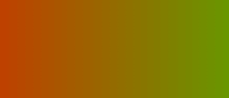
Example 2: Here's an example of an HTML program that uses a top-to-bottom linear gradient as the background: This example applies a linear gradient background to the element with the class gradient-example and sets its height to 200 pixels using the linear-gradient() function. The gradient transitions from red (#ff0000) at the top to green (#00ff00) at the bottom, as indicated by the bottom keyword. Output: 
Example 3: Here's an example of an HTML program that uses a right-to-left linear gradient as the background: This example applies a linear gradient background to the element with the class gradient-example and sets its height to 200 pixels using the linear-gradient() function. The gradient starts red (#ff0000) on the right and transitions to green (#00ff00) on the left, according to the top left keyword. Output: 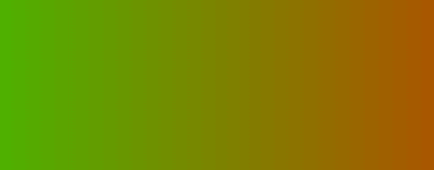
2. Radial GradientA circular or elliptical radial gradient transitions colors. It produces a seamless color change that spreads outward from a central point.
Example: Here's an example of an HTML program that uses a radial gradient as the background: This example uses the radial-gradient() function to apply a radial gradient background and sets the height and width of the element with the class gradient-example to 200 pixels. The gradient is circular and changes from red (#ff0000) in the middle to green (#00ff00) at the edges. Output: 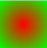
Example 2: Here's an example of an HTML program that uses a radial gradient with evenly shaped color stops: This example uses the radial-gradient() function to apply a radial gradient background and sets the height and width of the element with the class gradient-example to 200 pixels. The gradient is situated in the element's middle and shaped like a circle. Three evenly spaced color stops are present: Red is the color stop at 0% (#ff0000). At 33.3%, the color stop is green (#00ff00). At 66.6%, the color stop is blue (#0000ff). Output: 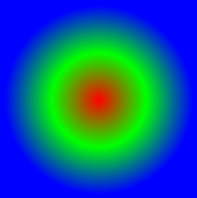
Example 3: Here's an example of an HTML program that uses a radial gradient with differently shaped color stops: This example uses the radial-gradient() function to apply a radial gradient background and sets the height and width of the element with the class gradient-example to 200 pixels. The gradient is an ellipse of 50% to the left of the element's top and 50% to its right. Three color stops are present. At 20%, the color stops are red (#ff0000). Green (#00ff00) is the color stop at 50%. Blue (#0000ff) is the color stop at 80%. Output: 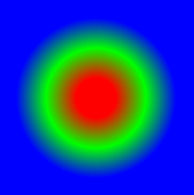
Next TopicCSS z-index
|
 For Videos Join Our Youtube Channel: Join Now
Feedback
- Send your Feedback to [email protected]
Help Others, Please Share


