 |

Angular Material- ButtonsAngular directing <mat-button> is used to create a button with content styling and animations. Angular content buttons are native <button> or elements enhanced with styling and ink ripples. Native <button> and <a> elements are used to provide the accessible experience for users. The <button> element is used when any action is performed. An <a> element will be used when the user will navigate another view. There are many button variants, each applied as an attribute:
ThemingButtons can also be colored in terms of the current theme using the color property to set the background color to primary, accent, or warn. CapitalizationButton text has to be capitalized. However, we have opted not to automatically capitalize buttons by text-transform: uppercase because it causes certain locales issues. AccessibilityAngular content uses the original <button> and <diagram> elements to ensure an accessible experience by default. The <button> element is used for any interaction that acts on the current page. The <a> element must be used for any interaction navigating to any other view. Only buttons or links with icons (such as mat-fab, mat-mini-fab, and mat-icon-buttons) should be given a meaningful label via the area-label. We should follow the steps given below to update the Angular application created in Angular content: Step 1: Create a Project with the name Content App. Step 2: Modify app.module.ts, app.component.ts, app.component.css, and app.component.html as given below. Keep the remaining files unchanged. Step 3: Compile and run the application to validate the result of the logic that is applicable. Let's follow the steps and create different types of buttons. app.component.html app.module.ts app.component.css Output: 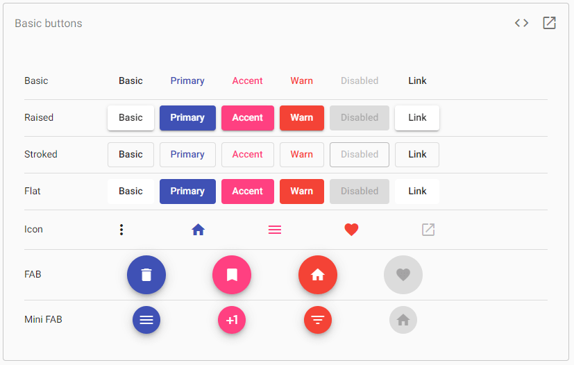
Let's create another module to create buttons. app.module.ts app.component.css app.component.html Output: 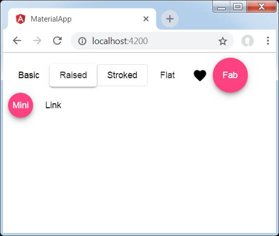
Next TopicAngular Material Checkbox
|
 For Videos Join Our Youtube Channel: Join Now
Feedback
- Send your Feedback to [email protected]
Help Others, Please Share


