 |

Angular Material DialogThe MatDialog service is used to open dialogs with content design, styling, and animations. MatDialogRef provides a handle to the open dialog. It is used to close the dialog and receive notifications to close the dialog. Any notification observatory will be completed when the dialogue closes. Components created by MatDialog can inject MatDialogRef and close the dialog where they are contained. Anoptional result value can be provided when closing. The result is forwarded as further observation. Configuring Dialog Content via entryComponentsMatDialog installs components at run-time, but the Angular compiler needs additional information to create the components required for your dialog component. To load any component into a dialog, you should include the component class in your NgModule definition in the computer list. Hence, the Angular compiler knows that how to create a component for NgModule. Specifying Global Configuration DefaultsDefault dialog options are specified by providing an instance of MatDialogConfig for mat_dialog_default_optionsin the root module. If you are using a template dialog (TemplateRef), the data will be available in the template: app.component.html app.component.ts dialog-data-example-dialog.html Output: 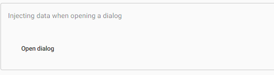
When we click on the Open dialog button it shows the following dialog box. 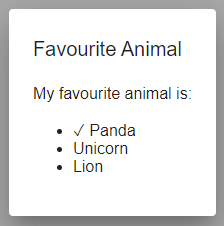
Dialog contentSome directives are available to make easier the dialog content:
For example: Once a dialog opens the dialog focus on the tabular element. We can control the element with the tab index attribute. AccessibilityBy default, each dialog has a role = "dialog" on the parent element. When opening, the role can be changed to alertdialog via MatDialogConfig. The attributes described by aria-labeled, aria-labelledby, and aria can all be set to the dialog element via MatDialogConfig as well. Each dialog has been a label set via aria-labeled. The content dialog uses a focus trap to prevent users from tabbing into background elements. Once a dialog is closed, it will focus on the focused element before the dialog opens. Focus managementThe first table element within the dialog will gain focus in the open. The tabbing through the dialog elements will focus on the dialog element, returning to the first tubular element when the tab reaches the end of the sequence. Focus restorationThe dialogue focuses on the element that was focused on the opening of the dialogue. The pre-centered element is not present in the DOM, such as menu items. You can then manually focus on subscribing after the observation on MatDialogRef. Keyboard InteractionBy default pressing the escape key will close the dialog. User should generally refrain from doing while this behaviour can be turned off via the disable option, so because it breaks the expected interaction patterns for screen-reader users. Let's see an example. app.component.html app.component.ts dialog-overview-example-dialog.html Output: 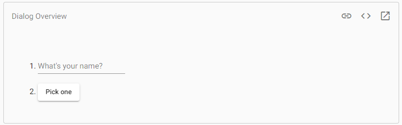
Next TopicAngular Material Menu
|
 For Videos Join Our Youtube Channel: Join Now
Feedback
- Send your Feedback to [email protected]
Help Others, Please Share


