 |

Angular Material IconsAn Angular Material icon is a component for showing vector-based icons in applications. It also supports icon fonts and SVG icons in addition to using Google content icons. The following table lists the parameters and descriptions of different features of md-icon.
Font iconsSome fonts are designed to display icons using ligature by presenting the text as a as a home image. To use the ligature icon, insert text into the content of the matte-icon component. By default, <mat-icon> expects the content icon font. Font icons with CSS Fonts can also display icons by defining a CSS class for each icon graph, which precedes the selector icon. If we want to use such font, set the font input to the font's CSS class and set the font icon input for the class to show the specific icon. You can specify the default font class to be used when the font set is not explicitly set by saying MatIconRegistry.setDefaultFontSetClass for both types of font icons. SVG icons<mat-icon> displays the SVG icon by inserting SVG content into the DOM as its own child. This approach provides an advantage over the <img> tag or CSS background-image as it allows SVG to be styled with CSS. The default color of SVG content is the CSS currentColor value. The SVG icon has the same color as the surrounding text and allows to change the color by setting the color style on the matte-icon element. To avoid XSS vulnerabilities, any SVG URL and HTML strings passed in MatIconRegistry must be marked as trusted using the Angular's DomSanitizer service. Named IconsUse the AddSvgIconLiteralInNamespace methods of AddSvgIcon, addSvgIconInNamespace, addSvgIconLiteral or MatSconRegistry to associate an icon with an icon URL. Use the name directly in default namespace. But in a non-default namespace, use the format [namespace]: [name]. Icon SetsIcon sets allow many icons to be grouped into a single SVG file. This is done by creating a single root <svg> tag that contains some nested <svg> tags in its <defs> section. Each nested tags is identified with an ID attribute. The ID is used as the name of the icon. To display icons from the icon set, use SVG icon input in the same way as for registered icons. Many icon sets also can registered in the same namespace. ThemingIcons uses the current font color (currentColor). The color is changed to match the colors of the current theme using the color attribute. It can be changed to 'Primary,' 'Pronunciation' or 'Warning'. AccessibilityAn icon alone does not provide any useful information for the screen-reader user such as the <img> element. The user of <mat-icon> should provide additional information about the use of the icon. In accessibility, there are three categories: An icon alone does not provide any useful information for the screen-reader user such as the <img> element. The user of <mat-icon> should provide additional information about the use of the icon. In accessibility, there are three categories: Decorative Icon It has no real semantic meaning and it is purely cosmetic. When an icon is cosmetic and conveys no real semantic meaning, the <mat-icon> element is marked with aria-hidden="true". Interactive Icon In interactive icon, a user will click or interact with the icon to perform some action. Symbols alone are not interactive elements for screen-reader users. The <mat-icon> element must be a child of the <button> or <a> element. The parent <button> or <a> must be direct text content, aria-label or meaningful label provided by aria-label. Indicator Icon It conveys some information, such as a status. It uses the icon in place of text inside of a large message. When an icon gives the user some information, whether inbuilt as an indicator or in a block of text, that information can be made available to screen-readers. Add a <span> with the text as the closest sibling to the <mat-icon> element, which conveys the exact information as the icon. It makes the message invisible but still available to screen-reader users. Animated iconsThe animation reflects the action performs in a way that adds and delight. 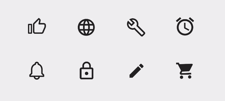
The animation of each icon is aligned with the visual design. Transitions LinkTransitions connect animated icons between two visual states. Transitioning between two icons signifies that they are linked with each other and pressing the first icon makes the other icon. 
Transition shows the connection between two icons in a single icon. 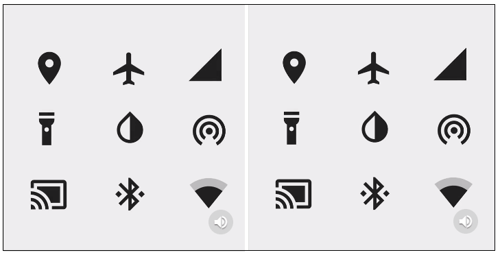
Transitions have toggle icons between on and off states. ExampleThe example shows the use of md-icons directive and also the uses of icons. am_icons.htm Test it NowOutput: 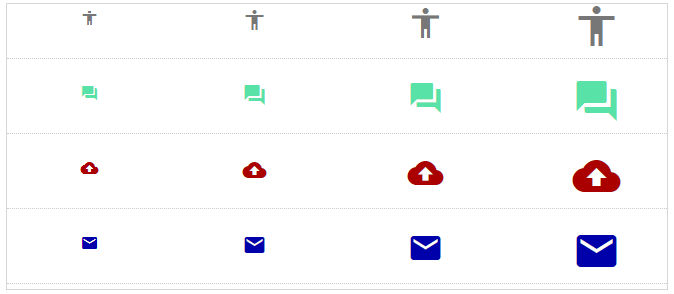
Next TopicAngular Material Inputs
|
 For Videos Join Our Youtube Channel: Join Now
Feedback
- Send your Feedback to [email protected]
Help Others, Please Share


