Angular Material InputsThe angular material input-container is a used to contains any <input> or <textarea> element as a child. It also supports error handling using ng-message directives and animates messages using ngEnter / ngLeave events or ngShow / ngHide events. The following table lists the parameters and descriptions of many attributes of the md-input-container.
<input> and <textarea> AttributesThe attributes that are used with normal <input> and <textarea> elements can be used with elements inside <mat-form-field>. It has Angular directives such as ngModel and formControl. Supported <input> TypesThe following input types are used with matInput:
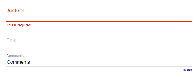
Form Field FeaturesThere are a number of <mat-form-field> features that can be used with <textarea matInput>. They are error messages, hint text, prefix, suffix, and theming. PlaceholderThe placeholder text is shown when the input is empty and the label <mat-form-field> is floating. It is used to give the user hint about typing in the input. The placeholder can be specified by setting a placeholder text on the <input> or <textarea> element. Changing when the error messages are shown<mat-form-field> allows us to associate error messages with matInput. When the control is invalid then an error message will be shown, and either the user has interacted with the element, or the original form has been rendered. ExampleThe below example shows the use of md-input-container directive and the uses of inputs. am_inputs.htm Test it NowOutput: 
Next TopicAngular Material Widgets
|
 For Videos Join Our Youtube Channel: Join Now
Feedback
- Send your Feedback to [email protected]
Help Others, Please Share


