 |

Angular Material List<Mat-list> is an angular directive used to create a container for carrying and formatting various objects. <Mat-list> is a container component that wraps the line items. It provides material design styling but has no behavior. Angular Content is a UI component library developed by the Angular to build design components for mobile or desktop applications. Enter the command in the command prompt and download it. The <mat-list> tag is used to display a list of objects or records. Syntax: Installation Steps
Simple listsThe <mat-list> element contains many <mat-list-item> elements. Navigation listsUse mat-nav-list tags for navigation lists (i.e. lists that have anchor tags). For more complex navigation lists (more than one target per item), wrap the anchor element in <mat-list-item>. Action listsWhen each item in the list performs some action, use the <mat-action-list> element. Each item in the list is the <button> element. Simple action lists will use the mat-list-item attribute on button tag elements: Selection listsIt provides an interface to select values, where every list item is an option. app.component.html app.component.ts Output: 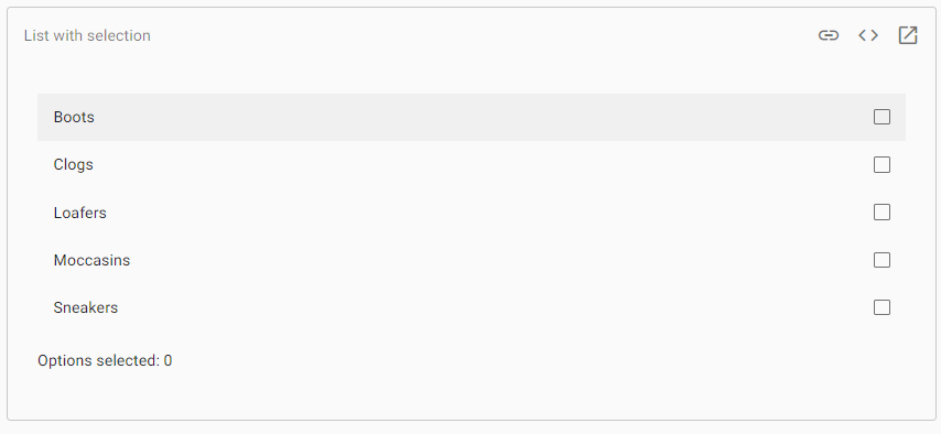
Options selected: 0 Select-list options may not have further interactive controls, such as buttons and anchors. Multi-line ListLists that require multiple lines per item, annotate each line with a matlin attribute. Lists with IconsUse the matListIcon attribute for adding an icon to the list item. Lists with AvatarsAdd an image tag with the matListAvatar attribute for include an avatar image. Dense ListsTo enable Dense list mode, add a dense attribute mat-list tag. Lists with Multiple SectionsSub-header will be added to a list by a heading tag with a matSubheader attribute. Use <mat-divider> to add a divider. AccessibilityThe type of list used in any situation depends on the end-user who interacts with it. NavigationWhen list-items navigate somewhere, <mat-nav-list> should be used as a list item with the elements <mat-list-item>. The neo-list will be rendered using role = "navigation" and can be given an area-label to reference the set of presented navigation options. Additional interactive Content, Like buttons, is not be added inside the anchor. Example 1:Below is the content of the modified module descriptor app.module.ts. Following is the content of the modified HTML host file app.component.html. Output: 
Explanation: Previously, we have created the list using mat-list. Then, we have added Content using mat-list-item. Example 2:app.module.ts app.component.html Output: 
Example 3:app.component.html app.module.ts Output: 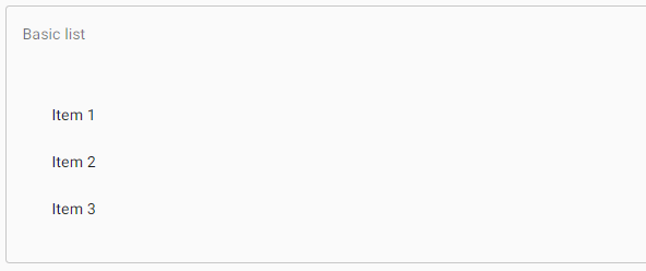
Next TopicAngular Material-Tree
|
 For Videos Join Our Youtube Channel: Join Now
Feedback
- Send your Feedback to [email protected]
Help Others, Please Share


