 |

Angular Material StepperAngular content stepper provides a wizard-like workflow by dividing the content into logical steps. The material stepper is responsible for logic on the CDK stepper's foundation that drives the stepped workflow. The material stepper extends the CDK stepper and a material design style. Stepper VariantsThere are two stepper components: mat-horizontal-stepper and mat-vertical-stepper. They both are used as same way. The only difference is the orientation of the stepper. app.component.html app.component.ts app.component.css Output: 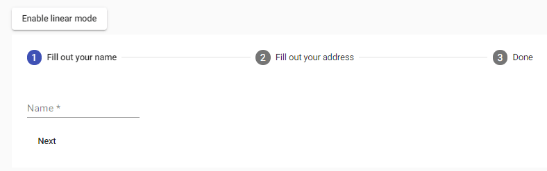
app.component.html app.component.ts app.component.css Output: 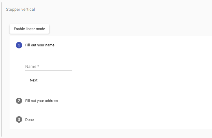
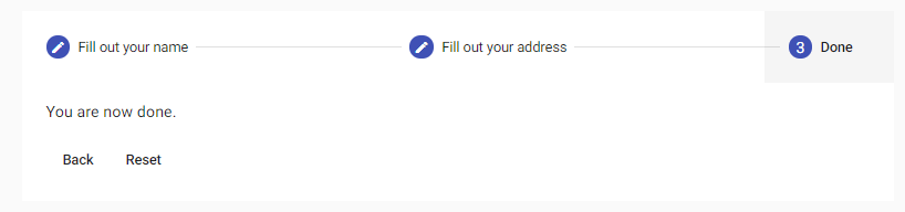
The Mat-horizontal-stepper selector can create a horizontal stepper, and the Mat-vertical-stepper used to make a vertical stepper. Mat-step components are placed inside either of the two stepper components. LabelsThe label attribute is used If a step's label is text. For more complex labels, add a template with matStepLabel directive. Label positionFor mat-horizontal-stepper, we define the position of the label. The end is the default value, while below, it will be placed under the step icon instead of on its side. The label property controls this behavior. Stepper buttonsThere are two button instructions to support navigation between many stages: matStepperPrepret and matStepperNext. Linear stepperThe linear attribute set to mat-horizontal-stepper and mat-vertical-stepper to create a linear stepper that requires the user to complete the previous steps before proceeding to the below steps. For each mat-step, the step control feature will be set to the top-level abscontrol used to check the action's validity. Below are two approaches. One uses a form for the stepper, but another uses the different form for each step. Alternatively, if you do not want to use angular forms, you pass in the complete property at each step, which will not allow the user to continue until it becomes true. Note that if both absolute and phase control are set, phase control will take precedence. Using a different form for each stepTypes of stepsOptional stepIf completing a linear stepper step is not required, then the optional attribute is set on the mat-step. Editable stepBy default, the steps are editable, which means that users can return to previously completed actions and edit their responses. Completed stepBy default, the phase's absolute attribute is corrected if the stage is valid (in the case of linear stepper) and the user has interacted with the phase. However, the user can also override the built-in attribute as required by this default complete behavior. Overriding iconsBy default, step headers use icons created and made from the Material Design icon set via the <mat-icon> elements. If you want to provide many sets of icons, you can do this by placing a MatsapperIcon for each icon that you want to override. Indicative, active, and alternative values of individual phases are available by the template variable: Note that you aren't limited to using the mat-icon component when providing custom icons. Step StatesYou can set a step position when you want. The position given to an icon by the default map. However, it can be overridden in the same way as above. In order to use the custom step states, you should add the displayDefaultIndicatorType option to the global default stepper which can be specified by providing a value for STEPPER_GLOBAL_OPTIONS in the application's root module. app.component.html app.component.ts app.component.css Output: 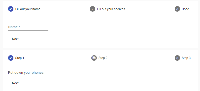
Error StateIf you want to show an error when the user moved past a step that hasn't been filled correctly. Then, you can set the error message by the errorMessage input and configure the stepper to show errors by the showError option in the STEPPER_GLOBAL_OPTIONS injection token. app.component.html app.component.ts app.component.css Output: 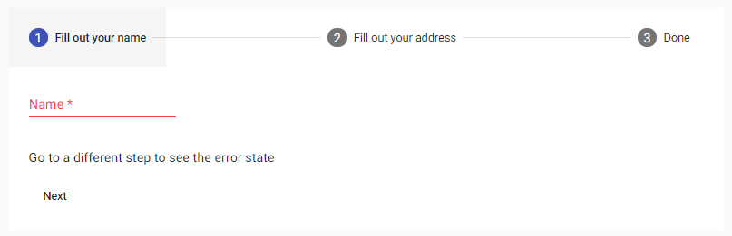
Keyboard interaction
Localizing labelsLocalization of messages is done by providing a subclass with translated values in the root module. AccessibilityThe stepper is treated as a tabbed view for accessibility purposes, so it is given role = "tablist" by default. The step header's aria-selected feature and the aria-extended quality of the step content are set based on the phase selection change. The area label or the area-labeledby gives the stepper and each step a meaningful label.
Next TopicAngular Material Ripples
|
 For Videos Join Our Youtube Channel: Join Now
Feedback
- Send your Feedback to [email protected]
Help Others, Please Share


