 |

Angular Material Toggle ButtonThe Angular directive <mat-button-toggle> is used to create a toggle or on/off button with material styling and animations. Mat-button-toggle buttons are configured to behave as radio buttons or checkboxes. They are part of <mat-button-toggle-group>. <mat-button-toggle> are on/off toggles with the appearance of a button. These toggles can be configured to behave as either radio-buttons or checkboxes. While they can be standalone, they are typically part of a mat-button-toggle-group. app.component.html app.component.ts Output: 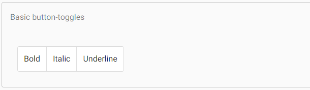
Exclusive selection vs. multiple selectionsBy default, mat-button-toggle-group acts like a radio-button group- only one item can be selected. In this mode, the value of the mat-button-toggle-group will reflect the value of the selected button, and ngModel is supported. Adding the multiple attributes allows multiple items to be selected (checkbox behavior). In this mode, the values of the toggles are not used, the mat-button-toggle-group does not have a value, and ngModel is not supported. AppearanceThe appearance of mat-button-toggle-group and mat-button-toggle will follow the latest Material Design guidelines. If you want to, you can switch back to the appearance that was following the previous Material Design spec by using the appearance input. The appearance can be configured globally using the MAT_BUTTON_TOGGLE_DEFAULT_OPTIONS injection token. app.component.html app.component.ts app.component.css Output: 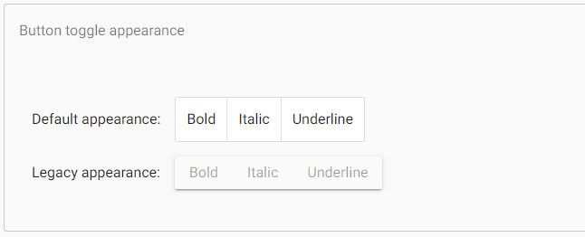
Use with @angular/forms<mat-button-toggle-group> is compatible with @angular/forms and supports both FormsModule and ReactiveFormsModule. AccessibilityThe button-toggles internally use native button elements with aria-pressed to convey their toggled state. The button-toggle-group surrounding the individual buttons applies role="group" to convey the association between the individual toggles. For button toggles containing only icons, each button toggle should be given a meaningful label via aria-label or aria-labelledby. For button toggle groups, each group should be given a meaningful label via aria-label or aria-labelledby. OrientationThe button-toggles can be rendered in a vertical orientation by adding the vertical attribute. Example:Following is the content of the modified module descriptor app.module.ts. Following is the content of the modified CSS file app.component.css. Following is the content of the modified HTML host file app.component.html. Output: 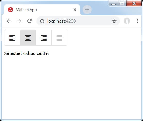
Explanation: At first, we have created a toggle button group using mat-button-toggle-group. Then, we have added toggle buttons to the group using mat-button-toggle.
Next TopicAngular Material Datepicker
|
 For Videos Join Our Youtube Channel: Join Now
Feedback
- Send your Feedback to [email protected]
Help Others, Please Share


