 |

Angular Material Toolbar and ToolTipThe <mat-toolbar> is an Angular Directive used to create a toolbar to show the title, header, or any button action of buttons. <mat-toolbar>: It represents the main container. <mat-toolbar-row>: It adds a new row at the toolbar. Example of ToolBar: Modified descriptor app.module.ts. Content of modified CSS file�app.component.css. Modified HTML host file�app.component.html. Output: 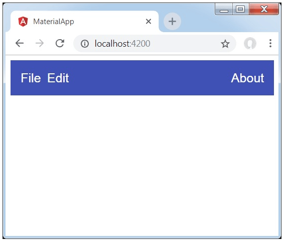
Explanation: First, we have created a toolbar with complete page. Then the labels are added. Angular Material TooltipThe Angular Material tooltip provides a text label which is displayed when the user hovered over or pressed for long time any button or element. app.component.html app.component.ts Output: 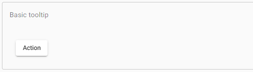
PositioningThe tooltip will be displayed below the element but configured by using matTooltipPosition input. The tooltip displays above, below, left, or right of the component. The status will be down by default. If the tooltip is in switch left / right positions in the RTL layout direction, then the before and after positions are used instead of left and right.
app.component.html app.component.ts app.component.css Output: 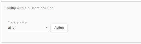
Showing and hidingBy default, the tooltip will be shown immediately when the user's mouse hovers over the tooltip's trigger element and hides when the user exits the mouse. You can use the inputs matTooltipShowDelay and matTooltipHideDelay to provide a delay in seconds to add a delay before showing or hiding the tooltip. app.component.html app.component.ts app.component.css Output: 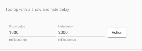
Changing the default delay behaviourYou can configure / delay your application's tooltip default show using MAT_TOOLTIP_DEFAULT_OPTIONS injection tokens and provide your options. app.component.html app.component.css Output: 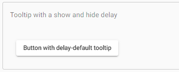
Manually calling the show () and hide ()You can show and hide directing methods to call the tooltip to show or hide tooltip, which accept a number in milliseconds to delay before changing the display. app.component.html app.component.ts app.component.css Output: 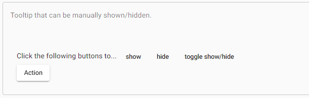
Disabling the tooltip from showing Set matTooltipDisabled to disable a tooltip. When it was disabled, it will never show again. AccessibilityIt provides the information needed to read the tooltip's content when the end-user focuses on the element that triggered the tooltip. The element referenced by aria -by is not just a tooltip but an invisible copy of the tooltip that is present in the DOM. If the tooltip is only shown manually through clicks, funnels, etc., should be taken to do similar actions for screen-reader users.
Next TopicAngular Material Feb-Toolbar
|
 For Videos Join Our Youtube Channel: Join Now
Feedback
- Send your Feedback to [email protected]
Help Others, Please Share


