 |

<apex: detail> Component in Visualforce PageThe <apex: detail> is another important component, i.e., a standard detail page for an Object, as defined by the associated page layout for the Object in the setup. The component contains attributes for
Note: There is no need to wrap this component inside the <apex: form> element, as it already provides the <form> element.The <apex: detail> component has the following attributes: 1. id The id is a string-type attribute, i.e., a unique identifier that allows the detail component to be referenced by other components on the page. Syntax 2. inlineEdit The inlineEdit is a Boolean-type attribute used to control whether the component supports inline editing. Syntax 3. oncomplete The oncomplete is a string-type attribute used to invoke the JavaScript method when:
The oncomplete attribute works only when the inlineEdit or showChatter attributes are true. Syntax 4. relatedList The relatedList is a Boolean-type attribute used to specify whether the related lists are included in the rendered component. The boolean value true is set as a default value to this attribute. Syntax 5. relatedListHover The relatedListHover is a Boolean-type attribute used to specify whether or not the related list hover links are included in the rendered component. The boolean value true is set as a default value to this attribute. Syntax 6. rendered The rendered is a Boolean-type attribute used to specify whether or not this component is rendered on the page. The boolean value true is set as a default value to this attribute. Syntax 7. rerender The rerender is an Object-type attribute used to specify the Id of one or more components that needs to be redrawn when the result of an AJAX update request completes on the client. The boolean value true is set as a default value to this attribute. Syntax 8. showChatter The showChatter is a Boolean-type attribute used to specify whether to display the Chatter information and controls for the record. Syntax 9. subject The showChatter is a string-type attribute used to specify the record's ID that should provide data for this component. Syntax 10. title The title is a Boolean-type attribute used to specify whether the title bar is included in the rendered page. The boolean value true is set as a default value to this attribute. Syntax Let's take an example to understand how we can use the <apex: detail> component on the VF page: ApexDetailExample.vfp Output 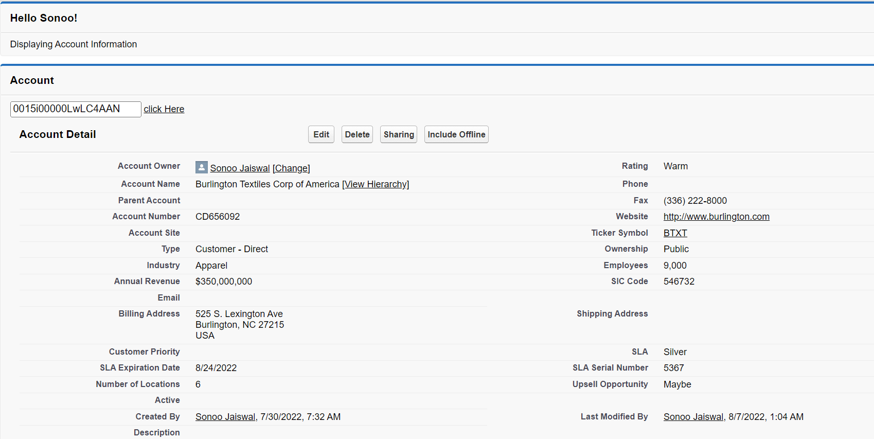
Next Topicapex:define Component
|
 For Videos Join Our Youtube Channel: Join Now
Feedback
- Send your Feedback to [email protected]
Help Others, Please Share


