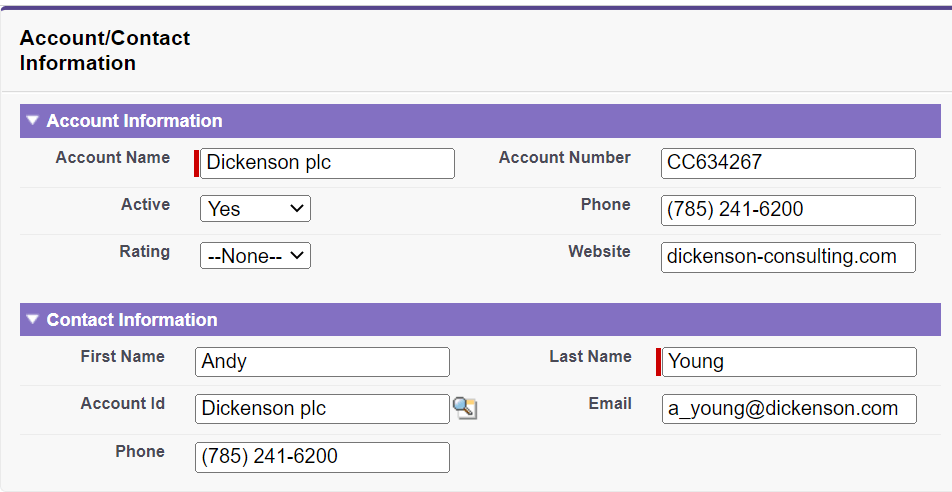
<apex: inputField> Component in Visualforce PageThe <apex: inputField> is another important input element in Salesforce. The major difference between <apex: inputField> and <apex: input> is that the <apex: inputField> is used for a value that corresponds to a field on a Salesforce object, whereas the <apex: input> is used for a value that doesn't corresponds to a field on a Salesforce object. The <apex: inputField> component respects all the attributes associated with this field. Attributes include whether this field is required or unique and the user interface widget for displaying. If the specified <apex: inputField> component is a date or picklist field, the calendar input widget or picklist dropdown is displayed respectively. The HTML pass-through attribute are supported by this component by using the "html-" prefix and are attached to the generated <input> tag. The <apex: inputField> component has the following attributes: 1. idThe id is a string type attribute, i.e., a unique identifier that allows this component to be referenced by other components in the page. Syntax 2. ignoreEditPermissionForRenderingThe ignoreEditPermissionForRendering is a Boolean type attribute. When its value is true, the user can edit or override the field even when the underlying permission on the object doesn't allow edits. The overridden data affects all users but is intended only for guest users. Note: We can use this attribute only with a custom controller without sharing mode.Syntax 3. labelThe label is a string-type attribute used to specify the text value. This attribute overrides the default label of the field with the specified label value. To hide the default label of the field, we can set the label to an empty string. Syntax 4. onblurThe onblur is a string-type attribute used to invoke the JavaScript method when the onblur event occurs or when the focus moves off the field. Syntax: 5. onchangeThe onchange is a string-type attribute used to invoke the JavaScript method when the onchange event occurs or when the user changes the field's content. Syntax: 6. onclickThe onclick is a string-type attribute used to invoke the JavaScript method when the onclick event occurs or when the user clicks the field. Syntax: 7. ondblclickThe ondblclick is a string type attribute used to invoke the JavaScript method when the ondblclick event occurs or when the user clicks the field twice. Syntax: 8. onfocusThe onfocus is a string-type attribute used to invoke the JavaScript method when the input event occurs, or the focus is on the field. Syntax: 9. onkeydownThe onkeydown is a string attribute used to invoke the JavaScript method when the onkeydown event occurs or when the user presses a keyboard key. Syntax: 10. onkeypressThe onkeypress is a string type attribute used to invoke the JavaScript method when the onkeypress event occurs or when the user holds down or presses a keyboard key. Syntax: 11. onkeyupThe onkeyup is a string-type attribute used to invoke the JavaScript method when the onkeyup event occurs or when the user releases a keyboard key. Syntax: 12. onmousedownThe onmousedown is a string-type attribute used to invoke the JavaScript method when the onmousedown event occurs or when the user presses the mouse button. Syntax: 13. onmousemoveThe onmousemove is a string type attribute used to invoke the JavaScript method when the onmousemove event occurs or when the user moves the mouse pointer. Syntax: 14. onmouseoutThe onmouseout is a string type attribute used to invoke the JavaScript method when the onmouseout event occurs or when the user moves the mouse pointer away from the field. Syntax: 15. onmouseoverThe onmouseover is a string-type attribute used to invoke the JavaScript method when the onmouseover event occurs or when the user moves the pointer over the input. Syntax: 16. onmouseupThe onmouseup is a string-type attribute used to invoke the JavaScript method when the onmouseup event occurs or when the user releases the mouse button. Syntax: 17.onselectThe onselect is a string-type attribute used to invoke the JavaScript method when the onselect event occurs or when the user selects a checkbox associated with this field. Syntax: 18. renderedThe rendered is a Boolean type attribute that specifies whether this component needs to be rendered on the page or not. By default, its value is set to true. Syntax: 19. requiredThe required is a Boolean type attribute that specifies whether this field is a required field or not. By default, its value is set to false. Syntax: 20. showDatePickerThe showDatePicker is a Boolean type attribute used to check whether we need to use the VF date picker for this field or not. This attribute affects only date and datetime fields. Syntax: 21. styleThe style is a string type attribute used to specify the inline CSS style that will be applied for displaying the input component. Syntax: 22. styleClassThe styleClass is a string type attribute used to specify the style class that will be applied for displaying the input component. Syntax: 23. taborderhintThe taborderhint is an Integer type attribute that specifies the hint that indicates the relative order in which this field is selected compared to other page components when the user presses the tab key. The value of this attribute should be between 0 to 32767. Syntax: 24. typeThe type is a string-type attribute used to add the defined type to the generated input element. The possible values for the type attribute include auto, date, datetime, datetime-local, month, week, time, email, number, range, search, tel, text, url. Syntax: 25. valueThe value is an Object type attribute, i.e., an expression that references the Salesforce field associated with this inputField. Syntax: Let's take an example to understand how we can use the <apex:inputField> component on VF page: ApexInputFieldExample.vfp ApexInputFieldController.apxc Output 
|
 For Videos Join Our Youtube Channel: Join Now
Feedback
- Send your Feedback to [email protected]
Help Others, Please Share


