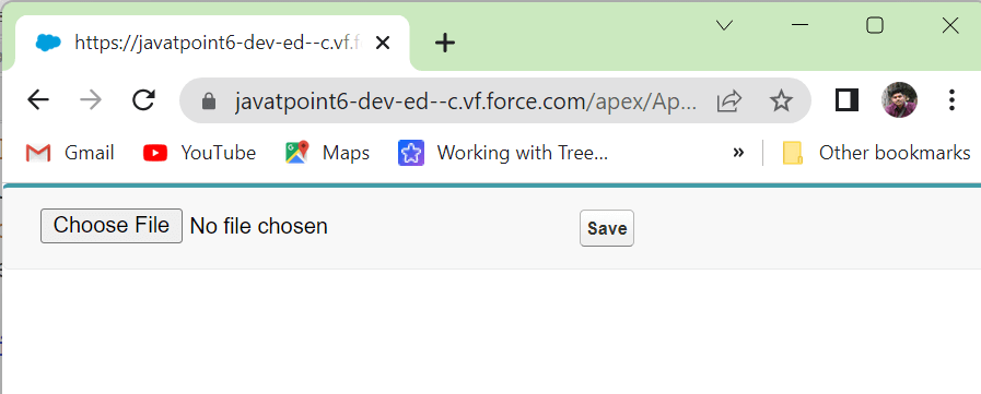
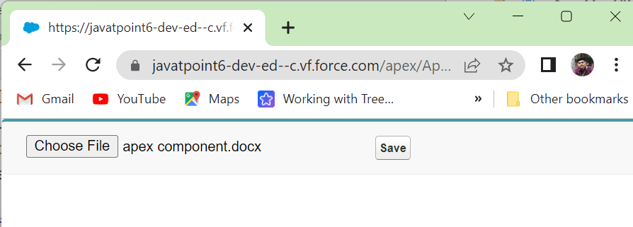
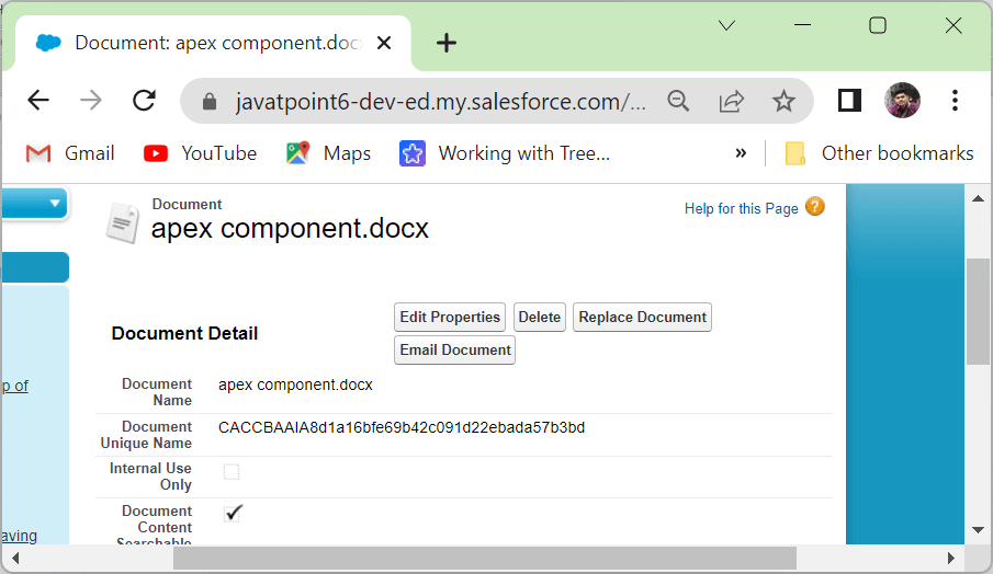
<apex: inputFile> Component in Visualforce PageThe <apex: inputFile> is one of the most important components for creating an input field to upload a file. The <apex: inputFile> component plays an important role when we need to work with the file on Visualforce Page. We can upload a file of a maximum size of 10 MB via Visualforce. The <apex: inputFile> has the following attributes: 1. acceptThe "accept" is a string type attribute, i.e., a comma-delimited set of content types used by the browser to limit the set of file options made available for selection. Syntax 2. accesskeyThe acesskey is a string type attribute that defines the keyboard access key that puts the field in focus. Syntax 3. altThe alt is a string-type attribute that defines the field's alternative text description. Syntax 4. contentTypeThe contentType is a string type attribute used to store the type of the uploaded file's content. Syntax 5. dirThe dir is a string-type attribute used to specify the direction in which the generated HTML component should be used. RTL and LTR are the two possible values for the dir attribute. Syntax 6. disabledThe disabled is a Boolean type attribute that specifies whether this text box should be displayed in the disabled state or not. By default, its value is set to false. Syntax 7. fileNameThe fileName is a string-type attribute used to store the uploaded file's name. Syntax 8. fileSizeThe fileSize is an Integer type attribute that is used for storing the size of the uploaded file. Syntax 9. idThe id is a string type attribute, i.e., a unique identifier that allows this component to be referenced by other components in the page. Syntax 10. langThe lang is a string-type attribute used for specifying the base language used for the generated HTML output. The possible values of this attribute are en and en-US. Syntax 11. onblurThe onblur is a string-type attribute used to invoke the JavaScript method when the onblur event occurs or when the focus moves off the field. Syntax: 12. onchangeThe onchange is a string-type attribute used to invoke the JavaScript method when the onchange event occurs or when the user changes the field's content. Syntax: 13. onclickThe onclick is a string-type attribute used to invoke the JavaScript method when the onclick event occurs or when the user clicks the field. Syntax: 14. ondblclickThe ondblclick is a string-type attribute used to invoke the JavaScript method when the ondblclick event occurs or when the user clicks the field twice. Syntax: 15. onfocusThe onfocus is a string-type attribute used to invoke the JavaScript method when the onfocus event occurs or the focus is on the field. Syntax: 16. onkeydownThe onkeydown is a string-type attribute used to invoke the JavaScript method when the onkeydown event occurs or when the user presses a keyboard key. Syntax: 17. onkeypressThe onkeypress is a string-type attribute used to invoke the JavaScript method when the onkeypress event occurs or when the user holds down or presses a keyboard key. Syntax: 18. onkeyupThe onkeyup is a string-type attribute used to invoke the JavaScript method when the onkeyup event occurs or when the user releases a keyboard key. Syntax: 19. onmousedownThe onmousedown is a string-type attribute used to invoke the JavaScript method when the onmousedown event occurs or when the user presses the mouse button. Syntax: 20. onmousemoveThe onmousemove is a string-type attribute used to invoke the JavaScript method when the onmousemove event occurs or when the user moves the mouse pointer. Syntax: 21. onmouseoutThe onmouseout is a string-type attribute used to invoke the JavaScript method when the onmouseout event occurs or when the user moves the mouse pointer away from the field. Syntax: 22. onmouseoveThe onmouseover is a string-type attribute used to invoke the JavaScript method when the onmouseover event occurs or when the user moves the pointer over the input. Syntax: 23. renderedThe rendered is a Boolean type attribute that specifies whether this component needs to be rendered on the page or not. By Syntax: 24. requiredThe required is a Boolean type attribute that specifies whether this field is a required field or not. By default, its value is set to false. Syntax: 25. sizeThe size is an Integer type attribute used to specify the size of the selected box. Size is expressed by the number of characters displayed at a time. Syntax: 26. styleThe style is a string type attribute used to specify the inline CSS style that will be applied for displaying the input component. Syntax: 27. styleClassThe styleClass is a string type attribute used to specify the style class that will be applied for displaying the input component. Syntax: 28. tabindexThe tabindex is a string type attribute used to specify the order in which this field is selected compared to other page components when a user presses the Tab key repeatedly. The value of this attribute should be between 0 to 32767. Syntax: 29. titleThe title is a string-type attribute that specifies the text to display as a tooltip when the user's mouse pointer hovers over this component. Syntax: 30. valueThe value is a merge field that references the controller class variable associated with this component. Syntax: Let's take an example to understand how we can use the <apex: inputFile> component: ApexInputFileExample.vfp DocumentController.apxc Output 


Next Topicapex:detail Component
|
 For Videos Join Our Youtube Channel: Join Now
Feedback
- Send your Feedback to [email protected]
Help Others, Please Share


