| |

Bar Graph DefinitionThe bar graph is one of the most popular visual tools for clearly and relevantly presenting data. They are an excellent approach to conveying numerical data since they enable the viewer to quickly comprehend and interpret the information. This article will define bar graphs and their types, use, and creation. What is Bar Graph?A bar graph is a visual representation of data that uses bars to compare different values. The bars can be in any linear direction, horizontal or vertical, depending on the represented data type. The length of each bar shows the value of the data it represents. The graph usually includes a label for each bar to provide context and make it easier for the viewer to understand the information presented. Following the simple steps in this article, you can create effective bar graphs to help you communicate your data effectively. Here are a few examples of creating bar graphs. Example 1: Sales Data Suppose you run a small business and want to create a bar graph to show your monthly sales for the past year. Your sales data is as follows:
To create a bar graph: Label the x-axis with the months of the year. Label the y-axis with the sales amount in dollars. Create a rectangular bar for each month, with the height of each bar representing the sales amount for that month. Add a title and any required labels to the graph. The resulting bar graph would show a steady increase in sales from January to July, followed by a decline in sales through the end of the year. 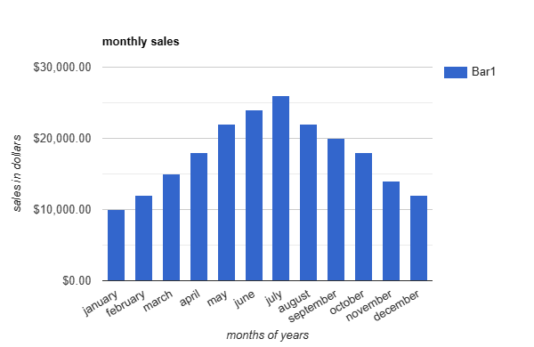
Example 2: Student Grades Suppose you are a teacher and want to create a bar graph to show your students' grades on a recent test. The grades are as follows:
To create a bar graph: Label the x-axis with the names of the students. Label the y-axis with the grade on the test. Create a rectangular bar for each student, with the height of each bar representing their grade on the test. Add a title and any required labels to the graph. The resulting bar graph would show each student's grades, allowing the teacher to identify areas where students may need extra support and track progress over time. 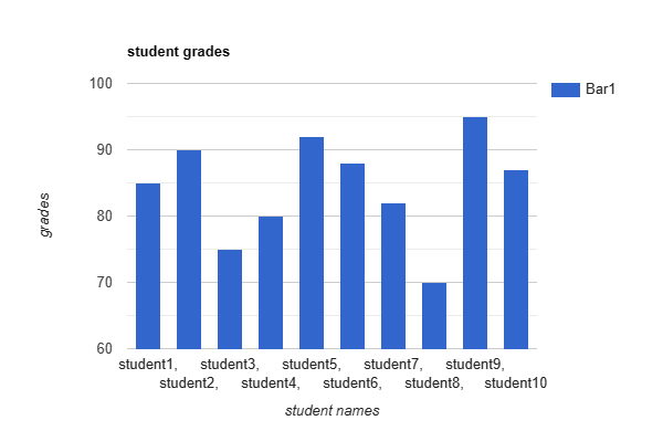
Example 3: Customer Satisfaction Suppose you run a customer service department and want to create a bar graph to show the satisfaction ratings of your customers over the past year. The ratings are as follows:
To create a bar graph: Label the x-axis with the months of the year. Label the y-axis with the satisfaction rating percentage. Create a rectangular bar for each month, with the height of each bar representing the satisfaction rating for that month. Add a title and any required labels to the graph. The resulting bar graph would show the satisfaction ratings of customers throughout the year, allowing the customer service department to identify areas where improvements may be needed and track progress over time. 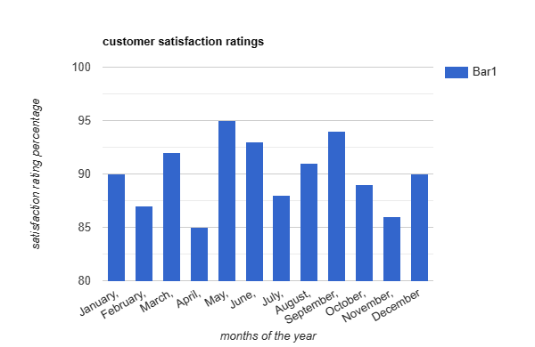
Example 4: Population by Age Group Suppose you want to create a bar graph showing a city's population by age group. The population data is as follows:
To create a bar graph: Label the x-axis with the age groups. Label the y-axis with the population size. Create a rectangular bar for each age group, with the height of each bar representing the population size for that age group. Add a title and any required labels to the graph. The resulting bar graph would show the population size of each age group in the city, allowing you to easily see which age groups comprise the largest portion of the population. 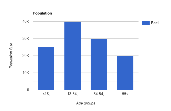
This information could be used for various purposes, such as planning city services and programs catering to different age groups. The components of a bar graph work together to provide a clear and concise visual representation of data, making it easy to compare values and draw conclusions. Using a bar graph makes it possible to identify patterns or trends quickly and easily in the data, as well as to make comparisons between different variables or categories which further helps draw expected trends and make future plans. The Components of a Bar Graph Include
Types of Bar GraphsMany bar graphs are available, each suited for a specific type of data. Some are given below:
Steps to Create Bar GraphsCreating a bar graph is a relatively simple process that involves the following steps: 1. Identify the Data: The first step is to identify the type of data you want to represent using the bar graph. 2. Choose a Type of Bar Graph: Choose the appropriate type of bar graph among different bar graphs that suit your data and satisfy your condition. 3. Choose a Scale: Determine the scale for your graph, which represents the range of values for the y-axis. 4. Create the Graph: Using a spreadsheet program or other data visualization software, input and create the data. 5. Label the Graph: Include clear labels for the axes and each bar to provide context and make it easy for the viewer to understand the information presented. Other Types of GraphsIn addition to bar graphs, various other types of graphs are used to represent data. Here is a brief overview of some of them:
Advantages and DisadvantagesEach type of graph has advantages and disadvantages, and the choice of which type to use depends on the nature of the data and the message you want to convey. Bar graphs are a widely used visual representation of data, providing several advantages in effectively conveying information. However, they also have some disadvantages when selecting the appropriate chart type for data visualization. Here are some of the advantages and disadvantages of bar graphs: Advantages
Disadvantages
Bar graphs are an effective way to represent numerical data, making it easy to understand and interpret. While they have some disadvantages, such as the limited display of large amounts of data and the potential for misrepresentation, the advantages of bar graphs make them a popular choice for data visualization. When selecting the appropriate chart type for data visualization, it is essential to consider the type of data and the message you want to convey. Each graph has its best use case, which depends on the situation and the data plotting type. Applications of a Bar GraphBar graphs are a powerful tool for visualizing and presenting data in a way that is easy to understand and interpret. They have numerous applications in various fields, including business, education, research, and more. Here are some of the common applications of bar graphs: Sales and Marketing: Bar graphs are commonly used to present sales and marketing data. They can help to identify trends, highlight key performance indicators, and track progress over time.
ConclusionIn conclusion, bar graphs effectively represent numerical data, making it easy to understand and interpret. They are versatile, easy to read, and allow for easy comparisons between different data points. Following the simple steps outlined in this article, you can create effective bar graphs to help you communicate your data effectively.
Next TopicBlind Definition
|
 For Videos Join Our Youtube Channel: Join Now
Feedback
- Send your Feedback to [email protected]
Help Others, Please Share


