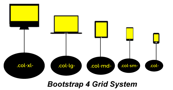
Bootstrap 4 Grid SystemIn this article, we will learn about the bootstrap 4 grid system in detail with the help of various examples. What do you mean by bootstrap 4 grid system?In Bootstrap 4 grid system is responsive. In a grid system, columns will re-arrange depending on the screen size, i.e., small, large, and extra small, and extra-large. On a big screen, i.e., the desktop and the laptop screen, it might look better with the content organized in three columns, but on a small screen, i.e., tablets, phones, etc., it would be better if the content items were stacked on top of each other. Bootstrap 4 Grid Classes
The Bootstrap 4 grid system has five classes:
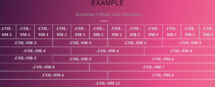
Let's take the various example of the bootstrap 4 grid system. Example 1:Explanation: In the above example, we have created an example of bootstrap 4 basic grid structure. Output: Following is the output of this example. 
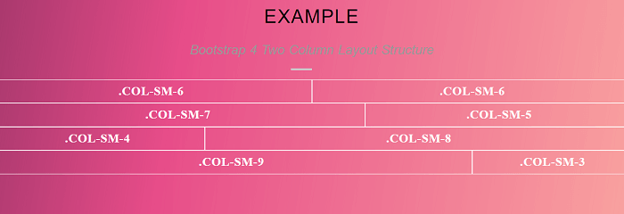
Example 2:Explanation: In the above example, we have created an example of bootstrap 4 grid two column layout structure. In this for creating a two column layout structure we created a 1 group of .col-sm 6 and .col-sm 6,, one group of .col-sm 5 and .col-sm 7, one group of .col-sm 4 and .col-sm 8, and last one group of .col-sm 9 and .col-sm 3. Output: Following is the output of this example. 
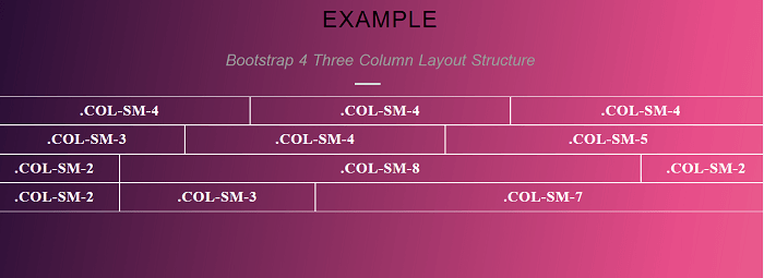
Example 3:Explanation: In the above example, we have created an example of bootstrap 4 grid three column layout structure. In this for creating a three column layout structure we created a 1 group of .col-sm 4, .col-sm 4 and .col-sm 4, one group of .col-sm 3, .col-sm 4 and .col-sm 5, one group of .col-sm 2, .col-sm 8 and .col-sm 2, and last one group of .col-sm 2, .col-sm 3 and .col-sm 7. Output: Following is the output of this example. 
Next TopicBootstrap 4 Textarea
|
 For Videos Join Our Youtube Channel: Join Now
Feedback
- Send your Feedback to [email protected]
Help Others, Please Share


