 |

Bootstrap 4 Responsive TableIn this article, we will understand the responsive table in Bootstrap 4. What do you mean by Bootstrap 4 responsive table?Table is a combination of rows and columns. Rows represent in horizontal directions and columns represent in vertical direction. In bootstrap 4, Responsive tables allow tables to be scrolled horizontally in easy manner. The Responsible table works properly in all devices because it adjusts according to resolution of the devices. Let's take the various examples of Bootstrap 4 responsive tables. Example 1:Explanation: In the above example, we have created an example of bootstrap 4 responsive table with the use of .table-responsive class. Output: Following is the output of this example: 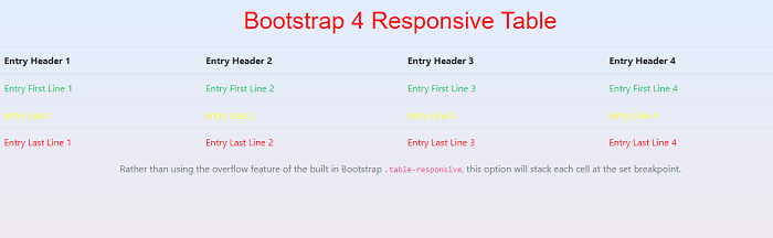
Example 2:Explanation: In the above example, we have created an example of a bootstrap 4 responsive table. Output: Following is the output of this example: 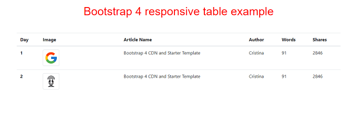
Example 3:Explanation: In the above example, we have created an example of bootstrap 4 responsive table with scrollbar. Output: Following is the output of this example: 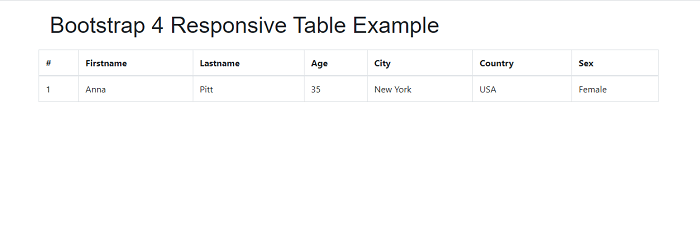
Example 4:Explanation: In the above example, we have created an example of a bootstrap 4 responsive table with a search option. Output: Following is the output of this example: 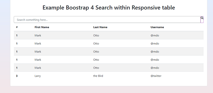
Next TopicBootstrap 4 colors
|
 For Videos Join Our Youtube Channel: Join Now
Feedback
- Send your Feedback to [email protected]
Help Others, Please Share


