 |

Bootstrap 5 formsBootstrap5 forms use to create a function for user interaction. The form element collects and updates information from the user using fields such as checkboxes, radio buttons, or text fields. We can insert and save users' data in the database. The form controls in Bootstrap 5 provide classes to form designs. Use these classes to enable browser and device-specific rendering. Bootstrap 5 version uses a suitable type property on all inputs to take advantage of current input controls such as email verification, number selection, password, text, etc. Bootstrap 5 form typesBootstrap 5 has a form type that allows displaying the form in the right format alongside other functions. There are two kinds of form layouts or types in Bootstrap 5:
Bootstrap 5 Stacked formsThe bootstrap 5 stacked form generates a full-width form with mandatory input fields such as a text field, an email, a password, and a submit button. To maintain form margins on a web page, use a form wrapper element with the ".form-control" class. We can use the "form-label" class for the element heading. This form layout is used to make a registration form, a login form, and a contact form. Syntax The bootstrap 5 stacked forms syntax shows in below. Example The following example shows us to create stacked form using bootstrap 5 classes. Here, we can use "form-control" class in input element. Each input element needs individual "div" tag. Output The output shows stacked form using bootstrap 5 class and element in the below image. 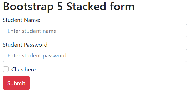
Bootstrap 5 Inline FormAn inline form's elements are in a single line and left-aligned. It only applies to forms within viewports with a minimum width of 576px. If screen width is less than 576 px, an inline form displays horizontally by default. The form screen width is greater than the small size screen. Syntax The bootstrap 5 stacked forms syntax shows in below. The "form-control" class uses in input element. This element places in the different columns. Example The following example shows us to create stacked form using bootstrap 5 classes. Here, we can use "form-control" class in input element. Each input element needs individual "div" tag. Output: The output shows inline form using bootstrap 5 class and element in the below image. 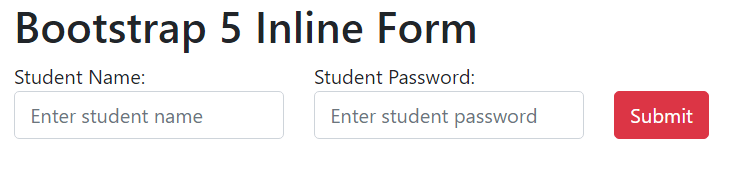
Bootstrap 5 Form control sizeBootstrap 5 version uses a form control class with the required size. We can apply large, medium, and small sizes of the input elements. The form control size uses as per design and user interface. The "form-control" class uses the default size or medium size of the element. The "form-control-lg" and "form-control-sm" classes apply for elements' large and small sizes, respectively. SyntaxThe bootstrap 5 large size form control's syntax shows in below. The bootstrap 5 medium or default size form control's syntax shows in below. The bootstrap 5 small size form control's syntax shows in below. ExampleThe following example shows us to create a stacked form using bootstrap 5 classes. We can use the "form-control" class in the input element. Each input element places an individual "div" tag with form control size.
Output: 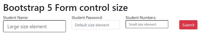
Bootstrap 5 Form TextareaBootstrap 5 version uses a textarea element with a form-control class. The textarea element applies the row with the required size. It uses for user interaction, such as written comments and messages in a form. SyntaxThe bootstrap 5 form textarea syntax shows in below. ExampleThe following example shows us to create textarea in the form using bootstrap 5 classes. Here, we can use "form-control" class in input element with <textarea> tag. Each input element needs individual "div" tag. The "message" input uses <textarea> tag with the "3" rows. The "comment" input uses <textarea> tag with the "5" rows. Output: The output shows a textarea in a form using the bootstrap 5 class and element below the image. 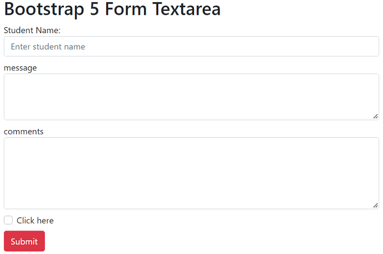
Bootstrap 5 Readonly and disabled elementBootstrap 5 uses the "disabled" and "readonly" elements with the form-control class. The disabled keyword uses to show the data or disable a given function. This keyword uses in the input element to disable the input field. The "readonly function uses to read the input field data but does not provide writing access. SyntaxThe bootstrap 5 disabled in form syntax shows in below. The bootstrap 5 readonly in form syntax shows in below. ExampleThe following example shows us to create a "disable" input element in the form using bootstrap 5 classes and functions. Here, we can use the "form-control" class in the input element with <input> tag. Each input element uses required functions to enable and disables data.
Output: 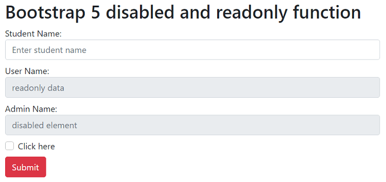
Bootstrap 5 plaintext form controlBootstrap 5 version uses the "form-control-plaintext" class to display input elements in simple text. We can read placeholder data and write new information for user interaction. It provides for styling the form element only. SyntaxThe bootstrap 5 plain text with form element syntax shows in below. ExampleThe following example shows us to create input elements with plain text and normal text style data.
Output: 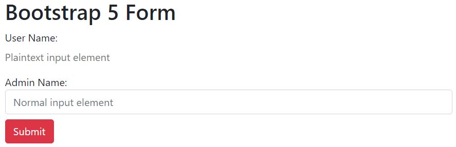
ConclusionThe form is an essential part of the bootstrap 5 web page. The bootstrap 5 form gives many functions, classes, and elements to create a user-friendly form. This element provides multiple features for user interaction with the web page.
Next TopicBootstrap 5 Select Menus
|
 For Videos Join Our Youtube Channel: Join Now
Feedback
- Send your Feedback to [email protected]
Help Others, Please Share


