 |

Bootstrap 5 Popover functionWhen a user clicks on a control button or enters a specific area, a popover, which is a temporary display, appears on the content screen. The popover functions are similar to the popover function with header and content in a single tag. Popover rules for Bootstrap 5For placement in popovers, Bootstrap 5 makes use of a third-party library. The popovers won't work unless the web page includes the "bootstrap.bundle.js" or "bootstrap.bundle.min.js" library. The bootstrap.js link and the JavaScript bundle library are both included. Popovers are opt-in for performance reasons, so we have to initialize them ourselves. The popover titles "Zero-length" are never displayed on the website. When activated by hyperlinks that cross multiple lines, popovers are centred. Popovers cannot be triggered on elements that are hidden. A wrapper element needs to be active to show popovers for disabled elements. Before removing the associated elements from the DOM, the popover must be deactivated (Document Object Model). To start popovers, select an element from a shadow document object model. Basic Popover with Anchor TagThe popover function works as a popover by clicking events using different tags and elements. The popover variable initializes the function after clicking on the href tag using a script tag. ExampleThe following example shows popover data after clicking the anchor tag. Output The following image shows a basic popover with an anchor <a> tag. 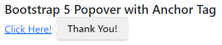
Basic Popover with Button FunctionThe popover function works as a pop-up box with clicking events using the button function. The popover variable initializes the function after clicking on the button value or function using a script tag. ExampleThe following example shows popover data after the hovers button function. Output The following image shows a basic popover with a button function. 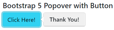
Basic Popover with PositionThe popover function describes using the position per user requirements and application format. Using Bootstrap 5 elements, we can add a popover to the content's top, bottom, left, and right. The anchor or button function works with the the data-bs-placement = "position(top)" element. SyntaxThe following syntax uses the button function to display popover information in various positions. ExampleThe following example shows popover data in different positions with the button function. Output The following image shows different position popovers with button functions. 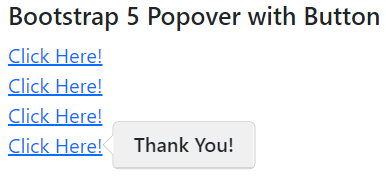
Closing PopoverThe Html element-like button includes the data-bs-trigger = "focus" element on the web page. The focus element closes the popover function after clicking on the button or anchor function. SyntaxThe following syntax uses the button function to display closing popover information. ExampleThe following example shows the closing popover function with header and text. Output The following image shows the closing popover function with content. 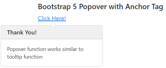
Hover PopoverThe Html element-like button includes the data-bs-trigger = "hover" element on the web page. The hover element shows a popover function after the mouser arrow touches the button or anchor function. SyntaxThe following syntax uses the button function to display closing popover information. ExampleThe following example shows the hover popover function with header and text. Output The following image shows the hover popover function with content. 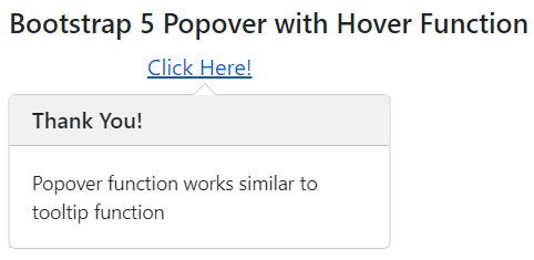
Basic Popover with OffsetThe data-bs-offset = "10,15" element uses inside of the user interactive function. This element shows a popover on the page as per the required position from the button or anchor element. SyntaxThe following syntax shows the popover function with offset value from the html element. ExampleThe following example shows the required offset value for the popover function from the html element. Output The following image shows the popover function with an offset to the button. 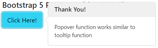
Basic Popover with Disabled buttonThe disabled button of the application does not show the popover function and its data. The html <span> with <button> tags work for the displaying popover data. The tabindex = "0" element is placed in the span tag to show the tooltip. SyntaxThe following syntax shows the popover function with the disabled element. ExampleThe following example shows the popover function with the disabled button. Output The following image shows the popover function with the disabled button. 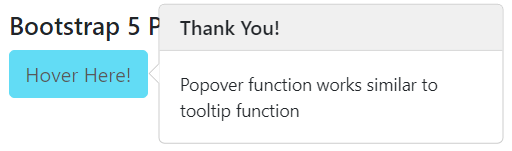
ConclusionThe popover function helps users and developers to get detailed information. It works to create user-friendly, detailed, and informative functions for the application. The bootstrap 5 popover function displays extra information using the interactive pop-up box.
Next TopicBootstrap 5 offcanvas sidebar function
|
 For Videos Join Our Youtube Channel: Join Now
Feedback
- Send your Feedback to [email protected]
Help Others, Please Share


