 |

Bootstrap 5 TooltipWhen a user hovers their mouse pointer over an element, a little pop-up box is called a tooltip function. Bootstrap 5 tooltip shows extra information or a short message after placing the mouse on a particular function. Bootstrap 5 Tooltip RulesBootstrap 5 uses a third-party package for placement in tooltips. The tooltips do not function until we use the "bootstrap.bundle.min.js" or "bootstrap.bundle.js" library on the web page. The JavaScript bundle library or the link includes before bootstrap.js link. We must initialize tooltips ourselves because they are opt-in for performance reasons. The "Zero-length" tooltip titles are never shown on the web page. Tooltips are center-positioned when they are activated by hyperlinks that cross multiple lines. On hidden elements, tooltips cannot be triggered. A wrapper element must be activated to display tooltips for disabled elements. The tooltip must be disabled before their related elements are deleted from the DOM (Document Object Model). An element inside a shadow document object model can be used to initiate tooltips. How to operate the tooltip
Basic Tooltip with Anchor TagThe tooltip function uses different user-friendly tags and elements. Here, we use anchor <a> tag with tooltip toggle element and its title. In script tag, the tooltip variable initializes the function after hover on <a> tag. Example The following example shows tooltip data after hovering the anchor tag. Output The following image shows a basic tooltip with an anchor tag. 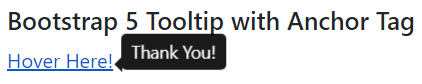
Basic Tooltip with Button FunctionMostly, the tooltip function uses a button function with html element. Here, we use a button tag with a tooltip toggle element and its title. In the script tag, the tooltip variable and function initialize the function after hovering on the button tag. Example The following example shows tooltip data after the hover button function. Output The following image shows a basic tooltip with a button function. 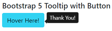
Basic Tooltip with PositionThe tooltip displays using the position as per user requirement and application format. We can place a tooltip on the top, bottom, left, and right side of the content using bootstrap 5 elements. The data-bs-placement = "position(top)" element uses inside of the button or anchor function. Syntax The following syntax shows tooltip data in different positions with the button function. Example The following example shows tooltip data in different positions with the button function. Output The following image shows different position tooltips with button functions. 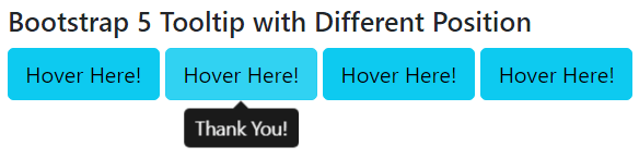
Basic Tooltip with Html ElementThe data-bs-html = "true" element uses inside of the button or anchor function. If it is true, the tooltip's title will display HTML tags. If false, the DOM will be filled with information using the inner Text attribute. This element shows a tooltip on the page as per availability and required position. Syntax The following syntax shows tooltip data with an Html element. Example The following example shows tooltip data with html element. Output The following image shows a tooltip with the Html function. 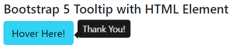
Basic Tooltip with OffsetThe data-bs-offset = "10,15" element uses inside of the user interactive function. This element shows a tooltip on the page as per the required position from the button or anchor element. Syntax The following syntax shows the tooltip function with offset value from the html element. Example The following example shows the required offset value for the tooltip function from the html element. Output The following image shows the tooltip function with an offset to the button. 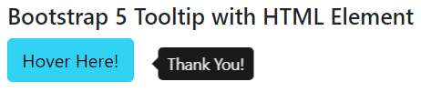
Basic Tooltip with Disabled buttonThe disabled button does not show the tooltip function on the web page. The <span> and <button> tag require for the displaying tooltip data. The tabindex = "0" element is placed in the span tag to show the tooltip. Syntax The following syntax shows the tooltip function with the disabled element. Example The following example shows the tooltip function with the disabled button. Output The following image shows the tooltip function with the disabled button. 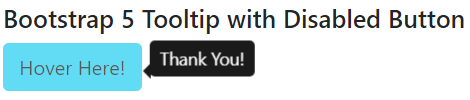
ConclusionThe bootstrap 5 tooltip function works to display extra information using the interactive pop-up box. The tooltip function helps users and developers to get detailed information. It works to create user-friendly, detailed, and informative functions for the application.
Next TopicBootstrap 5 Flex
|
 For Videos Join Our Youtube Channel: Join Now
Feedback
- Send your Feedback to [email protected]
Help Others, Please Share


