 |

Bootstrap 5 utilitiesBootstrap offers hundreds of utility classes for showing, aligning, concealing, and spacing content for responsive and mobile-friendly development. Our utility API is built on a set of Sass maps and functions that generate families of classes with varied options. It can change or expand our default set of utility classes using html elements. Our utility classes generate bootstrap 5 utilities. Border size and sideTo add or remove borders from an element, use the border classes. To modify the width of the border, add the ".border-1" class to the ".border-5" class. Bootstrap 5 rounded classes work to add rounded corners to an element. We can use the "rounded-pill" class for a rounded rectangle border. SyntaxThe following syntax shows the basic border for function. The following syntax shows border width. The following syntax shows border sides disabled. The following syntax shows border sides. The following syntax shows border-radius. ExampleThe following example shows border size and sides using bootstrap 5 classes. Output The following image shows the different types of borders, sizes and shapes. 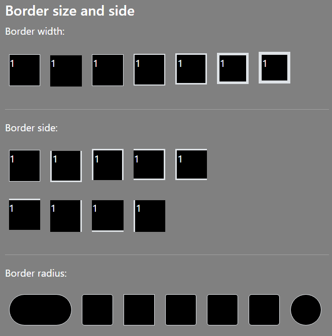
Float and clearfixThe "clearfix" class uses to clear the web page floats for application function. The " float-start" class shows the function left side of the web page. The "float-end" class shows the function right side of the web page. SyntaxThe following syntax shows the clearfix function. The following syntax shows float position. ExampleThe following example shows the position of the element. Output The following output shows the start and ends side elements. 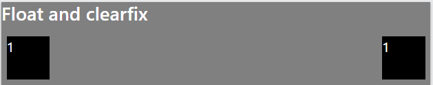
Center alignmentThe centre alignment shows function in the center position of the web page. The "mx-auto" class helps to create a function in the middle position of the application. SyntaxThe following syntax shows center alignment. ExampleThe following example shows the center alignment of the element. Output The following output shows the center alignment of the element. 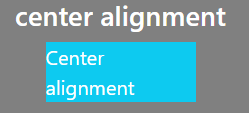
Responsive Float and clearfixThe responsive float class uses to create a float function for all screen size devices. The small, medium, large, and extra large devices can use the application properly. SyntaxThe following syntax shows responsive float position. ExampleThe following example shows the responsive float position of the element. Output The following output shows the start and ends side elements. 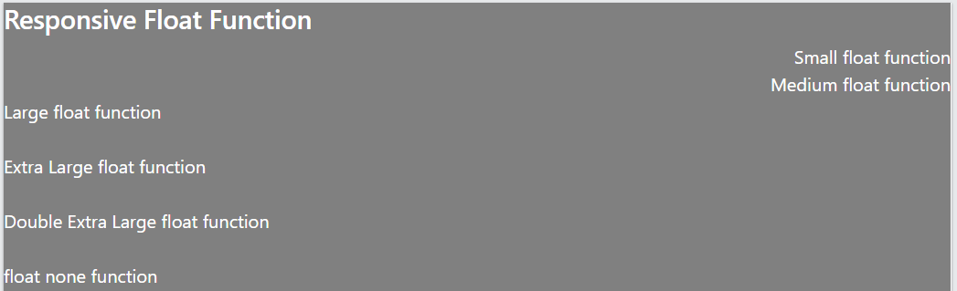
Bootstrap 5 widthThe w-* classes specifies the width of an element. The bootstrap 5 version provides w-25, w-50, w-75, w-100, mw-100, and mw-auto classes to set the width size. SyntaxThe following syntax shows 50% width of the function. ExampleThe following example shows the width of the element. Here, we can use different sizes of the width of the function as per requirement. Output The following output shows multiple sizes of the width for the element. 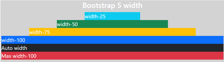
Bootstrap 5 heightThe h-* classes specify the height of an element. The bootstrap 5 version provides h-25, w-50, h-75, h-100, mh-100, and mh-auto classes to set the height size. SyntaxThe following syntax shows 50% height of the function. ExampleThe following example shows the height of the element. We can set the height at 25 to 100 percent per the application requirement. Output The following output shows the different sizes of the height for the element. 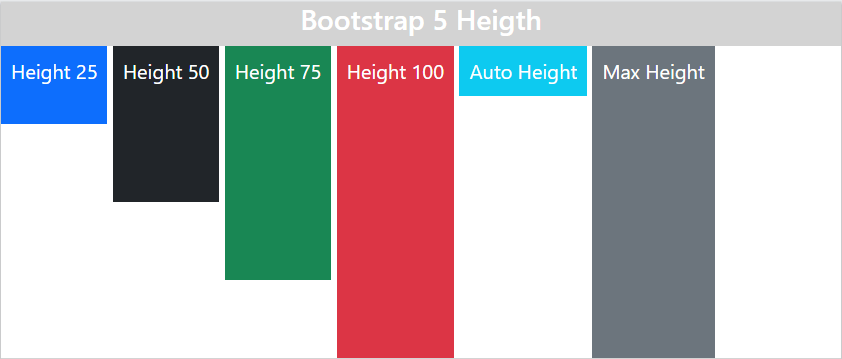
Bootstrap 5 visibilityBootstrap 5 provides a visibility class to show and hide the element. There is no need for a CSS-style property for each id or class. The "visible" class appears as the required element, and the "invisible" class disappears from the web page. SyntaxThe following syntax shows the visibility of the function. ExampleThe following example shows the visibility of the element. Output The following output shows the visibility of the element. 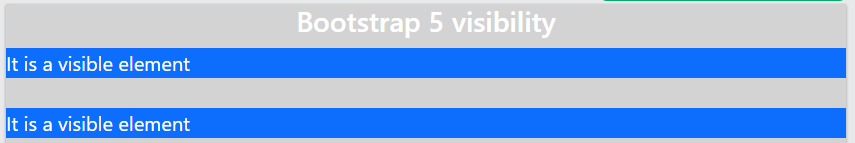
Bootstrap 5 screen readerThe "sr-only" class shows the screen-only or readable function on the page. The "visually-hidden" class hides the screen reader function from the web page. SyntaxThe following syntax shows the visibility of the function. ExampleThe following example shows a screen reader of the element. Output The following output shows the screen reader of the element. 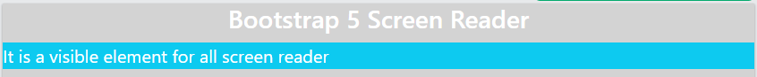
Bootstrap 5 close buttonThe close button gives notification and syntax to dismiss a particular function. It is similar to other buttons but shows a close sign on the button. The button tag or button type must use the "close" class. SyntaxThe following syntax shows the visibility of the function. ExampleThe following example shows the close button element. Output The following output shows the close button element. 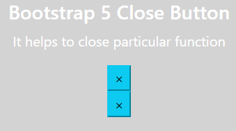
Bootstrap 5 SpacingThe margin creates space outside the element using the "m-*" class. The padding creates space inside the element using the "p-*" class. The margin or padding from 1 to 5 creates the size of the element space. The spacing of the particular side with size creates using the bootstrap 5 classes. The "mt-2" and the "pt-2" shows the top side of spacing. The "b" shows the bottom, "s" describes the start, and "e" describes the end side of the element. The "x" describes the element's left and right sides spacing. The "y" describes the top and bottom sides of the element spacing function. SyntaxThe following syntax shows a basic margin. The following syntax shows basic padding. Example1The following example shows margin and padding space using bootstrap 5 classes. Output The following image shows different margins and padding. 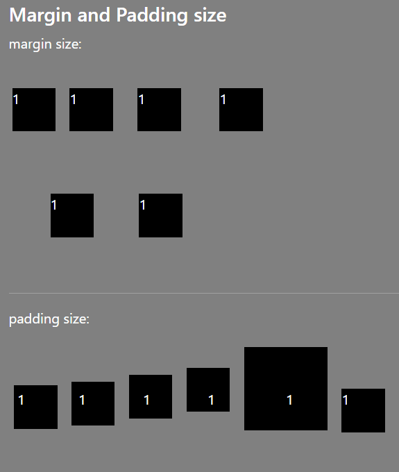
Example2The following example shows the margin side of the element. Output The following image shows different margin sides. 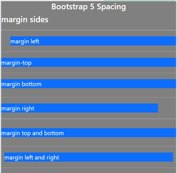
Example3The following example shows the padding side of the element. Output The following image shows different padding sides. 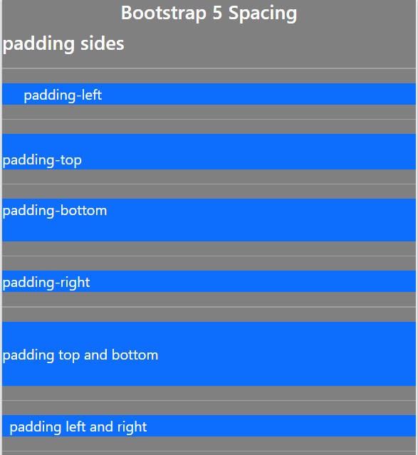
Bootstrap 5 shadowBootstrap 5 provides a shadow class to show shadows around the element or functions. We can use the "no-shadow" class for clear shadow around the function. The shadow uses the small, default, or large size per requirement. SyntaxThe following syntax shows the shadow of the function. ExampleThe following example shows the shadow of the element. Output The following output shows shadows of the element. 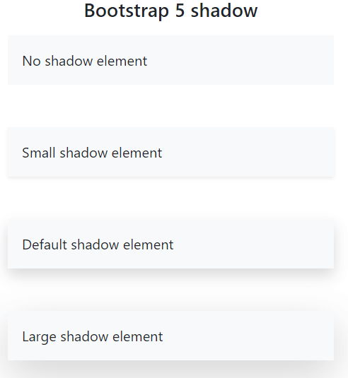
Bootstrap 5 element colorsThe bootstrap 5 classes use contextual color for background, text, and border. We can use a contextual border, information and border of the functions. SyntaxThe following syntax shows the bootstrap 5 text colors for function. The following syntax shows the bootstrap 5 background colors for function. The following syntax shows the bootstrap 5 border colors for function. ExampleThe following example shows the different colors of the element. Output The following output shows the color of the element. 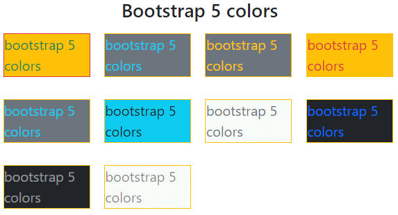
ConclusionThe bootstrap 5 utilities use several classes to create attractive functionality. It contains CSS style property in a single class. It avoids the complexity of the programming.
Next Topic#
|
 For Videos Join Our Youtube Channel: Join Now
Feedback
- Send your Feedback to [email protected]
Help Others, Please Share


