 |

Bootstrap GridWikipedia says: "In graphic design, a grid is a structure (usually two-dimensional) made up of a series of intersecting straight (vertical, horizontal) lines used to structure the content. It is widely used to design layout and content structure in print design. In web design, it is a very effective method to create a consistent layout rapidly and effectively using HTML and CSS." Bootstrap Grid SystemThe Bootstrap Grid System allows up to 12 columns across the page. You can use all 12 columns individually or you can groups the columns together to create wider columns. 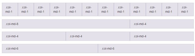
Bootstrap Grid System is responsive and the columns are re-arranged automatically according to the screen size. Grid Classes:There are four classes in Bootstrap Grid System:
You can combine the above classes to create more dynamic and flexible layouts. Basic Structure of a Bootstrap Grid:Follow the below instructions while creating a Bootstrap Grid:
Bootstrap Grid ExampleFor equal columns: Test it NowFor unequal columns: Test it NowBootstrap 4 Grid ClassesThere are 5 classes in Bootstrap 4 grid system.
You can also combine the above classes to create more dynamic and flexible layouts. Structure of Bootstrap 4 GridSee the basic structure of Bootstrap 4 grid: First create a row (<div class="row">) then add the desired number of columns (tags with appropriate .col-*-* classes). Here: In .col-*-* , the first star (*) represents the responsiveness: sm, md, lg or xl, while the second star represents a number, which should add up to 12 for each row. Equal Columns ExampleLet's take an example to see how to create an equal width column on all devices and screen widths: ExampleTest it NowUnequal Column ExampleLet's take an example to see how to create an unequal width column which supports tablets and scaling to large extra desktops: Example:Test it Now
Next TopicBootstrap Table
|
 For Videos Join Our Youtube Channel: Join Now
Feedback
- Send your Feedback to [email protected]
Help Others, Please Share


