 Home
Home CSS
CSS HTML
HTML XHTML
XHTML JavaScript
 Bootstrap
 jQuery
 PHP
PHP XML
XML JSON
JSON Python
 C++
C++ Java
Java C#
C# SQL
SQL Interview Q
Border Shadow CSSThe "box-shadow" property in CSS enables developers to apply a shadow effect to an element, giving the appearance of depth and separation from the backdrop. The box shadow may produce various effects, such as border shadows, commonly referred to as "border shadows". we will start with the fundamentals in this article before moving on to more complex usage. Basics of Box Shadow in CSSThe box-shadow property's fundamental syntax is as listed below:
Border Around TextImagine you're drawing a picture, and you want to put a line around something to make it pop. That's what a border around text does. It's like a fancy line around words to make them look special and easier to see. A border around the text is like a frame that goes around the outside of the text. It's like drawing a line around the words to make them stand out or separate them from the rest of the content. This can help highlight the text and make it more noticeable on a webpage, document, or design. The border can have different colors, thicknesses, and styles, such as solid or dashed lines, to give the text a specific look or emphasize its importance. ExampleOutput 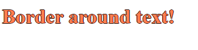
Adding Border ShadowApplying the box-shadow attribute to an element using a solid background color will provide the border shadow impact. The shadow will encircle the element's boundaries, creating the appearance of a border. Here's an illustration: Output 
Advanced Border Shadow Techniques1. Multiple Shadows:A single element can have many shadows applied to it, separated by commas. This enables you to produce more complicated shadow effects. The above example can be applied here. 2. Inset Shadows:The element will appear to be pressed into the backdrop if the "inset" keyword is used to produce an inner shadow impact. 3. Spread Radius for Border-Like Shadows:A more distinct border-like shadow effect can be produced by utilizing a spread radius that is not zero. In this case, the spread radius is set to 3 pixels, creating a shadow resembling a border surrounding the element. 4. Transition and Animation:Additionally, you may create shadow effects by adding transitions or animations to the box-shadow attribute. Output 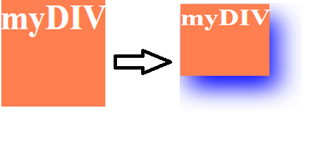
Before effect After effect ConclusionBorder shadows may be made using CSS's "box-shadow" property, a strong tool for this purpose. You may create various shadow effects by altering the horizontal position, vertical position, blur radius, spread radius, and color. CSS box shadows may improve the aesthetic of your items on a webpage, regardless of whether you're looking for a straightforward border shadow or a complicated pattern.
Next TopicCSS Text-shadow
|
 For Videos Join Our Youtube Channel: Join Now
Feedback
- Send your Feedback to [email protected]
Help Others, Please Share


