 |

Box shadow in React NativeIn React Native, applying box shadows is not easy. Because the developers build for both the Android and iOS platforms, it will be tedious to apply consistent box shadows with the different platform-specific deployment processes. In this tutorial, we learn theimplementationof box shadows in the React Native app on the Android and iOS platforms. To create shadow boxes onthe iOS devices, we have to use four different React Native shadow props.
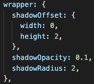
Because it is developed by X and Y offsets relative to the element on the box-shadow where it is applied, the width property will determine the X offset at the shadow. In contrast, the height prop will determine the Y offset. Both the width and height support accept the positive and negative values. Let's use the props to apply a box shadow at a card component with the below code: Now, import the StyleSheet to apply styles on the card component: The app readsthe card bythe box-shadow in the code added below. 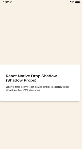
Adding the styles.elevation prop for AndroidUsing Android elevation API, we have to use the elevation widget to add the box shadows to the Android. Just apply a box shadow to the card component. Note: The styles.elevation property works with the applied <View> component: After that, weimport the Style Sheet for styling the card here: By setting the elevation 20 in Shadow Color, we applythe box-shadow at the Android card options. 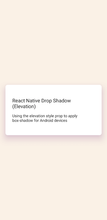
Note: There is no control at the box's opacity, radius, and shadow offset; we have to control the color of the shadow.React Native Cross-Platform Box ShadowItcovers the style props ofshadow props for implementingthe box-shadowiniOS and Android devices in place of separate processes. Now, let's create thefunction that callsthe render box-shadow for the card component based on the user's device by React Native Platform API. We start by configuring the cards: Let's generate a generateBoxShadowStyle() which will apply the box shadow based on the user's operating system in the styles object: With the help of code, we implemented the app checks the user's device platform and applied the appropriate box-shadow props. Let's invoke the generateBoxShadowStyle() and pass the value of shadow and props as arguments: It renders the below platforms: 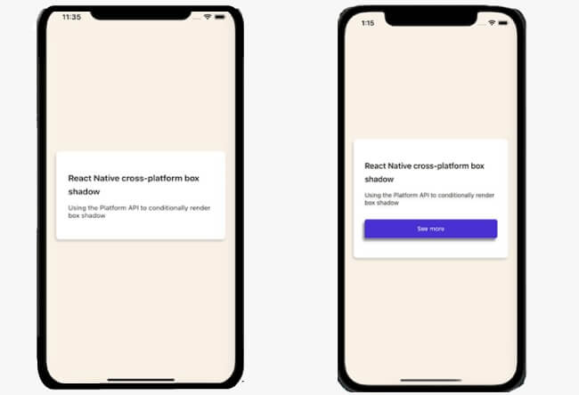
Cross-platform box-shadow limitationsThere are many use cases when we control the box-shadow's offset, opacity, and blur radius. It may include:
With the help of the current implementation, design flexibility is not possible here. However, wecould overcome the limitations with the react-native-drop-shadow. Applying the box-shadow with react-native-drop-shadowThe react-native-drop-shadow is a view componentthat takes the nested component and creates a bitmap representation, blurring or colorizing the style's shadow value, like shadow props in the iOS inputting. Install the react-native-drop-shadow package by the commandsgiven below: Sync, the Android Gradle Toolkit, buildsto restart the development serverif the installation is done. Then after, you have to import the package: You can generate a custom button using the<pressable> component and wrap it to the drop shadow component where we import it. Note the consistency in both the iOS platform and Android platforms.
The drop shadow component is the parent component of the <pressable> component, which is styled to look exact as a button. if we want to apply drop shadow to our button: Add a drop shadow to the dropshadow component to make the <pressable> component look exactly like a button key from the style sheet which is given below: Using React-Native-shadow-2The react-native-shadow-2 package is anupdated version of the react-native-shadow, whichdeclarethe functionality, typing, and support and is written from scratch to minimizethe performance-impactingdependencies. Unlike the drop shadow implementation with react-native-drop-shadow, it creates a bitmap representation of the child components; react-native-shadow-2 is usedfor persistent implementation on Android and with the plugin react-Native-SVG shadow of the iOS platform. Install both the packages at the root of the project directory to get the installation done: To ensure runs on iOS, CD ios directory and run pod install to sync the packages that we installed: The code generates the below given output: 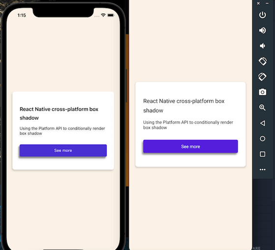
Shadow propsBy using the shadow props recommended in the react-native doc.
There is a problem with using React Native's shadow props if weuse styled-components: The shadow is a set on top of the element, and there isnoway to move it. It is a problem that has not any solution, so you have to use the below code: Box shadowBy using the CSS box-shadow property:
How to apply shadows on the Android platformOn Android, we can use the height style prop from react-native to add the shadow. Upgrade: It sets up the upgrade of the scene by using Android's built-in upgrade API. It adds a drop shadow to affect the z-order ofthe overlapping scenes. 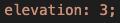
There are no other properties to customize the look of the shadow. Android's shadow on the circle button is very soft, but it's hard to appreciate, but if we turn the button so vast, then the exact value of height property looksexcellent. 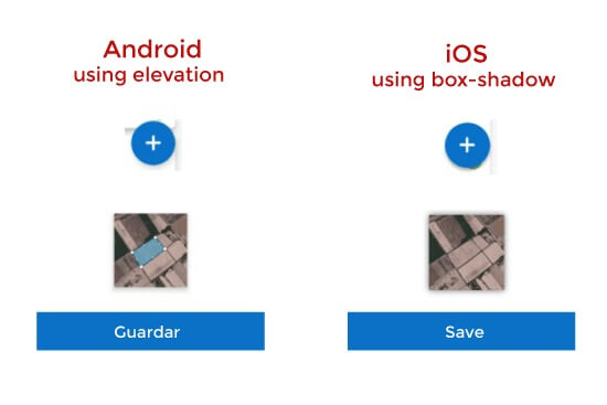
Other multi-platform alternativesThe react-native-shadow enables the management of Android shadow like iOS, but its performance is terrible because of some user opinion.Shadow does not work with React Native in Android. The view takes the children,creates a bitmap representation, blurs it, and colors it like shadow values in iOS. InstallationLimitationsAndroid's bitmap limit is 2048x2048, but it depends on the API version. If shadows and animations are rendered continue, It uses bitmap rendering to simulate heavy shadows in performance. UsageUsage with FlatListUsage with Animated ViewsWe use animated.createAnimatedComponent to create any animatable version of the drop shadow to make the work instead of animated. view. For example: Weuse AnimatedDropShadow despite the Animated. view. ConclusionIt will notbe used in Android apps. It's the big problem with shadow props in React Native. We implement persistent box shadows in React Native apps for Android or iOS platforms by using the react-native-drop-shadow and the react-native-shadow-2.
Next TopicReact Native IAP
|
 For Videos Join Our Youtube Channel: Join Now
Feedback
- Send your Feedback to [email protected]
Help Others, Please Share


