 |

Components States in Adobe XDThe states in Adobe XD allows us to develop interactive content to make the design feel realistic. The states are useful for creating user interactions and high-fidelity prototypes. In Adobe XD, we can easily create the component with different states (variations). It is useful for creating a real-time user experience for the application without copying the components multiple times. Having states in the design system makes it easy to manage and organize the assets and project structure. We can add states to our design using the component section in the property inspector area. When a component is created, it always starts with a default state; later, we can add multiple states such as hover or click to it. The components state makes the component intractable. It allows us to save the different variations of the component with the events. We can add and update the state to a component. The state properties also inherited by a component instance means the child component also holds the change state properties. The states are also useful for creating a different variation of a component. For example, if we want to hold the different variations of the buttons such as primary and secondary using the state. We can create two states for the button component and change it in a child component as per the requirement. We can also create different variants of the components by overriding the state in the component instance. Let's understand how to add states to a component: How to add States to a ComponentTo add states to a component, select the component and click the "+" button in the component section in the property inspector area given next to the master component's Default State. 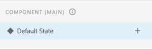
It will display the available state options in a dropdown menu: 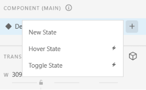
We can select any given state or define a new state with any name for any action which can be called in the prototyping. The new state option will be useful for displaying the disabled or clicked version. The hover state option will change the appearance of the component when we take the cursor over the component in preview mode. The toggle state will determine the behavior while toggling on the component. It will be useful for creating a toggle button. Once a state is added, it will be customized easily. To preview the variations of the state, switch between the states in the property inspector area. Let's add a hover state to understand its behavior: By default, every component will be in its default state; first, navigate to the state section and select a state. In our example, we are selecting the hover state option. In the default state, our button component looks as follows: 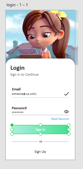
Now, select the hover state option and update the button color on the hover state. After updating the hover state, select the default state to revert the component to its default state. We notice here that nothing is changed when we reverted the component to its default state. To preview the changes, press the Ctrl+Enter key. It will open a new window with the document preview. Here, when we hover on the button component, the button color will be changed. It will work just like a real-time application. Now, our button color will look as follows in the preview panel while hovering: 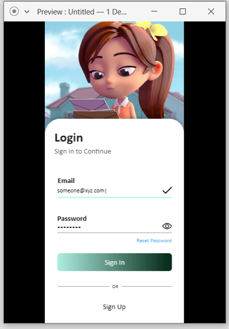
From the above image, we can notice that the changes are only applied when the particular states hits. Similarly, we can create different states for different versions of the component. The following points will be useful while working with states:
Rename and Delete Component StatesTo rename a state, double click on it and change the name of the state. To delete a state from the main component, right-click on the component state and select the delete option. It will delete the selected state. When we delete a state from the main component, it will be automatically deleted from its instances. The instances which have the active deleted state will be reverted back to the default state. Managing States Using a Single SourceWe can manage our states using the main component. We can only add, rename, or delete the states from the main component. It will be automatically updated to the components instances. All the copied components will automatically inherit all the changes from their main component. Thus, we can manage states from our main component only. We do not need to change it for each component.
Next TopicFonts in Adobe XD
|
 For Videos Join Our Youtube Channel: Join Now
Feedback
- Send your Feedback to [email protected]
Help Others, Please Share


