 Home
Home CSS
CSS HTML
HTML XHTML
XHTML JavaScript
 Bootstrap
 jQuery
 PHP
PHP XML
XML JSON
JSON Python
 C++
C++ Java
Java C#
C# SQL
SQL Interview Q
CSS flex-flow propertyThis CSS property is shorthand for flex-direction and flex-wrap properties. It only works on the flex-items, so if the container's item is not a flex-item, the flex-flow property will not affect the corresponding item. SyntaxThe default value of the flex-flow property is row nowrap which is the concatenation of the default values of flex-direction (i.e. row) and flex-wrap (i.e. nowrap) properties. The possible values of this CSS property are tabulated as follows:
ExampleHere, we are using the wrap value of the flex-wrap property and all the possible values of the flex-direction property that are row, row-reverse, column, and column-reverse. In the first container we apply the flex-flow: row nowrap; to the flex-items, in the second container we apply the flex-flow: row-reverse nowrap; to the flex-items, in the third container we apply the flex-flow: column nowrap; to the flex-items, and in the fourth container we apply the flex-flow: column-reverse nowrap; to the flex-items. Test it NowOutput 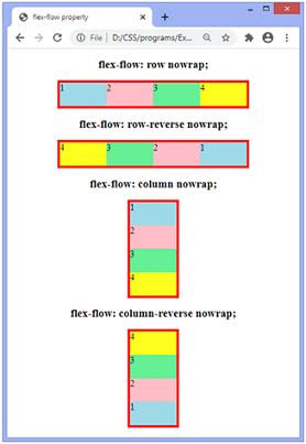
ExampleSimilarly to the above example, here we are using the wrap value of the flex-wrap property and all the possible values of the flex-direction property that are row, row-reverse, column, and column-reverse. In the first container we apply the flex-flow: row wrap; to the flex-items, in the second container we apply the flex-flow: row-reverse wrap; to the flex-items, in the third container we apply the flex-flow: column wrap; to the flex-items, and in the fourth container we apply the flex-flow: column-reverse wrap; to the flex-items. Test it NowOutput 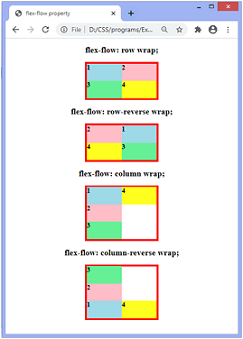
ExampleHere we are using the wrap-reverse value of the flex-wrap property and all the possible values of the flex-direction property that are row, row-reverse, column, and column-reverse. Test it NowOutput 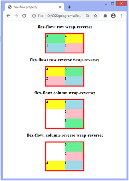
Next TopicMedia Queries
|
 For Videos Join Our Youtube Channel: Join Now
Feedback
- Send your Feedback to [email protected]
Help Others, Please Share


