CSS Grid Layout
What is CSS Grid?
CSS grid is a two-dimensional layout that helps web designers build complex and flexible web pages. As we know now, CSS offers a two-dimensional grid layout model which allows us exact control over the placement and the size of elements within the rows and columns.
Thanks to CSS Grid's new properties and values, web designers can now create dynamic, responsive, and grid-based layouts without relying heavily on positioning workarounds or floats. It makes the process of organizing the content on a web page easier, more logical, and more effective.
What is CSS Grid Layout?
In CSS, we have a two-dimensional layout system that is called CSS grid layout, also known as CSS grid, or with the help of CSS grid, web designers can build flexible and adaptable grid-based layouts for web pages. With precise control over the positioning and sizing of elements within the grid, it offers a flexible way to arrange content in rows and columns.
The grid container and grid items make up the CSS Grid Layout model:
- Grid Container: The element that houses the grid layout is called the "grid container." Usually, it is a parent element that has several child elements, which turn into grid items. We create a new grid formatting context for the children of an element by setting it to be a grid container.
- Grid Items: The term "grid items" refers to the grid container's child elements. These are the components that the grid layout has positioned and aligned. Multiple rows and columns of grid items are possible, allowing for adaptable and dynamic arrangements.
Comparing CSS Grid to more conventional layout techniques that heavily rely on floats, positioning, or intricate CSS frameworks, CSS Grid introduces new properties and values that make it easier and more efficient for web designers to create grid-based layouts.
Features of Grid Layout in CSS
There are some key features that grid layout includes in CSS:
- Grid Lines and Tracks: The lines that divide the grid into rows and columns are known as grid lines. "Grid tracks" are the voids between grid lines. Designers have various options for sizing these rows and columns, including fixed values, percentages, and flexible units.
- Grid Template: Using the "grid-template" properties, such as grid-template-columns and grid-template-rows, which specify the size and structure of the rows and columns, developers can specify the grid's layout. These characteristics make it simple for designers to make grids with any number of rows and columns, which makes it perfect for responsive design.
- Grid Areas: The grid-template-areas property in CSS Grid enables designers to create named grid areas. Using the named areas rather than defining explicit row and column positions makes it easier to place and position items within the grid.
- Alignment and Justification: CSS Grid offers several alignment and justification properties, including justify-items, align-items, justify-content, and align-content. These properties enable designers to align grid items within and along the grid container.
- Responsive layouts: CSS Grid is incredibly effective at producing responsive layouts. Designers can seamlessly adapt the grid layout to various screen sizes and devices by combining media queries with relative units like percentages.
- Nested Grids: CSS Grid supports nesting, allowing grid items to double as containers to create more intricate and hierarchical grid layouts.
CSS grid has a very good layout for web design. It offers a robust method and user-friendly way to create responsive and flexible grid-based layout.CSS Grid has completely transformed the design of web layouts. It is a preferred option for web developers when working on contemporary web design projects due to its easy handling of complex layouts and the fine-grained control it offers.
Why We Use Grid Layout in CSS?
Due to its many benefits and abilities, CSS Grid Layout is used for various purposes. The following are some of the main justifications why web designers and developers favor CSS Grid layout:
- Flexible grid-based layouts: It can be made with CSS Grid, which enables the development of intricate, adaptable, and multidimensional grid-based layouts. Its system for organizing content into rows and columns is robust and simple, allowing designers to make intricate and dynamic page structures.
- Responsive Design: One of CSS Grid's main advantages is its responsiveness. Without complicated media queries or additional frameworks, creating responsive layouts that adjust to different screen sizes and devices is simple.
- Simple to Implement: CSS Grid is comparatively simple to implement. The process of creating complex layouts is made simpler when compared to earlier techniques like floats and positioning because you can define the grid template and position elements within the grid with just a few lines of CSS code.
- Fine-grained control: Grid layout offers fine-grained control over the positioning and dimensions of elements. Designers have precise control over the page's visual appearance because they can explicitly define the size of the rows and columns and how items span across grid cells.
- Harmony and Consistency: Grid layouts encourage harmony and consistency in web design. Designers can create a consistent look and feel across the entire website using a grid-based approach, resulting in a more polished and expert user experience.
- Support for Nested Grids: Because CSS Grid supports nesting, grid elements can act as grid containers. With the help of this feature, designers can make hierarchical layouts without using deeply nested HTML structures.
- Accessibility: CSS Grid can help make websites more accessible. Screen readers and other assistive technologies can better interpret the content and make it more accessible to users with disabilities by using well-structured grid layouts.
- Efficiency and maintainability: CSS Grid encourages code that is both effective and dependable. It is simpler to update and modify the layout without affecting other elements on the page by organizing content within a grid.
- Supports CSS Grid Frameworks: Some CSS Grid frameworks have appeared, further streamlining the development of grid-based layouts. These frameworks offer pre-built grid architectures and utility classes that simplify grid design.
- Future-Proofing: Major browsers strongly support CSS Grid, a contemporary layout solution. Using it ensures that your layouts remain compatible with upcoming browser updates and advancements and is regarded as a best practice in web design.
Overall, CSS Grid is a strong and adaptable layout technique that provides notable benefits regarding adaptability, responsiveness, maintainability, and accessibility. It's a great option for contemporary web design projects because it makes complex layouts simple to create.
Example of CSS Grid Layout
You can arrange elements in a grid-based structure using the Grid layout in CSS to build a simple program. A simple HTML and CSS program that uses a Grid layout to create a 3x3 grid is shown here as an example:
HTML:
CSS:
Output:
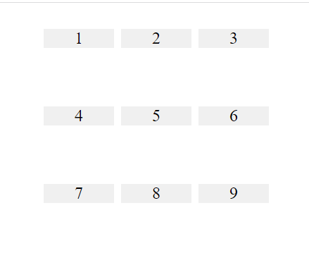
In this example, you can see the display property of the container is set to the grid to create a 3x3 grid using the grid layout in CSS. The grid's columns and rows are defined using the grid-template-columns and grid-template-rows properties, respectively. We use CSS to style each grid item with a background color and center its content. Each grid item is a div element with the class grid item.
You should see a 3x3 grid with numbers from 1 to 9 set up in a grid layout when you open the HTML file in a web browser. To create grid layouts that are more complex and tailored to your needs, you can change the CSS properties.
|
 Home
Home CSS
CSS HTML
HTML XHTML
XHTML JavaScript
 Bootstrap
 jQuery
 PHP
PHP XML
XML JSON
JSON Python
 C++
C++ Java
Java C#
C# SQL
SQL Interview Q
 For Videos Join Our Youtube Channel: Join Now


