| |

Double Bar GraphA bar graph is something that most of us have seen. A bar graph represents data using single bars of different heights. A double-bar graph represents data that uses two parallel bars of different heights. You can arrange the bars either vertically or horizontally. A double-bar graph can be used to compare two sets of data. The bars are often color-coded to make it easier to compare data. They can also be used to interpret the results of tests or surveys. A double bar graph can be shown either horizontally or vertically. Another name for the double bar graph is a grouped bar graph or a dual-axis graph. There are two axes in a double-bar graph. A double bar graph's x-axis displays the comparison categories, and the y-axis indicates the scale. A scale is a group of figures that depict data and are divided into equal intervals. Understanding that every double-bar graph must have a title is crucial. The title of the double-bar graph provides the observer with an overview of the comparisons and measurements being made. 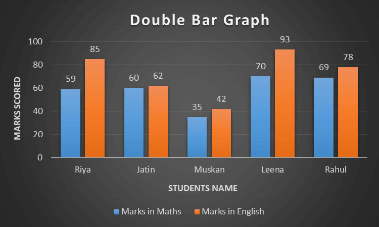
The double-bar graph above, for example, shows the grades of five students in Maths and English. The yellow color bars indicate each of the five students' Math marks, while the blue color bars reflect each of the five students' English marks. In this graph, the categories are the students, and the parameters are the subjects of English and Maths. Importance of Double Bar GraphIn data analysis, a double bar graph is a crucial tool. It is a helpful tool in various areas, including economics, business, and science, since it compares two or more data sets.
Advantages of Double Bar Graph
Double bar graphs are very simple to comprehend and interpret. They are applied when contrasting two data sets, which makes it simple and quick to find a relationship between them. This might be useful for contrasting various data sets or analyzing changes over time.
Double bar graphs may be quite exact and accurate. This is because it can compare two data sets more precisely since it can present them on the same graph. Additionally, the graph's size can be changed to reflect the variations in the two data sets.
Double bar graphs may be made quickly and easily. Most data visualization software packages come with built-in double bar graph templates, making it simple quickly make a double bar graph. Double-bar graphs are an excellent option for individuals who need to rapidly and easily compare data from several sources. They are, therefore, a fantastic option for both beginners and specialists.
Double bar graphs are less costly than other graphs since they use fewer resources. They can be created fast and easily, with little time and effort, and the data may be seen quickly and effortlessly.
Double bar graphs offer much flexibility. They can be applied to compare the same collection of items throughout time or different forms of data.
Double bar graphs are visually attractive and can be used to make a more professional graph. This may be useful for presentations or for visually appealingly presenting the information.
Double bar graphs make it simple to contrast two data sets, which is useful for identifying patterns. It is possible to use this to spot trends or changes in the data over time. This is especially helpful for comparing the effectiveness of various goods or services.
Double bar graphs are often simple to interpret. This is because they provide the data with a visual representation, making it easier to see differences or similarities between the two data sets.
Double bar graphs can be used in reports or presentations and are simple to distribute. They are, therefore, a fantastic option for exchanging data with colleagues and clients.
Double bar graphs are ideal for several applications since they can be easily customized. For instance, a researcher might alter the bars' size, color, and form or add labels to make the data simpler to understand. Double bar graphs have certain limitations despite their potential as an effective data visualization tool. Disadvantages of Double Bar Graph
Double bar graphs can be challenging to understand, especially for someone unfamiliar with this graph style. Determining which bars are being compared, which category each bar belongs to, and how to interpret the data in the graph can take time and effort. This might make it difficult to interpret the graph's meaning.
The amount of information that double bar graphs may display is limited. They allow for the comparison of two sets of data and nothing more. The data cannot be explained in depth, and no conclusions can be made from the graph.
Only two sets of data can be compared in a double-bar graph. A different kind of graph must be utilized if there are more than two sets of data to compare. As a result, using a double-bar graph to compare different data sets is difficult.
The difficulty in accurately representing the data in double-bar graphs is another disadvantage. It can be challenging to depict the data realistically using two bars if it is complicated or has a wide range of values. Additionally, it might be challenging to effectively portray continuous data with a double bar graph, such as population statistics for a city.
Double bar graphs can have the drawback of being misleading. Since the bars are next to one other, it may be simple to interpret the data incorrectly. Although the length of the bars may be similar, the actual values might be significantly different. Double bar graphs may also need to be more accurate if the scales of the two data sets are dissimilar. This might make comparing the two sets challenging. 
How to make a Double Bar GraphStep 1: Gather Data: First, gather the double bar graph information. Make a data-filled table. Data should have two distinct sets of comparable information. Step 2: Label Graph: Give the Graph a title and label the two axes (x and y). The two variables under comparison should be labeled on the x-axis. The values of the data should be labeled on the y-axis. Step 3: Plot Data: Create a graph and plot the data points. Make sure the points are visible and distributed equally. Step 4: Draw Bar: For every data point, create two bars. The bars should have a little space between them and be of similar length. Step 5: Add a Legend: Add a legend to the graph to make it easier to recognize the various bars. The graph will be simpler for readers to comprehend as a result. Step 6: Analyze: Analyze the data to make conclusions. Look for patterns or differences between the two data sets by comparing them. Following these instructions, you may make a double bar graph and analyze the data to conclude. The ConclusionIn conclusion, researchers who need to swiftly and readily compare data from various sources should consider using double-bar graphs. They are incredibly adaptable, simple to understand, and simple to make. Double bar graphs are an excellent option for various applications, including surveys and medical investigations. They offer a visual representation of the information and are simple to produce and analyze. They may also compare data from various sources and show the relationships among different data types.
Next TopicHistogram Graph
|
 For Videos Join Our Youtube Channel: Join Now
Feedback
- Send your Feedback to [email protected]
Help Others, Please Share


