| |

Excel Gauge ChartWe all know that a Gauge is a device used to measure the quantity or size of something, for example, a fuel gauge, speed gauge or temperature gauge. There are various situations where the concept of Gauge is applied -
Based on the same concept Microsoft Excel introduced the Gauge charts to help the end-users visualize the performance against a set goal. The Gauge charts in Excel are developed based on the idea of the speedometer of automobiles. They are very helpful and repeatedly are used by business executives to explain whether values fall within a permissible value (represented by green) or the acceptable outside value (represented by red). In this tutorial, we will learn in detail about the Excel Gauge Chart, including its definition, advantages, disadvantages and step-by-step implementations of this chart in your worksheet. What is Gauge Chart?"Gauge charts, also known as Dial charts or Speedometer charts, are developed and designed on the concept of the speedometer. Unlike the speedometer, these charts also incorporate a pointer or a needle to display information as a reading on a dial. The needle moves automatically whenever the user makes any changes in the data. It's a single-point chart which allows the user to chase a single data value against the specified target value." 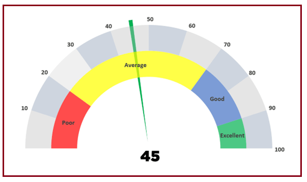
A Gauge Chart combines an Excel Doughnut chart and a Pie chart. A Gauge Chart is commonly used to show the minimum, the maximum and the current value representing how much distance is between the current value and the total value. It also allows the users to add two or three ranges between the minimum and maximum values and easily visualize the current value dropping in which range. Advantages of Gauge ChartsGauge charts can display a value relative to one-to-many data ranges. They are commonly used to cater for the below-given services -
Disadvantages of Gauge ChartsAlthough Gauge charts are one of the most popular charts and preferably used on the regular basis by most of the executives, but still there are various drawbacks with them. They are as follows-
To overcome the above fit falls, the bullet chart was introduced by Stephen Few Bullet charts are known to be the best solution for data analysis. Therefore nowadays, it is the first preference of business analysts. Creating a Gauge ChartMicrosoft Excel offers two ways to create Gauge charts in your worksheets:
Steps to create a Simple Gauge chartBelow given is the data for which you have to create a simple Gauge chart with single value. 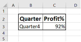
The above data is not yet ready. Therefore, we have to re arrange the data for Gauge chart: 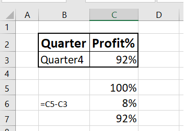
You can observe the following arrangement in the data-
Following are the steps to create a simple Gauge chart with single value - Step 1 - Select the data range for which you want to create the Gauge chart. In our case, it will be C5:C7. 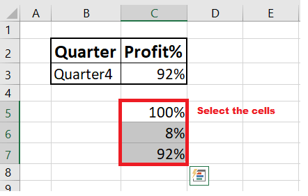
Step 2 - Go to Insert-> Charts. From the charts section, click on the Pie chart. 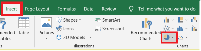
Step 3 - As a result you will notice, Excel will create a Pie Chart in your worksheet. Right click on the chart. 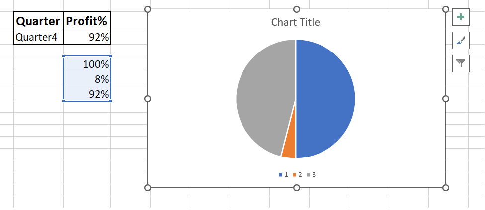
Step 4 - The following drop-down menu will appear. Select the Format Data Series option from the list. 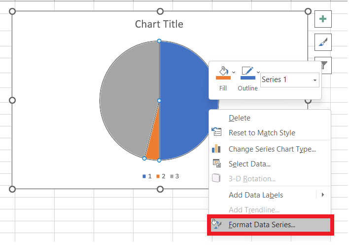
Step 5 - You will observe the Format Data Series option will be shown on the right side of the worksheet panel. From the listed options, click on the SERIES OPTIONS. In the first box, i.e., Angle of first slice type 90 degrees. 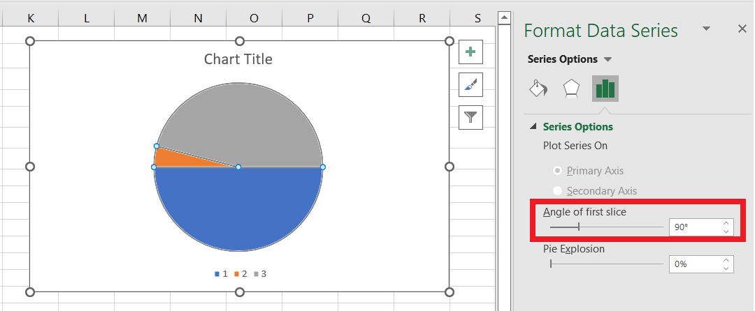
As you can see, the upper half of the Pie chart is what we need to create the Gauge chart. All we have to do is to remove the lower half and our chart is ready. Step 7 - Select the lower half of the pie and right-click on it. Click on Fill. From the listed option select the No Fill option. 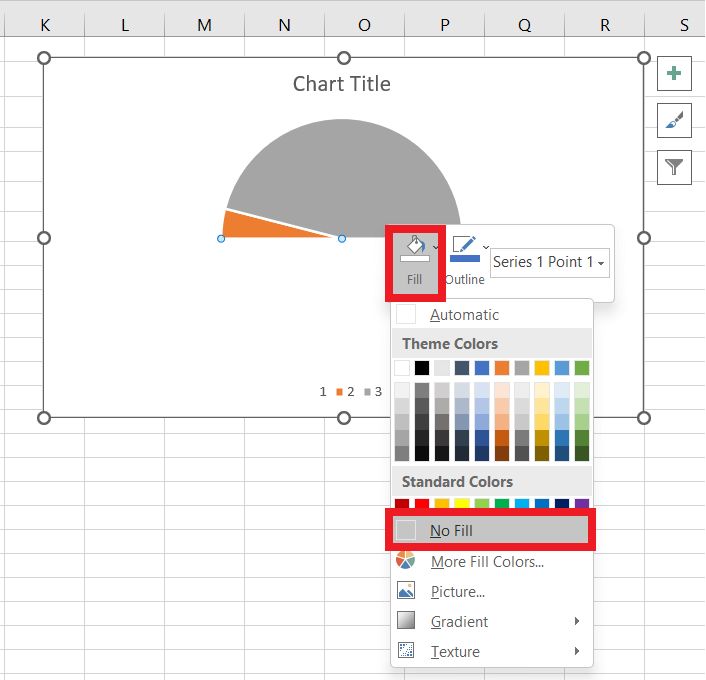
You can notice that the Pie slice on the hovering on right side represents the Profit %. Step 9 - Beautify the chart to make it visually appealing.
You will have the following chart as the output: 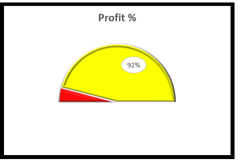
Steps to create a Gauge chart with Multiple RangesBelow is the data for which you must create a Gauge chart with multiple ranges. 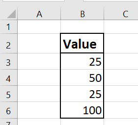
The above data is not yet ready. Therefore, we have to re arrange the data for Gauge chart as given below: 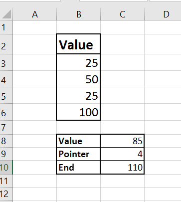
You can observe the following arrangement in the data-
To create advanced Gauge Chart, we will combine two different types of charts. We will incorporate the Doughnut chart depicting different parts corresponding to different Values and a Pie chart representing the Gauge pointer. Following are the steps to create a Gauge chart with multiple ranges:- Step 1 - Select the data range for which you want to create the Gauge chart. In our case, it will be C3:C6. 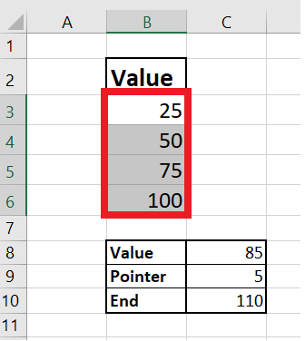
Step 2 - Go to Insert-> Charts. From the charts section, click on the Doughnut chart. 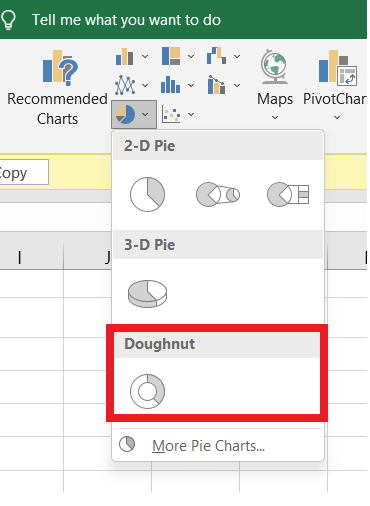
Step 3 - As a result you will notice, Excel will create a Pie Chart in your worksheet. Double click on the half portion of the chart. 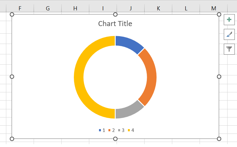
Step 4 - Right click and under the Fill category, select No Fill. 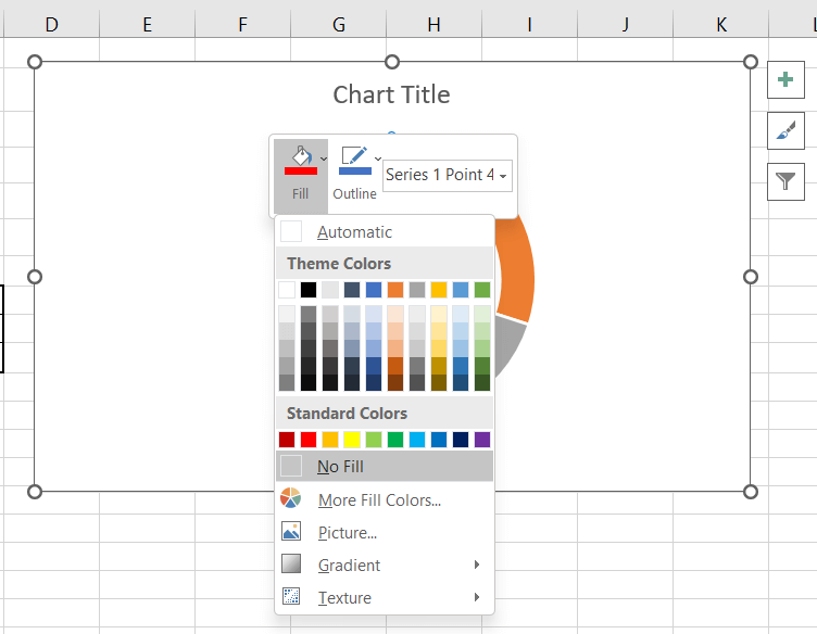
Step 5 - Since we don't want the title and legend to appear in our Gauge chart so we will deselect both Chart elements. 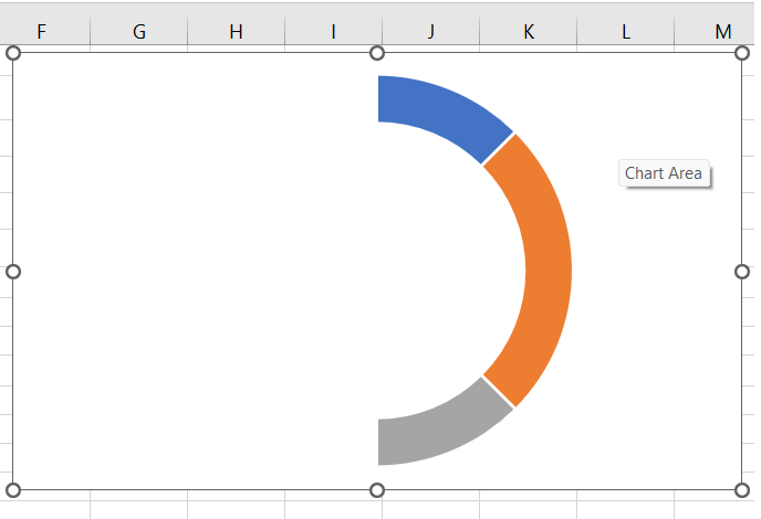
Step 6 - Right-click on the chart and select the Format Data Series from the listed options. You will observe the dialog window displayed on the pane's right side. In the first box of the Series Options type the 271 in the box. It will change the angle of your Chart. 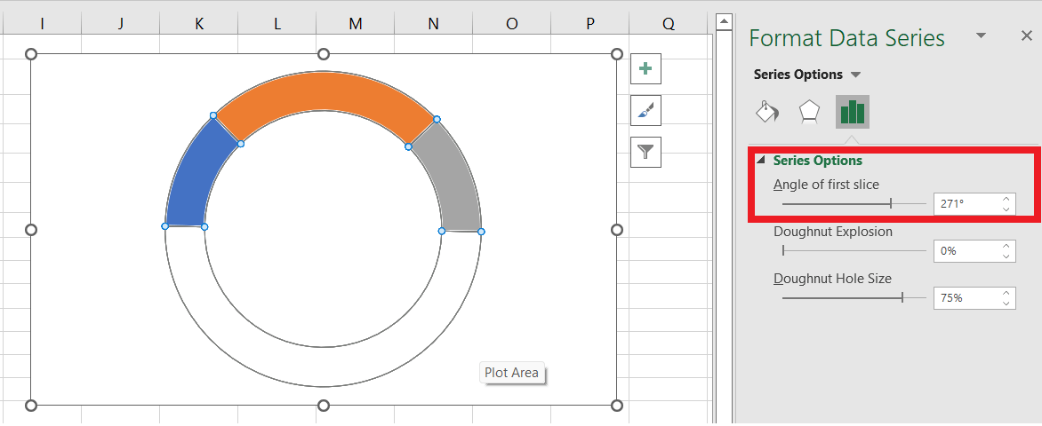
Step 7 - Next, we will change the Doughnut Hole Size from the same window to 65%. It will make the size of the chart bigger. 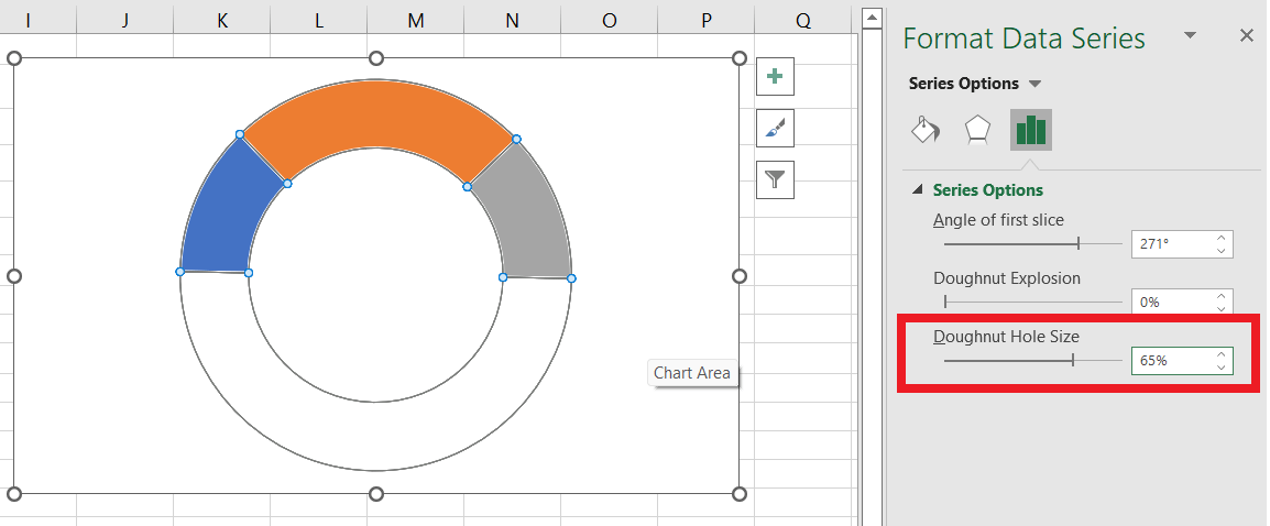
Step 8 - Next, we will change the Doughnut Hole Size from the same window to 65%. It will make the size of the chart bigger. 
As you can see in the above image, our Gauge chart is successfully created with proper values. The next step is to insert a Gauge pointer or needle to display the value status. Step 9 - To create a Gauge pointer with a Pie chart follow the below steps:
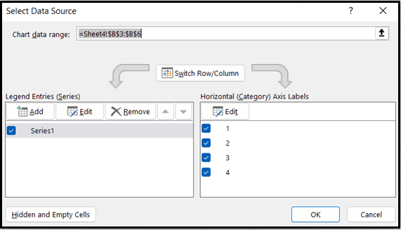
Step 10 - The above steps will open the Edit Series window pane.
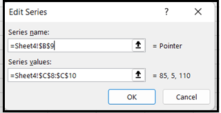
Step 11 - It will again redirect you to the Select Data Source dialog box. Click on OK. 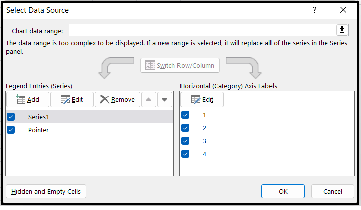
Step 12 - Select the chart. From the Excel Ribbon click on the Chart DESIGN tab and follow the below steps:
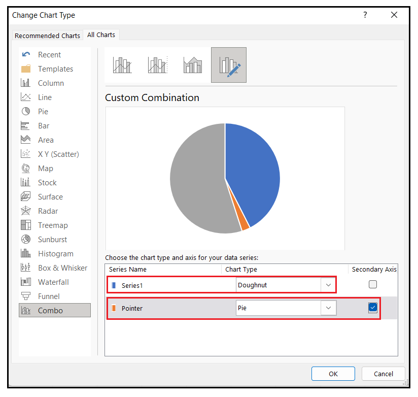
Your chart looks as shown below. 
Step 12 - We will Right click on each of the bigger Pie slices and follow the below steps-
Your chart looks as shown below. 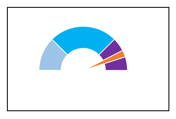
Step 13 - The last step is to format the Pointer Pie Slice look, making the Gauge Chart more appealing.
Finally, as shown below, you will have the desired Gauge Chart. 
Next TopicRandom Number Generator
|
 For Videos Join Our Youtube Channel: Join Now
Feedback
- Send your Feedback to [email protected]
Help Others, Please Share


