 |

Flutter ButtonsButtons are the graphical control element that provides a user to trigger an event such as taking actions, making choices, searching things, and many more. They can be placed anywhere in our UI like dialogs, forms, cards, toolbars, etc. Buttons are the Flutter widgets, which is a part of the material design library. Flutter provides several types of buttons that have different shapes, styles, and features. Features of ButtonsThe standard features of a button in Flutter are given below:
Types of Flutter ButtonsFollowing are the different types of button available in Flutter:
Let us discuss each button in detail. 1. Flat ButtonIt is a text label button that does not have much decoration and displayed without any elevation. The flat button has two required properties that are: child and onPressed(). It is mostly used in toolbars, dialogs, or inline with other content. By default, the flat button has no color, and its text is black. But, we can use color to the button and text using color and textColor attributes, respectively. Example: Open the main.dart file and replace it with the below code. Output: If we run this app, we will see the following screen: 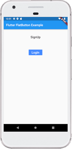
2. Raised ButtonIt is a button, which is based on the material widget and has a rectangular body. It is similar to a flat button, but it has an elevation that will increases when the button is pressed. It adds dimension to the UI along Z-axis. It has several properties like text color, shape, padding, button color, the color of a button when disabled, animation time, elevation, etc. This button has two callback functions. onPressed(): It is triggered when the button is pressed. onLongPress(): It is triggered when the button is long pressed. It is to note that this button is in a disabled state if onPressed() and onLongPressed() callbacks are not specified. Example: Open the main.dart file and replace it with the below code. Output: When we run this example, it will give the below screenshot. If we click on the "Click Here" button, it will change the text message. Show the second screenshot. 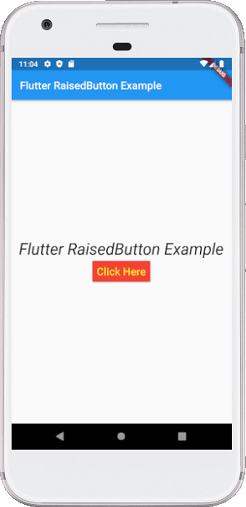 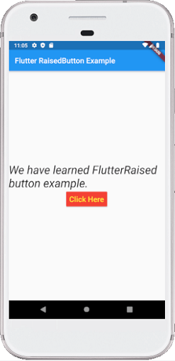
3. Floating Action ButtonA FAB button is a circular icon button that triggers the primary action in our application. It is the most used button in today's applications. We can use this button for adding, refreshing, or sharing the content. Flutter suggests using at most one FAB button per screen. There are two types of Floating Action Button: FloatingActionButton: It creates a simple circular floating button with a child widget inside it. It must have a child parameter to display a widget. FloatingActionButton.extended: It creates a wide floating button along with an icon and a label inside it. Instead of a child, it uses labels and icon parameters. Example: Open the main.dart file and replace it with the below code. Output: Run the application in android emulator, and it will give the UI similar to the following screenshot. The second image is an output of the FAB.extended button. Its coding can be seen in the above code's comment section. 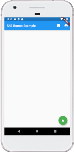 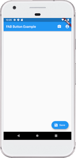
4. DropDown ButtonA drop-down button is used to create a nice overlay on the screen that allows the user to select any item from multiple options. Flutter allows a simple way to implement a drop-down box or drop-down button. This button shows the currently selected item and an arrow that opens a menu to select an item from multiple options. Flutter provides a DropdownButton widget to implement a drop-down list. We can place it anywhere in our app. Example Open the main.dart file and replace it with the below code. Output Run the application in android emulator, and it will give the UI similar to the following screenshot. The second image is an output of the list contains in the drop drown button. 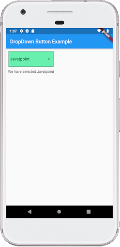 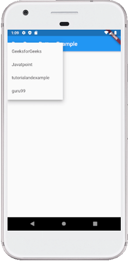
5. Icon ButtonAn IconButton is a picture printed on the Material widget. It is a useful widget that gives the Flutter UI a material design feel. We can also customize the look and feel of this button. In simple terms, it is an icon that reacts when the user will touch it. Example: Open the main.dart file and replace it with the below code. Output: Run the application in android emulator, and it will give the UI similar to the following screenshot. When we press the volume button, it will always increase by 5. 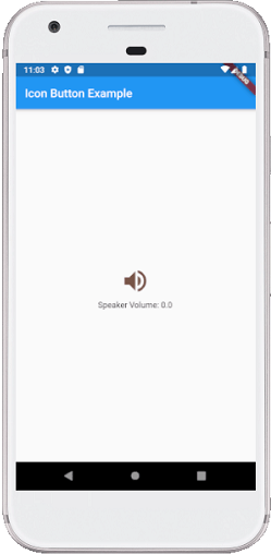
6. Inkwell ButtonInkWell button is a material design concept, which is used for touch response. This widget comes under the Material widget where the ink reactions are actually painted. It creates the app UI interactive by adding gesture feedback. It is mainly used for adding splash ripple effect. Example: Open the main.dart file and replace it with the below code. Output: Run the application in android emulator, and it will give the UI similar to the following screenshot. Every time we press the ring volume button, it will increase the volume by 2. 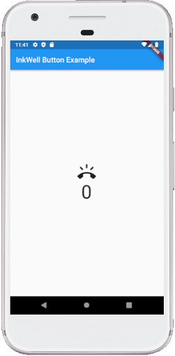
7. PopupMenu ButtonIt is a button that displays the menu when it is pressed and then calls the onSelected method the menu is dismissed. It is because the item from the multiple options is selected. This button contains a text and an image. It will mainly use with Settings menu to list all options. It helps in making a great user experience. Example: Open the main.dart file and replace it with the below code. Output: Run the application in android emulator, and it will give the UI similar to the following screenshot. When we click the three dots shown at the top left corner of the screen, it will pop up the multiple options. Here, we can select any option, and it will keep it in the card, as shown in the second image. 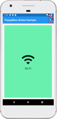 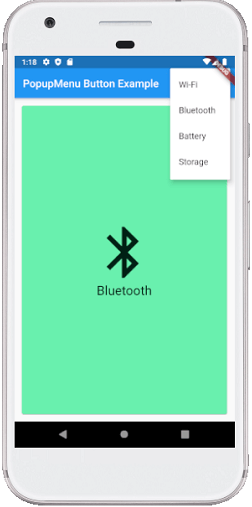
8. Outline ButtonIt is similar to the flat button, but it contains a thin grey rounded rectangle border. Its outline border is defined by the shape attribute. Example: Open the main.dart file and replace it with the below code. Output: Run the application in android emulator, and it will give the UI similar to the following screenshot. 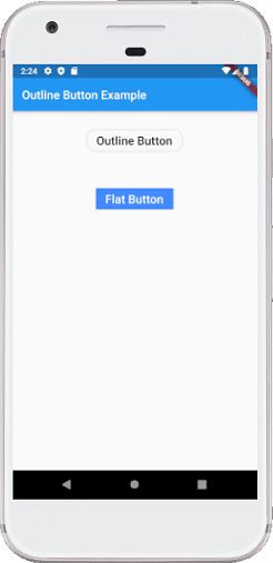
Button BarFlutter provides the flexibility to arrange the buttons in a bar or a row. ButtonBar widget contains three properties: alignment, children, and mainAxisSize.
Example: Open the main.dart file and replace it with the below code. Output: Run the application in android emulator, and it will give the UI similar to the following screenshot. Here, we can see that the three buttons are placed in a horizontal bar or row. 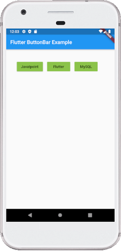
Next TopicFlutter Stack
|
 For Videos Join Our Youtube Channel: Join Now
Feedback
- Send your Feedback to [email protected]
Help Others, Please Share


