Flutter CheckboxA checkbox is a type of input component which holds the Boolean value. It is a GUI element that allows the user to choose multiple options from several selections. Here, a user can answer only in yes or no value. A marked/checked checkbox means yes, and an unmarked/unchecked checkbox means no value. Typically, we can see the checkboxes on the screen as a square box with white space or a tick mark. A label or caption corresponding to each checkbox described the meaning of the checkboxes. In this article, we are going to learn how to use checkboxes in Flutter. In Flutter, we can have two types of checkboxes: a compact version of the Checkbox named "checkbox" and the "CheckboxListTile" checkbox, which comes with header and subtitle. The detailed descriptions of these checkboxes are given below: Checkbox:
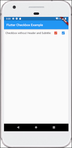
Example: Below is the demo example of checkbox: Let us write the complete code to see how checkbox is displayed in Flutter. First, create a project in android studio, open the main.dart file, and replace the code given below: Output Now execute the app in the emulator or device, we will see the below screen: 
CheckboxListTitle:
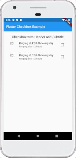
Example: Below is the demo example of CheckboxListTitle: Let us write the complete code to see how CheckboxListTitle is displayed in Flutter. First, create a project in android studio, open the main.dart file, and replace the code given below: Output Now execute the app in the emulator or device, we will get the following screen: 
Next TopicFlutter Radio Button
|
 For Videos Join Our Youtube Channel: Join Now
Feedback
- Send your Feedback to [email protected]
Help Others, Please Share


