 |

Flutter ContainerThe container in Flutter is a parent widget that can contain multiple child widgets and manage them efficiently through width, height, padding, background color, etc. It is a widget that combines common painting, positioning, and sizing of the child widgets. It is also a class to store one or more widgets and position them on the screen according to our needs. Generally, it is similar to a box for storing contents. It allows many attributes to the user for decorating its child widgets, such as using margin, which separates the container with other contents. A container widget is same as <div> tag in html. If this widget does not contain any child widget, it will fill the whole area on the screen automatically. Otherwise, it will wrap the child widget according to the specified height & width. It is to note that this widget cannot render directly without any parent widget. We can use Scaffold widget, Center widget, Padding widget, Row widget, or Column widget as its parent widget. Why we need a container widget in Flutter?If we have a widget that needs some background styling may be a color, shape, or size constraints, we may try to wrap it in a container widget. This widget helps us to compose, decorate, and position its child widgets. If we wrap our widgets in a container, then without using any parameters, we would not notice any difference in its appearance. But if we add any properties such as color, margin, padding, etc. in a container, we can style our widgets on the screen according to our needs. A basic container has a margin, border, and padding properties surrounding its child widget, as shown in the below image: 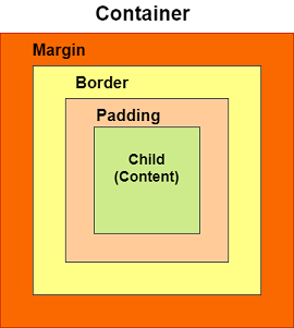
Constructors of the container classThe following are the syntax of container class constructor: Properties of Container widgetLet us learn some of the essential properties of the container widget in detail. 1. child: This property is used to store the child widget of the container. Suppose we have taken a Text widget as its child widget that can be shown in the below example: 2. color: This property is used to set the background color of the text. It also changes the background color of the entire container. See the below example: 3. height and width: This property is used to set the container's height and width according to our needs. By default, the container always takes the space based on its child widget. See the below code: 4. margin: This property is used to surround the empty space around the container. We can observe this by seeing white space around the container. Suppose we have used the EdgeInsets.all(25) that set the equal margin in all four directions, as shown in the below example: 5. padding: This property is used to set the distance between the border of the container (all four directions) and its child widget. We can observe this by seeing the space between the container and the child widget. Here, we have used an EdgeInsets.all(35) that set the space between text and all four container directions: 6. alignment: This property is used to set the position of the child within the container. Flutter allows the user to align its element in various ways such as center, bottom, bottom center, topLeft, centerRight, left, right, and many more. In the below example, we are going to align its child into the bottom right position. 7. decoration: This property allows the developer to add decoration on the widget. It decorates or paint the widget behind the child. If we want to decorate or paint in front of a child, we need to use the forgroundDecoration parameter. The below image explains the difference between them where the foregroundDecoration covers the child and decoration paint behind the child. 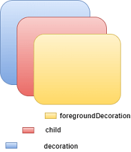
The decoration property supported many parameters, such as color, gradient, background image, border, shadow, etc. It is to make sure that we can either use the color property in a container or decoration, but not in both. See the below code where we have added a border and shadow property to decorate the box: We will see the output as below screenshot: 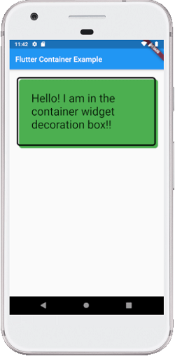
8. transform: The transform property allows developers to rotate the container. It can rotate the container in any direction, i.e., change the container coordinate in the parent widget. In the below example, we will rotate the container in the z-axis. 9. constraints: This property is used when we want to add additional constraints to the child. It contains various constructors, such as tight, loose, expand, etc. Let's see how to use these constructors in our app: tight: If we use size property in this, it will give fixed value to the child. expand: Here, we can choose the height, width, or both values to the child. Let us understand it with an example where we will try to cover most of the container properties. Open the main.dart file and replace it with the below code: Output When we run this app, it will give the following screenshot: 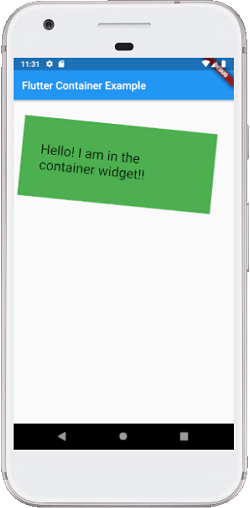
Next TopicFlutter Row & Column
|
 For Videos Join Our Youtube Channel: Join Now
Feedback
- Send your Feedback to [email protected]
Help Others, Please Share


