 |

Design interfaces with the control nodesMobile phones, Computer displays, and TV screens come in all shapes and sizes. To ship the game, we have to support different screen ratios and resolutions. It can be challenging to build responsive interfaces that are compatible with all platforms. Godot comes with robust tools to manage and design a responsive user interface. To develop our UI, we will use control nodes. These are nodes with a green icon in the editor. Dozens of them can create anything from life bars to complex applications. Godot's entire editors and plugins use these nodes. 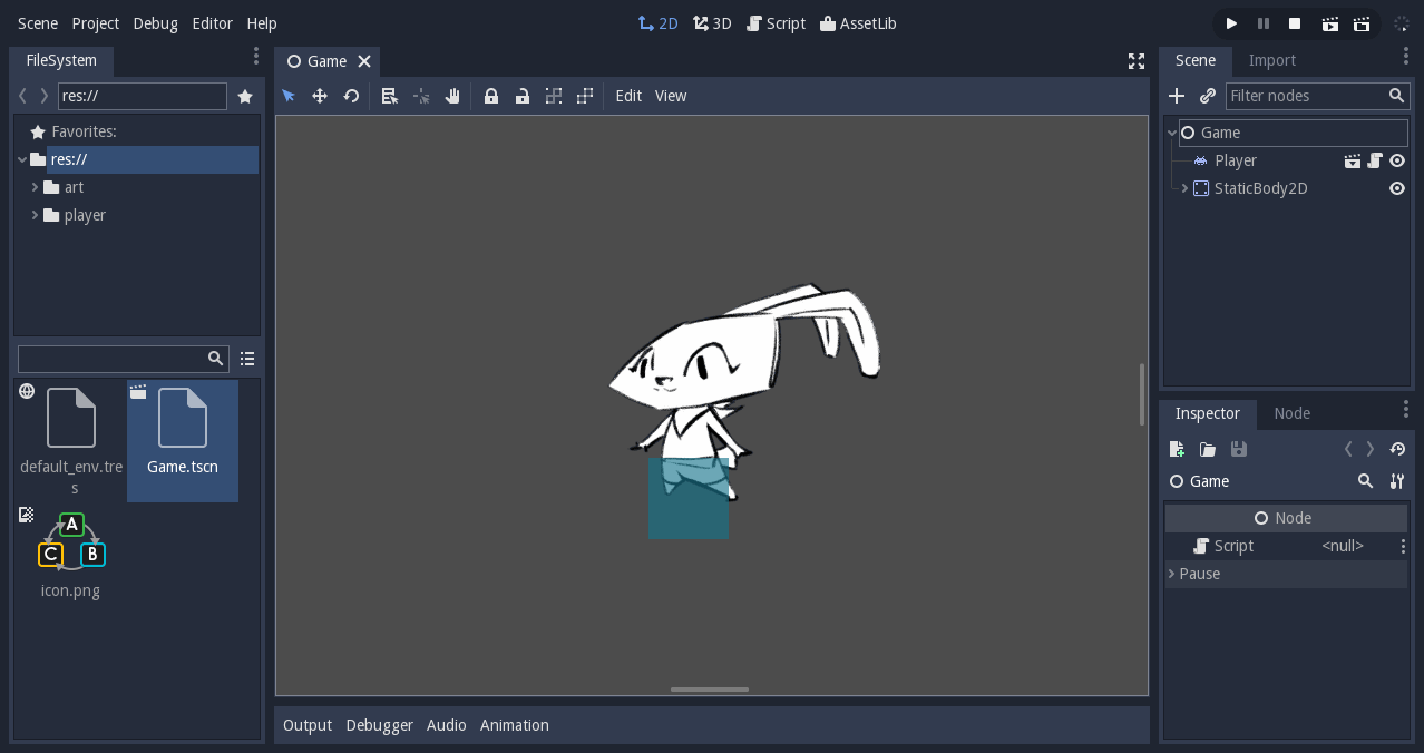
This guide will get us started with UI design. We will learn:
To learn to control the interface and connect it to other scripts, read build our first game UI in Godot. Only use control nodes when we design our interfaces. They have unique qualities that allow them to work with each other. Other nodes such as Node2D, Sprite, etc. will not work. We can still use some nodes that work with others like the Animation Player, Tween, or the StreamPlayer. Control nodes are Canvasitems like Node2D so that we can apply shaders to it. All control nodes share the main properties;
Once we understand the basics of the Control Node, it will take us less time to learn all the nodes that derive from it. Five common UI elementsGodot ships with dozens of control nodes. A lot of those editors are here to help us build plugins and applications. To learn more about them, click the guide about Advanced UI nodes and themes. For most games, we will only need five types of UI elements and a few containers. These five containers. These five control nodes are:
The five most common control nodes for UI design 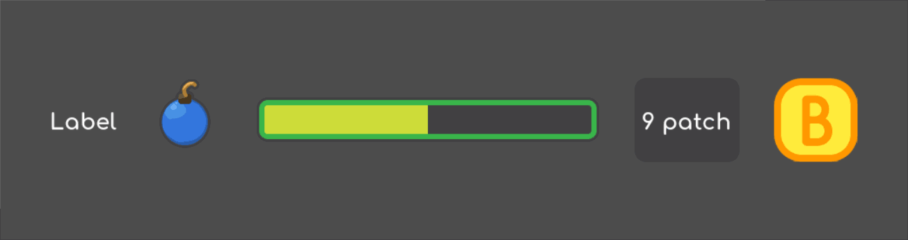
TextureRectTextureRect displays a texture or image inside the UI. It is similar to a sprite node but provides several scaling modes. Set the stretch mode property to change its behavior:
With sprite nodes, we can modify the color of TextureRect. Click on the Modulate property and use the color picker. TextureRect modulated with a red color. 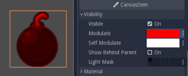
TextureButtonTextureButton is like TextureRect, except it has five texture slots: one for each of the button states. Most of the time, we will use the Normal, Pressed, and Hover textures. Focused is useful if we interface listens to the keyboard's input. The sixth image slot, and the click Mask, lets us define the clickable area using a 2-bit, pure black, and white image. In the Base Button section, we will find checkboxes that change how the button behaves. When the toggle mode is on, the button will toggle between active and normal state when we press it. It is disabled by default, in which case it will use the disabled design. TextureButton shares some properties with a frame of texture: Resize and Stretch modes have a modulate property to change its color and resize. 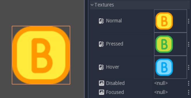
TextureProgressTextureProgress layers has 3 sprites to create the progress bar. Under and over textures sandwich progress, which displays the value of the bar. The mode property controls the direction in which the strip moves: horizontally, vertically, or radially. If we set it to radial, the Initial Angle and Fill Degrees properties let us limit the range of the gauge. To animate the bar, We want to see the category section. Set the minimum and maximum properties to define the range of the gauge. For example, to represent the life of a character, we'll want to set Min to 0, and Max to values to the default of 1 and 100, and set the Value property to update the bar. If we leave the Min and Max values to the default of 1 and 100 and set the Value property to 40, 40% of the progress texture will show up, and 60% of it will stay hidden. 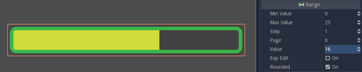
TextureProgress bar, two-thirds filled LabelLabel prints text to the screen. We will find all its properties in the Label section of the inspector. Write the text in the Text property, and check Autowrap if we want it to respect the textbox's size. If Autowrap is off, we can't be able to scale the node. We can align the text horizontally and vertically with Align and Valign, respectively. 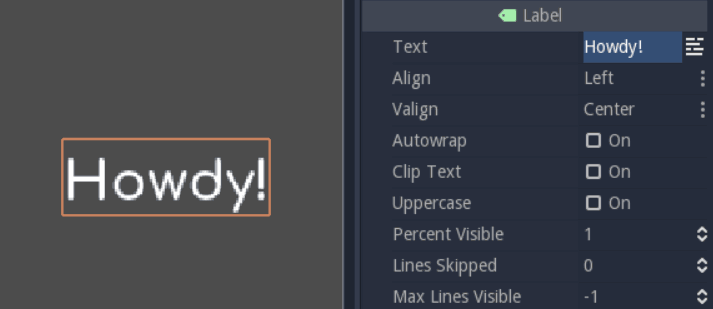
Picture of a label NinePatchRectNinePatchRect takes a texture split into 3 rows and 3 columns. Center and sides tile when we measure the texture, but it never surrounds the corners. Creating panels, dialog boxes, and scalable backgrounds are useful for our UI. 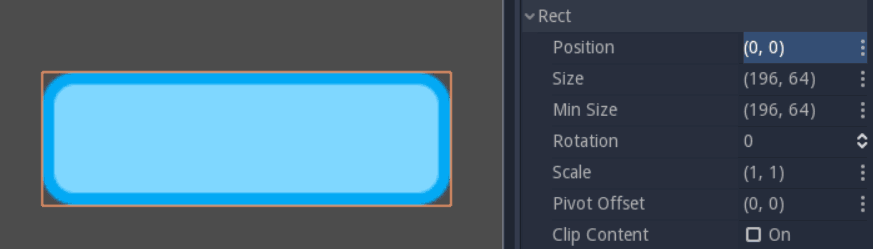
NinePatchRect scaled with the min_size property There are two workflows to build responsive UIThere are two workflows to build scalable and flexible interfaces in the Godot:
The two approaches are not always compatible. Because a container controls its children, we cannot use the layout menu on them. Each box has a specific effect, so we may need to nest several of them to get a working interface. With the layout approach, we work from the bottom up, on the children. As we don't insert extra containers in the scene, it can make for cleaner hierarchies, but it's harder to arrange items in a row, column, grid, etc. As we create UIs for games and tools, we'll develop a sense of what fits best in each situation. Place UI elements precisely with anchorsPut UI elements with anchors Control nodes have a size and position, but they also have margins and anchors. Anchors define the origin or reference point for the left, top, right, and bottom edges of a node. Change any of the four anchors to change the reference point of the margin 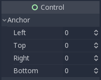
The anchor property How to change the anchor?Like any properties, we can edit the four anchor points in the inspector, but this is not the most convenient way. When we select a control node, the layout menu appears above the viewport, in the toolbar. It gives us a list of icons to set all four anchors with a single click, instead of using the inspector's four properties. The layout menu will only show when we select a control node. 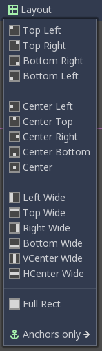
The layout menu in the viewport Anchors are relative to the original containerEach anchor is a value between 0 and 1. For left and top anchors, a value of 0 means that without any margin, the edge of the node will align with the right and bottom edges of the parent container. On the other hand, the margins represent the distance to the anchor position in pixels, while the anchors are relative to the size of the original container. 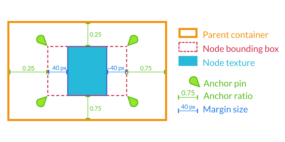
Margins are relative to the anchor position, which is comparable to the anchors. In practice, we will let the container update margins for us. Margins change with the anchorThe margin is updated when we move or resize the control node. They represent the distance from the edges of the control node to its anchor, relative to the parent's control node or container, as we will see in a moment. If there is no parent, the margins will be relative to the node's bounding rectangle, set in the Rect section. 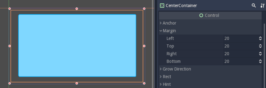
Margins on a CenterContainer set into the "Full Rect" anchor Try to change the anchors or nest our Control nodes inside Containers: the margins will update. We would hardly need to edit the margin manually. Always try to find a container to help us; Godot comes with nodes to solve all the common cases for us. Need to add space between a life bar and the border of the screen? Use MarginContainer. Want to build a vertical menu? Use VBoxContainer. More on these below. UI elements use shape tags to fill available spaceEach control node has shape flags. They tell the container how the UI elements should scale. If we add the "Fill" flag to the horizontal or vertical property, the node's bounding box will take all the space it can, but it will respect its siblings and retain its size. If an HBoxContainer has 3 TextureRect nodes, with "Fill" flags on both axes, they will take up to a third of each available space, but no more. The container will take the node and resize it. 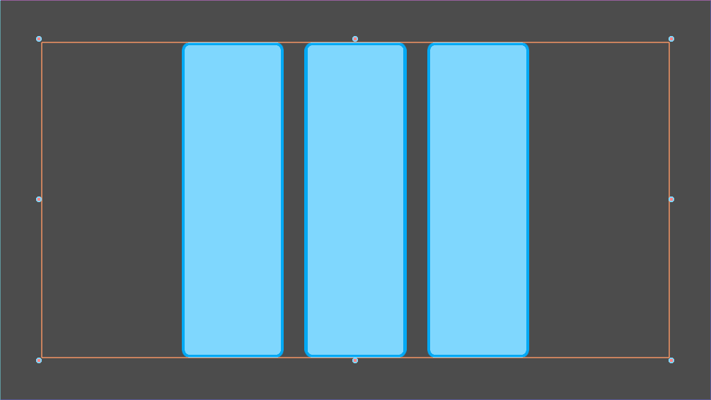
3 UI elements in an HBoxContainer, they align horizontally The "extension" flag allows that the UI element can take place all over, and push against its siblings. Its bounding rectangle will grow against the edge of its parent, or until another UI node blocks it. 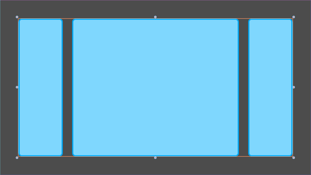
The same example as above, but the center node has to "Expand" size flag We will need some practice to understand the size tags, as their effect can change quite a bit, depending on how we set up our interface. Arrange control nodes automatically with containersContainers automatically arrange all children's control nodes, including other containers in rows, columns, and more. Use them to add padding to their bounding rectangles around our interface or center nodes. All the built-in containers are updated in the editor so that we can see the effect immediately. Containers have some unique properties for organizing UI elements. To change them, go to the Custom Constants section in the Inspector. Five most useful containersIf we build tools, we may need all the containers:
CenterContainer centers all its children within its bounding rectangle. It's one we typically use for title screens if we want the options to stay in the center of the viewport. As it centers everything, we will often want a single container nested inside it. If we use textures and buttons instead, they will stack up. 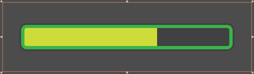
The MarginContainer adds a margin on either side of the child nodes. Add a margin Corner, which encompasses the entire viewport to add a separation between the edges of the window and UI. We can set a margin at the top, left, right, or bottom of the container. No need to tick the checkbox: Click on the corresponding value box and type any number. It will be activated automatically. 
The MarginContainer adds a 40px margin around the Gam User interface There are two BoxContainer: VBoxContainer and HBoxContainer. We cannot add the Boxcontainer node itself, as it is a helper class, but We can use vertical and horizontal box containers. They organize nodes into rows or columns. Use it to line up items in a shop, or to create complex grids with rows and columns of different sizes, because we can nest them to our heart's content. 
The HBoxContainer horizontally aligns UI elements VBoxContainer automatically arranges its children in a column. This puts them one after the other. If we use the separation parameter, it will leave a gap between its children. HBoxContainer arranges UI elements in a row. It is similar to the VBoxContainer, with an extra add_spacer method to add a spacer control node before its first child or after its last-child, from a script. The GridContainer lets us arrange UI elements in a grid-like pattern. We can only control the number of columns it has, and it will set the number of rows by itself, based on its children's count. If we have nine children and three columns, we will have 9÷3=3 rows. Add three more children, and we will have four rows. In other words, it create new rows as we add more textures and buttons. Like box containers, it has two properties to set vertical and horizontal separation between rows and columns, respectively. 
A grid container with two columns. It sizes each column automatically. Godot's UI system is complex and a lot more to offer. To learn how to design a more advanced interface, read Design advanced UI with other control nodes.
Next TopicDesign title screen in Godot
|
 For Videos Join Our Youtube Channel: Join Now
Feedback
- Send your Feedback to [email protected]
Help Others, Please Share


