| |

Histogram GraphA grouped frequency distribution with continuous classes is represented graphically by a histogram. It is an area diagram characterized by a collection of rectangles with bases that correspond to the distances between class boundaries and areas that are proportionate to the frequencies in the respective classes. Since the base includes the spaces between class boundaries in such representations, every rectangle is neighboring. Rectangle heights are inversely correlated with corresponding frequencies for similar classes and inversely correlated with frequency densities for dissimilar classes. 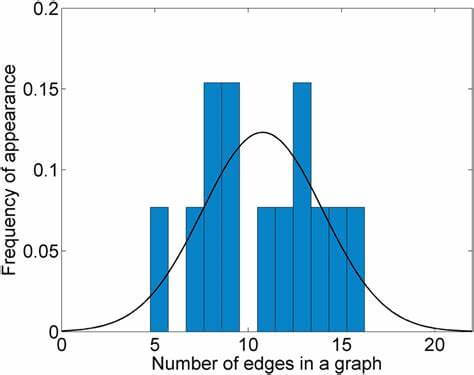
A Histogram Graph's DefinitionA histogram graph is a type of graph that uses rectangular bars to represent the Frequency of discrete and continuous data. The rectangular bars represent the number of data points that fall within a certain class interval. The class intervals (or bins), also referred to as a histogram chart, are not necessarily the same size across the horizontal axis. After gathering the data, the first step in creating a histogram chart is to choose the bins or class intervals. The Frequency of the data that fall into these groups will then be determined after the data have been grouped based on this interval. Unlike bar charts, the rectangular pars are not spaced since the class intervals typically span a continuous range of values (i.e. they touch each other). Characteristics of a Histogram GraphA common graphing technique that visually shows data distribution is the histogram graph. Here are some characteristics you need to watch out for to recognize a histogram graphic.
The Histogram's title provides information about the data represented graphically. It provides a summary of the data seen on the histogram display. A histogram chart's title makes it simple for a third party to understand the graph without having to read the graph itself. The histogram chart's heading in the image above is Histogram.
The vertical and horizontal axes make up a histogram chart's two axes. The Frequency is represented by the vertical axis on the histogram graphic, while the horizontal axis shows the class intervals or bins. The class interval's measurement scale is displayed on the horizontal (x) axis. The meaning of the histogram graph's title is further clarified by the standard labeling of these two axes with what they stand for. A label typically indicates the type of data plotted on each of these axes next to each axis. The horizontal label in this instance is Bin, and the vertical label is Frequency.
A histogram graph's bars serve as the main visual representation of the data collection. The number of times values occur inside each class interval is shown by the rectangular bars on a histogram display. The Frequency is depicted by the bars' height, while the bars' breadth shows the interval. The width of histogram graphs with constant class intervals is typically constant. 
The dataset on the graph is measured or quantified by a set of integers called the Histogram's scale. Each rectangular bar on the histogram chart has a width and height that are partially determined by this. It explains the organizational structure of each unit along the horizontal and vertical axes. In the example, 1 unit on the horizontal axis is comparable to 20, whereas 2 units on the vertical axis are equivalent to 2.
A histogram chart is a graph that combines the top midpoints of rectangular bars. They are typically used to visualize a dataset of continuous variables and are known as frequency polygons. To put it another way, histograms are line charts produced on a histogram chart, where the rectangular bars' mid-apex points represent the data points. There is only sometimes a photograph on histogram charts. It helps provide more details about the dataset when added to a histogram display. Histogram Graph Types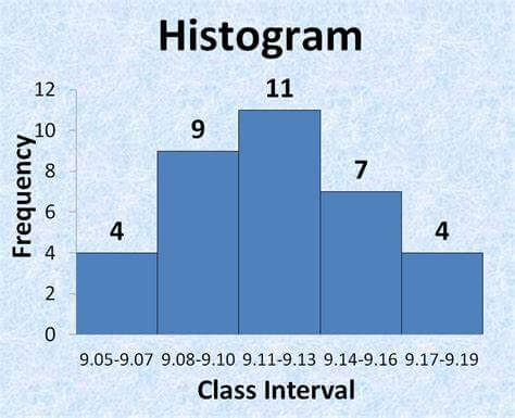
Several types can be distinguished based on how the rectangular bars are distributed on the histogram graph. Specifically, the structure of the entire graph and the shape of the bars. The following examples highlight the various histogram chart distributions:
If a histogram chart is bell-shaped, the normal distribution is said to be present in that data. As suggested by the name, even if a histogram distribution is not "normal," this structure is the typical structure expected. It is possible to infer the normality of a histogram graph simply by looking at it in some situations. It is important to undertake statistical calculations before a distribution can be referred to as normal because other distributions resemble a normal distribution.
Combining two distinct processes in one dataset results in a bimodal distribution. Two alternative regularly distributed graphs can be found in this distribution. For instance, the data gathered from a class's two divisions (Class 1A and Class 1B) has a chance of being bimodal. It is also double-peaked distribution and appears like a camel's back.
A skewed distribution is an asymmetric graph with an off-center peak that tends to the graph's edge (or away from the tail). Right- and left-skewed distributions are within the category of skewed distributions. The graph's tail is on the right side of a right-skewed distribution. It is sometimes referred to as a positively skewed distribution. On the other hand, a left-skewed distribution-also referred to as a negatively skewed distribution-has its tail on the left. 
There are multiple peaks produced by this form of distribution, which lacks a distinct pattern. Consequently, it is also known as multimodal distribution. Random distribution is typically produced when a collection of variables with various attributes is merged. The data in this situation needs to be separated and examined independently.
The difference between the edge peak and the normal distribution is the size of the huge peak on the edge peak distribution's tail. Usually, a mistake in building the histogram graph results in this form of distribution.
As the name suggests, a comb distribution's bars have a structure like a comb. The graph resembles the mouth of a comb because of the way these bars alternate between being tall and short.
A truncated distribution is created if the normal distribution's tail is removed from the resulting histogram display. Heart-cut distributions are so named because when the tail is cut, it occasionally takes on a heart-like shape. Typically, rounding mistakes in the data collection causes the comb distribution to be produced. Applications of Histogram Graph
The most frequent process results in a dataset can be quickly found without using intricate mathematical calculations. The highest frequency result will stand out as the graph's peak when the collected data is visualized on a histogram chart. 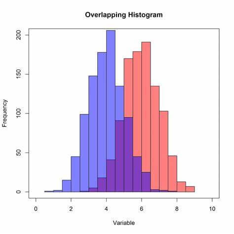
When examining a histogram chart, trends in the data are simple to identify. This can be useful for predicting outcomes, streamlining procedures, and spotting potential problems.
Unlike other data visualization techniques, utilizing a histogram makes it simple to identify data variances. When you are gathering data over time, this is quite helpful. The histogram graphic shows any deviations in the data as soon as they occur. This will make it simple for you to examine the data-gathering procedure and make adjustments if human error is to blame for the divergence. Comparison of a Histogram and a Bar ChartBar charts and histogram charts have a variety of distinctions despite sharing extremely similar structures and traits. These distinctions will make it easier for us to identify these charts when we encounter them. In light of this, this section will examine the parallels and discrepancies between bar charts and histograms. Differences
In contrast to the linked rectangular bars of a histogram, the rectangular bars in a bar chart are separated. Furthermore, the horizontal labels on a bar graph often represent discrete or nominal data. On the other hand, the axes of histograms are labeled with the data set's bins or class intervals. 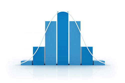
Bar graphs are used in data analysis to determine the Frequency of categorical data, whereas histograms are used to determine ordinal and quantitative (interval and ratio) data. The horizontal axis of a bar graph is categorical, while that of a histogram is numerical, even though the vertical axis of both graphs is discrete.
A bar graph typically has rectangular bars organized in ascending order of height. On the other hand, the rectangular bars in histograms are arranged according to where they fall in the class interval. The rectangular bars may be ordered differently than the class intervals, even though they are all listed in ascending order. This is due to how frequently each interval occurs, which changes at random depending on the dataset. Similarities
Bar charts and histograms both have rectangular bars, axes, and scales. They are very similar to one another just by looking at both graphs. This is mostly because they both use rectangular bars to represent data.
Bar charts and histograms are used to ascertain the mode or Frequency of the elements in a dataset. The height of the rectangular bars represents the Frequency of a specific dataset element and vice versa. The straightforward method for interpreting these two graphs is to adhere to the unwritten rule that "the higher the bar, the higher the frequency, and vice versa." The ConclusionA histogram chart is an excellent visualization tool for understanding a variety of huge data sets. One of the most used techniques for data visualization is statistical analysis. Due to their ease of use and capacity to address the bulk of quality-related problems, histograms are one of the seven fundamental quality control instruments. The distribution, breadth, and height of the rectangular bars are only a few things that quality control analysts look at in the histogram graphic. Although it is a frequent misconception that a histogram's height reflects the number of occurrences in a bin, this is only sometimes the case. The Frequency of the interval is calculated by the area of the rectangular bars when the Histogram does not have equal bins.
Next TopicHyperbola Graph
|
 For Videos Join Our Youtube Channel: Join Now
Feedback
- Send your Feedback to [email protected]
Help Others, Please Share


