How to use the CSS grid?A grid container can be created by declaring the display: grid or display: inline-grid on an element. Grid container contains the items of a grid that are placed inside the rows and columns. The CSS grid layout module creates a grid-based layout system. Using rows and columns, it designs the webpage without float and positioning. The CSS grid is supported in major browsers such as Google Chrome, Internet Explorer, Firefox, Safari, and Opera. Similar to the table, the grid enables a user to align the elements into columns and rows. But compare to tables, the designing of the layout is easier with the CSS grid. There are some of the properties of CSS grid are listed as follows:
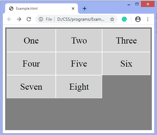
There are also some other properties of CSS grid such as grid-column-gap, grid-row-gap, grid-gap, grid-column-lines, grid-row-lines, and many more. Syntax We will see the examples of creating the grid by using the display: grid and display: inline-grid. Example In this example, we are also using grid-template-rows and grid-template-columns property. Here, we are presenting five rows in which the size of the first three is auto, and the last two rows size is 50px. There are also three columns with the size auto. Test it NowOutput 
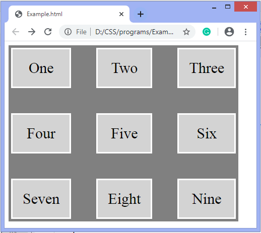
Example In this example, we are creating the grid by using the display: inline-grid; property. We are also using the grid-row-gap and grid-column-gap properties for specifying the gap between rows and columns. Test it NowOutput 
Next TopicHow to use Google fonts in CSS
|
 For Videos Join Our Youtube Channel: Join Now
Feedback
- Send your Feedback to [email protected]
Help Others, Please Share


