Materialize CSS Cards
Materialize CSS provides different CSS classes to apply various predefined visual and behavioral enhancements to display various types of cards.
| Index |
Class name |
Description |
| 1) |
card |
It is used to identify div element as a materialize card container. It is required on "outer" div. |
| 2) |
card-content |
It is used to identify div as a card content container and is required on "inner" div. |
| 3) |
card-title |
It is used to identify div as a card title container and is required on "inner" title div. |
| 4) |
card-action |
It is used to identify div as a card actions container and assigns appropriate text characteristics to actions text. It is required on "inner" actions div; content goes directly inside the div with no intervening containers. |
| 5) |
card-image |
It is used to identify div as a card image container and is required on "inner" div. |
| 6) |
card-reveal |
It is used to identify div as a revealed text container. |
| 7) |
activator |
It is used to identify div as a revealed text container and image to be revealer. It is used to show contextual information related to image. |
| 8) |
card-panel |
It is used to identify div as a simple card with shadows and padding. |
| 9) |
card-small |
It is used to identify div as a small sized card. Height: 300px; |
| 10) |
card-medium |
It is used to identify div as a medium sized card. Height: 400px; |
| 11) |
card-large |
It is used to identify div as a large sized card. Height: 500px; |
Example
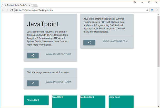
Let's take an example to demonstrate the use of card classes to showcase various types of cards.
Test it Now
Output:

|

 For Videos Join Our Youtube Channel: Join Now


