| |

Matplotlib (Python Plotting Library)
Human minds are more adaptive for the visual representation of data rather than textual data. We can easily understand things when they are visualized. It is better to represent the data through the graph where we can analyze the data more efficiently and make the specific decision according to data analysis. Before learning the matplotlib, we need to understand data visualization and why data visualization is important. Data Visualization
Graphics provides an excellent approach for exploring the data, which is essential for presenting results. Data visualization is a new term. It expresses the idea that involves more than just representing data in the graphical form (instead of using textual form). This can be very helpful when discovering and getting to know a dataset and can help with classifying patterns, corrupt data, outliers, and much more. With a little domain knowledge, data visualizations can be used to express and demonstrate key relationships in plots and charts. The static does indeed focus on quantitative description and estimations of data. It provides an important set of tools for gaining a qualitative understanding. There are five key plots that are used for data visualization. 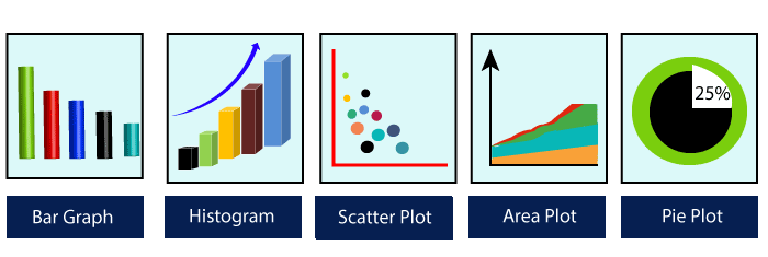
There are five phases which are essential to make the decision for the organization: 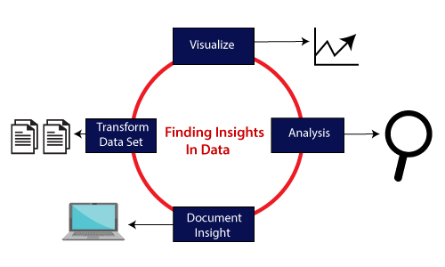
Why need data visualization?
Data visualization can perform below tasks:
Benefit of Data VisualizationHere are some benefits of the data visualization, which helps to make an effective decision for the organizations or business: 1. Building ways of absorbing information Data visualization allows users to receive vast amounts of information regarding operational and business conditions. It helps decision-makers to see the relationship between multi-dimensional data sets. It offers new ways to analyses data through the use of maps, fever charts, and other rich graphical representations. Visual data discovery is more likely to find the information that the organization needs and then end up with being more productive than other competitive companies. 2. Visualize relationship and patterns in Businesses The crucial advantage of data visualization is that it is essential to find the correlation between operating conditions and business performance in today's highly competitive business environment. 
The ability to make these types of correlations enables the executives to identify the root cause of the problem and act quickly to resolve it. Suppose a food company is looking their monthly customer data, and the data is presented with bar charts, which shows that the company's score has dropped by five points in the previous months in that particular region; the data suggest that there's a problem with customer satisfaction in this area. 3. Take action on the emerging trends faster Data visualization allows the decision-maker to grasp shifts in customer behavior and market conditions across multiple data sets more efficiently. Having an idea about the customer's sentiments and other data discloses an emerging opportunity for the company to act on new business opportunities ahead of their competitor. 4. Geological based Visualization Geo-spatial visualization is occurred due to many websites providing web-services, attracting visitor's interest. These types of websites are required to take benefit of location-specific information, which is already present in the customer details. Matplotlib is a Python library which is defined as a multi-platform data visualization library built on Numpy array. It can be used in python scripts, shell, web application, and other graphical user interface toolkit. The John D. Hunter originally conceived the matplotlib in 2002. It has an active development community and is distributed under a BSD-style license. Its first version was released in 2003, and the latest version 3.1.1 is released on 1 July 2019. Matplotlib 2.0.x supports Python versions 2.7 to 3.6 till 23 June 2007. Python3 support started with Matplotlib 1.2. Matplotlib 1.4 is the last version that supports Python 2.6. There are various toolkits available that are used to enhance the functionality of the matplotlib. Some of these tools are downloaded separately, others can be shifted with the matplotlib source code but have external dependencies.
Matplotlib ArchitectureThere are three different layers in the architecture of the matplotlib which are the following:
Backend layer The backend layer is the bottom layer of the figure, which consists of the implementation of the various functions that are necessary for plotting. There are three essential classes from the backend layer FigureCanvas(The surface on which the figure will be drawn), Renderer(The class that takes care of the drawing on the surface), and Event(It handle the mouse and keyboard events). Artist Layer The artist layer is the second layer in the architecture. It is responsible for the various plotting functions, like axis, which coordinates on how to use the renderer on the figure canvas. Scripting layer The scripting layer is the topmost layer on which most of our code will run. The methods in the scripting layer, almost automatically take care of the other layers, and all we need to care about is the current state (figure & subplot). The General Concept of MatplotlibA Matplotlib figure can be categorized into various parts as below: 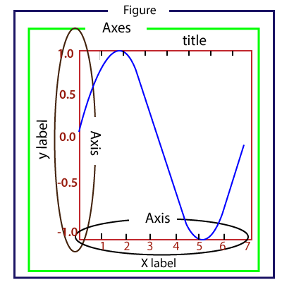
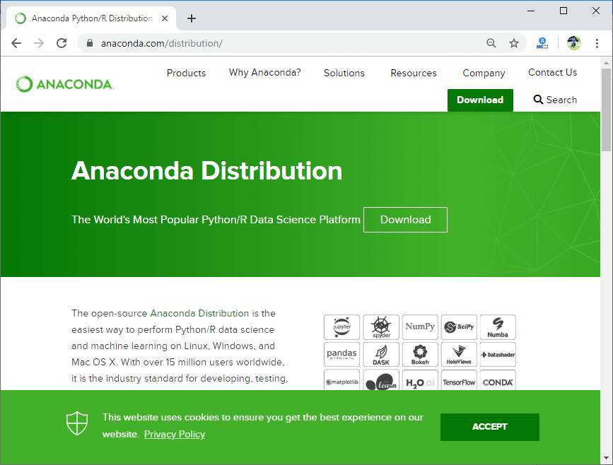
Figure: It is a whole figure which may hold one or more axes (plots). We can think of a Figure as a canvas that holds plots. Axes: A Figure can contain several Axes. It consists of two or three (in the case of 3D) Axis objects. Each Axes is comprised of a title, an x-label, and a y-label. Axis: Axises are the number of line like objects and responsible for generating the graph limits. Artist: An artist is the all which we see on the graph like Text objects, Line2D objects, and collection objects. Most Artists are tied to Axes. Installing MatplotlibBefore start working with the Matplotlib or its plotting functions first, it needs to be installed. The installation of matplotlib is dependent on the distribution that is installed on your computer. These installation methods are following: Use the Anaconda distribution of Python The easiest way to install Matplotlib is to download the Anaconda distribution of Python. Matplotlib is pre-installed in the anaconda distribution No further installation steps are necessary.
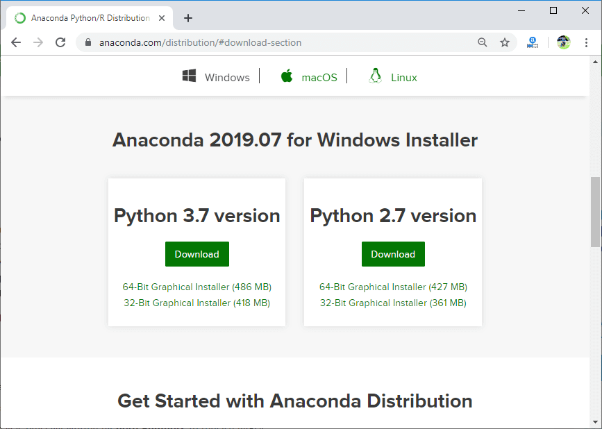
Install Matplotlib using with Anaconda Prompt Matplotlib can be installed using with the Anaconda Prompt by typing command. To install matplotlib, open Anaconda Prompt and type the following command: 
Install Matplotlib with pip The python package manager pip is also used to install matplotlib. Open the command prompt window, and type the following command: Verify the InstallationTo verify that matplotlib is installed properly or not, type the following command includes calling .__version __ in the terminal. Basic Example of plotting GraphHere is the basic example of generating a simple graph; the program is following: Output: 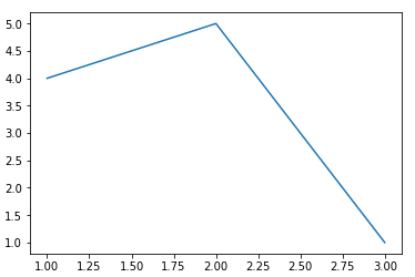
It takes only three lines to plot a simple graph using the Python matplotlib. We can add titles, labels to our chart which are created by Python matplotlib library to make it more meaningful. The example is the following: Output: 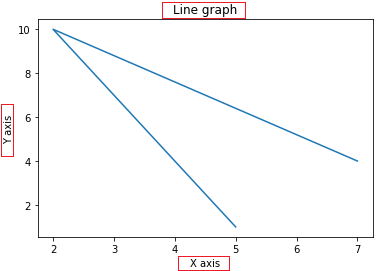
The graph is more understandable from the previous graph. Working with PyplotThe matplotlib.pyplot is the collection command style functions that make matplotlib feel like working with MATLAB. The pyplot functions are used to make some changes to figure such as create a figure, creates a plotting area in a figure, plots some lines in a plotting area, decorates the plot including labels, etc. It is good to use when we want to plot something quickly without instantiating any figure or Axes. While working with matplotlib.pyplot, some states are stored across function calls so that it keeps track of the things like current figure and plotting area, and these plotting functions are directed to the current axes. The pyplot module provide the plot() function which is frequently use to plot a graph. Let's have a look on the simple example: Output: 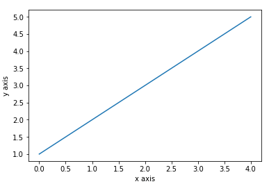
In the above program, it plots the graph x-axis ranges from 0-4 and the y-axis from 1-5. If we provide a single list to the plot(), matplotlib assumes it is a sequence of y values, and automatically generates the x values. Since we know that python index starts at 0, the default x vector has the same length as y but starts at 0. Hence the x data are [0, 1, 2, 3, 4]. We can pass the arbitrary number of arguments to the plot(). For example, to plot x versus y, we can do this following way: Output: 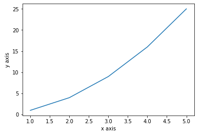
Formatting the style of the plot There is an optional third argument, which is a format string that indicates the color and line type of the plot. The default format string is 'b-'which is the solid blue as you can observe in the above plotted graph. Let's consider the following example where we plot the graph with the red circle. Output: 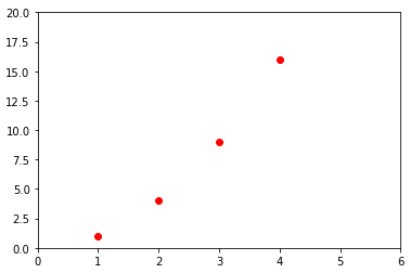
Example format String
The matplotlib supports the following color abbreviation:
Plotting with categorical variablesMatplotlib allows us to pass categorical variables directly to many plotting functions: consider the following example Output: 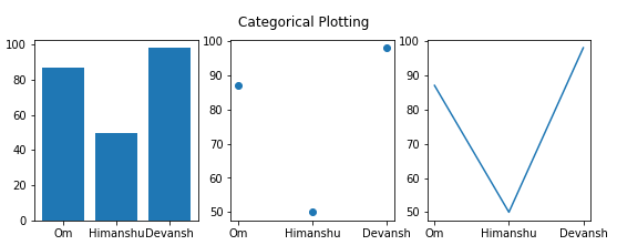
In the above program, we have plotted the categorical graph using the subplot() function. Let's a have a look on the subplot() function. What is subplot()The Matplotlib subplot() function is defined as to plot two or more plots in one figure. We can use this method to separate two graphs which plotted in the same axis Matplotlib supports all kinds of subplots, including 2x1 vertical, 2x1 horizontal, or a 2x2 grid. It accepts the three arguments: they are nrows, ncols, and index. It denote the number of rows, number of columns and the index. The subplot() function can be called in the following way: Parameters:
Three separate integers or three-digit integer describes the position of the subplot. If the three integers are nrows, ncols, and index in order, the subplot will take the index position on a grid with nrows row and ncol column. The argument pos are a three-digit integer, where the first digit is denoted the number of rows, the second digit denoted the number of columns, and the third represents the index of the subplot. For example, subplot (1, 3, 2) is the same as the subplot (132). Note: Passed integer must be less than 10.
The subplot() function also accepts the keyword arguments for the returned axes base class. Consider the following example: Creating different types of graph1. Line graphThe line graph is one of charts which shows information as a series of the line. The graph is plotted by the plot() function. The line graph is simple to plot; let's consider the following example: Output: 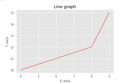
We can customize the graph by importing the style module. The style module will be built into a matplotlib installation. It contains the various functions to make the plot more attractive. In the below program, we are using the style module: Output: 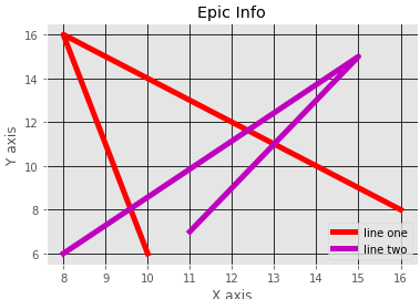
In Matplotlib, the figure (an instance of class plt.Figure) can be supposed of as a single container that consists of all the objects denoting axes, graphics, text, and labels. Example-3 Output: 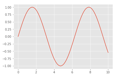
The matplotlib provides the fill_between() function which is used to fill area around the lines based on the user defined logic. Example-4Output: 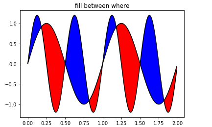
2. Bar graphsBar graphs are one of the most common types of graphs and are used to show data associated with the categorical variables. Matplotlib provides a bar() to make bar graphs which accepts arguments such as: categorical variables, their value and color. Output: 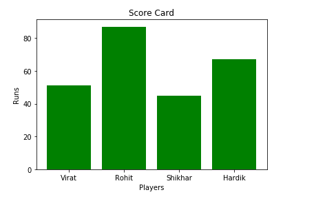
Another function barh() is used to make horizontal bar graphs. It accepts xerr or yerr as arguments (in case of vertical graphs) to depict the variance in our data as follows: Output: 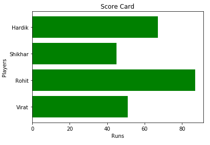
Let's have a look on the other example using the style() function: Output: 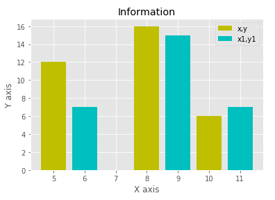
Similarly to vertical stack, the bar graph together by using the bottom argument and define the bar graph, which we want to stack below and its value. Output: 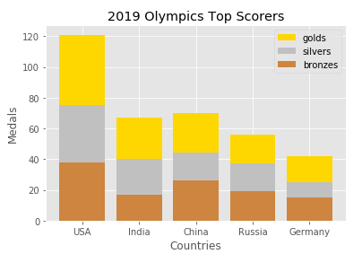
3. Pie ChartA pie chart is a circular graph that is broken down in the segment or slices of pie. It is generally used to represent the percentage or proportional data where each slice of pie represents a particular category. Let's have a look at the below example: Output: 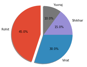
4. HistogramFirst, we need to understand the difference between the bar graph and histogram. A histogram is used for the distribution, whereas a bar chart is used to compare different entities. A histogram is a type of bar plot that shows the frequency of a number of values compared to a set of values ranges. For example we take the data of the different age group of the people and plot a histogram with respect to the bin. Now, bin represents the range of values that are divided into series of intervals. Bins are generally created of the same size. Output: 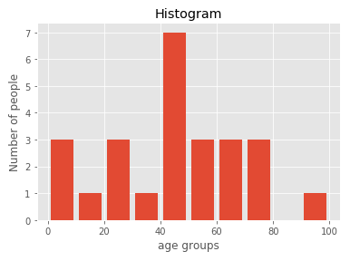
Let's consider the another example of plotting histogram: Output: 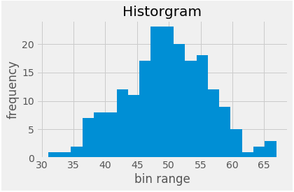
5. Scatter plotThe scatter plots are mostly used for comparing variables when we need to define how much one variable is affected by another variable. The data is displayed as a collection of points. Each point has the value of one variable, which defines the position on the horizontal axes, and the value of other variable represents the position on the vertical axis. Let's consider the following simple example: Example-1: Output: 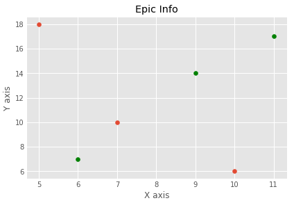
Example-2 Output: 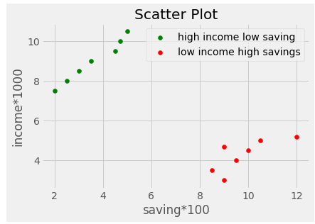
6. 3D graph plotMatplotlib was initially developed with only two-dimension plot. Its 1.0 release was built with some of three-dimensional plotting utilities on top of two-dimension display, and the result is a convenient set of tools for 3D data visualization. Three-dimension plots can be created by importing the mplot3d toolkit, include with the main Matplotlib installation: When this module is imported in the program, three-dimension axes can be created by passing the keyword projection='3d' to any of the normal axes creation routines: Let's see the simple 3D plot Example-1: Output: 
Example-2: Output: 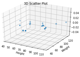
Note: We can use the plot3D () to plot simple 3D line graph.Example-3 Output: 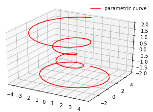
Important functions of Matplotlib
In this tutorial, we have learned about the matplotlib (Python Library), where we covered the brief introduction of data visualization and how data visualization is essential to make a decision for the organization. We have plotted the different types of graphs for the graphical representation of the data. |
 For Videos Join Our Youtube Channel: Join Now
Feedback
- Send your Feedback to [email protected]
Help Others, Please Share


