 |

PrimeFaces ButtonIt is an extension to the standard h:button JSF component with advanced skinning features. It is used to send GET request on the web. The <p:button> component is used to create button in JSF application. It has following attributes. Button Attributes
ExampleHere, in the following example, we are implementing <p:button> component. This example contains the following files. JSF File// button.xhtml Output: 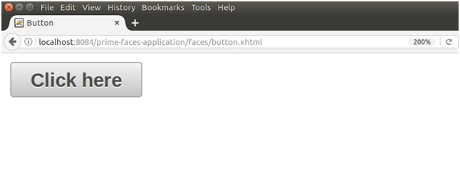
Next TopicPrimeFaces CommandButton
|
 For Videos Join Our Youtube Channel: Join Now
Feedback
- Send your Feedback to [email protected]
Help Others, Please Share


Like/Subscribe us for latest updates or newsletter 


