Javatpoint Logo
Javatpoint Logo

PrimeFaces ColorPicker

It is an input component with a color palette. It allows us to select and reselect color in web application. We can use it in our JSF application to get color as user input.

PrimeFaces provides <p:colorPicker> component to create ColorPicker in the web application. It has various attributes that are tabled below.

ColorPicker Attributes

Attribute Default value Type Description
id null String It is an unique identifier of the component
value null Object It is used to set value of the component.
required false Boolean It is used to mark component as required.
valueChangeListener null ValueChangeListener It is a method binding expression that refers to a method for handling a valuchangeevent.
requiredMessage null String It is used to set message to be displayed when required field validation fails.
validatorMessage null String It is used to set message to be displayed when validation fields.
mode popup String It is used to set display mode.
style null String It is used to set inline CSS style of the component.

Skinning

Following are the structural style classes that are applicable on the ColorPicker.

Style Class Applies
.ui-colorpicker Container element.
.ui-colorpicker_color Background of gradient.
.ui-colorpicker_hue Hue element.
.ui-colorpicker_new_color New color display.
.ui-colorpicker_current_color Current color display.
.ui-colorpicker-rgb-r Red input.
.ui-colorpicker-rgb-g Greed input.

Example

Here, in the following example, we are implementing <p:colorPicker> component. This example contains the following files.

JSF File

// colorPicker.xhtml

ManagedBean

// ColorPicker.java

Output:

PrimeFaces ColorPicker 1
PrimeFaces ColorPicker 2
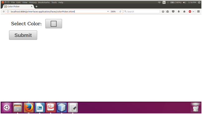
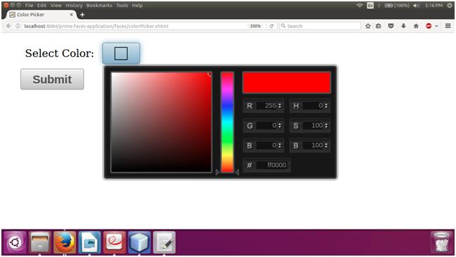
Next TopicPrimeFaces Inplace


Youtube For Videos Join Our Youtube Channel: Join Now

Feedback


Help Others, Please Share

facebook twitter pinterest

Learn Latest Tutorials


Preparation


Trending Technologies


B.Tech / MCA