PrimeFaces ConfirmDialog
It is an advanced version of JavaScript confirmation box. It includes various features like: skinning, customization and avoiding pop up blockers. It is used to create a confirmation dialog box to get user response.
The <p:confirm> component is used to create a confirm dialog box in JSF application. It has various attributes that are tabled below.
ConfirmDialog Attributes
| Attribute |
Default value |
Type |
Description |
| id |
null |
String |
It is an unique identifier of the component. |
| message |
null |
String |
It is used to set text to be displayed in body. |
| header |
null |
String |
It is used to set text for the header. |
| severity |
null |
String |
It is used to set message severity for the displayed icon. |
| width |
auto |
Integer |
It is used to set width of the dialog in pixels. |
| height |
auto |
Integer |
It is used to set width of the dialog in pixels. |
| style |
null |
String |
It is used to set inline CSS of the dialog container. |
| closable |
true |
Boolean |
It is used to define if close icon should be displayed or not. |
| appendTo |
null |
String |
It is used to append the dialog to the element defined by the given
search expression.
|
| visible |
false |
Boolean |
Whether to display confirm dialog on load. |
| global |
false |
Boolean |
When enabled, confirmDialog becomes a shared for other
components that require confirmation.
|
| responsive |
false |
Boolean |
In responsive mode, dialog adjusts itself based on screen
width.
|
Example
Here, in the following example, we are implementing <p:confirmDialog> component. This example contains the following files.
JSF File
// confirmDialog.xhtml
ManagedBean
// ConfirmBox.java
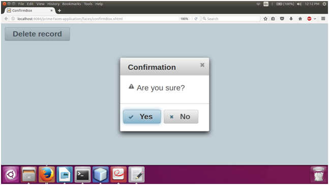
Output:


| 

 For Videos Join Our Youtube Channel: Join Now


