 |

PrimeFaces InputSwitchIt is used to take a boolean value as input from the user. It is a button which toggles ON or OFF. We can create it by using <p:inputSwitch> component. It also provides various attributes that are tabled below. InputSwitch Attributes
ExampleHere, in the following example, we are implementing <p:inputSwitch> component. This example contains the following files. JSF File// switch.xhtml ManagedBean// SwitchDemo.java Output: 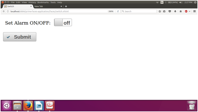 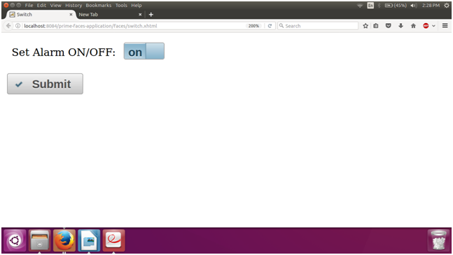
Next TopicPrimeFaces Password
|
 For Videos Join Our Youtube Channel: Join Now
Feedback
- Send your Feedback to [email protected]
Help Others, Please Share


Like/Subscribe us for latest updates or newsletter 


