 |

PrimeFaces InputTextIt is an extension to the standard inputText with skinning capabilities. We can create it by using the <p:inputText> component. It is used to get user input in JSF application. It includes various attributes that are tabled below. InputText attributes
ExampleHere, in the following example, we are implementing <p:inpuText> component. This example contains the following files. JSF File// inputText.xhtml This JSF Page produces the following output. Output: 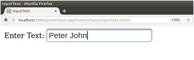
Next TopicPrimeFaces InputMask
|
 For Videos Join Our Youtube Channel: Join Now
Feedback
- Send your Feedback to [email protected]
Help Others, Please Share


Like/Subscribe us for latest updates or newsletter 


