PrimeFaces Knob
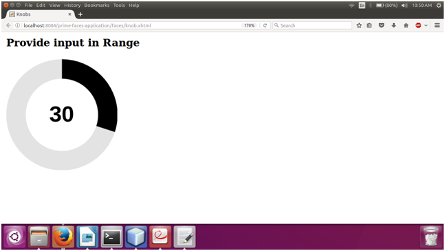
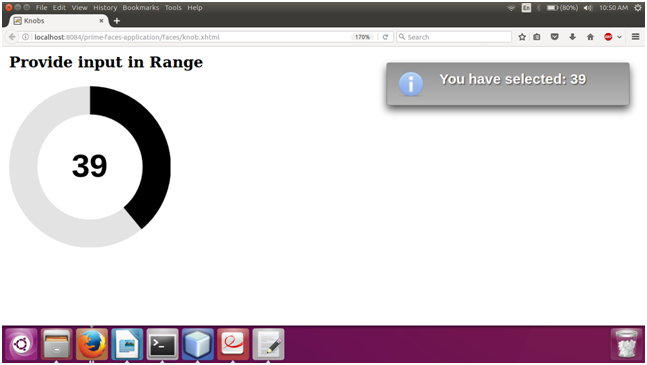
It is an input component which is used to get numeric value. It is used to get user input in a specified range. PrimeFaces provides <p:knob> component which is used to create a graphical circle. We can select any numeric value from that. It also provides various attributes that are tabled below.
Knob Attributes
| Attribute |
Default value |
Type |
Description |
| Value |
null |
Object |
It is used to set value of the component. |
| required |
false |
Boolean |
It is used to mark component as required. |
| min |
0 |
Integer |
It represents min valid value of the component. |
| max |
100 |
Integer |
It is used to set max valid value of the component. |
| step |
1 |
Integer |
It is used t to set Increment/decrement step of the component. |
| thickness |
null |
Float |
It is used to set thickness of the bar. |
| width |
auto |
String |
It is used to set width of the component. |
| height |
auto |
String |
It is used to set height of the component. |
| foregroundColor |
null |
Object |
It is used to set foreground color of the component. |
| backgroundColor |
null |
Object |
It is used to set background color of the component. |
| colorTheme |
null |
String |
It is used to set theme of the knob. |
| disabled |
false |
Boolean |
It disables the input element. |
| showLabel |
true |
Boolean |
It is used to hide/show the label. |
| cursor |
false |
Boolean |
When set true to show only a cursor instead of the full bar. |
| labelTemplate |
{value} |
String |
Template of the progress value. |
Example
Here, in the following example, we are implementing <p:knob> component. This example contains the following files.
JSF File
// knob.xhtml
ManagedBean
// Knob.java
Output:
| 

 For Videos Join Our Youtube Channel: Join Now


