 |

PrimeFaces SelectOneButtonIt is used to select a single item from a list using buttons. It creates items list as a list of buttons. So, we can select item by clicking on the button. The <p:selectOneButton> component is used to create list of buttons in the JSF application. It has various attributes that are tabled below. SelectOneButton Attributes
SkinningFollowing is the list of structural style classes;
ExampleHere, in the following example, we are implementing <p:selectOneButton> component. This example contains the following files. JSF File// oneButton.xhtml ManagedBean// OneButton.java Output: 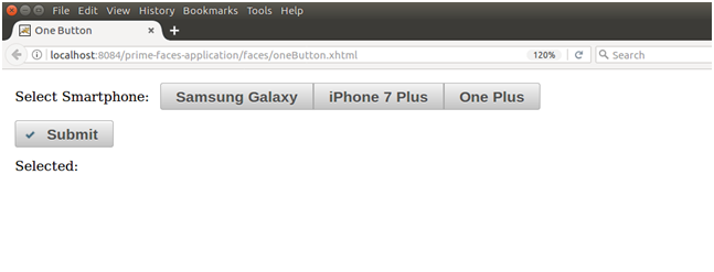 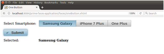
Next TopicPrimeFaces SelectOneRadio
|
 For Videos Join Our Youtube Channel: Join Now
Feedback
- Send your Feedback to [email protected]
Help Others, Please Share


Like/Subscribe us for latest updates or newsletter 


