 |

PrimeFaces SliderIt is a text input with slider. It is used to get user input with the help of slider. It allows us to increment and decrement input by using slider. The <p:slider> component is used to create slider input text. It also has various attributes that are tabled below. Slider Attributes
ExampleHere, in the following example, we are implementing <p:slider> component. This example contains the following files. JSF File// slider.xhtml ManagedBean// Slider.java Output: 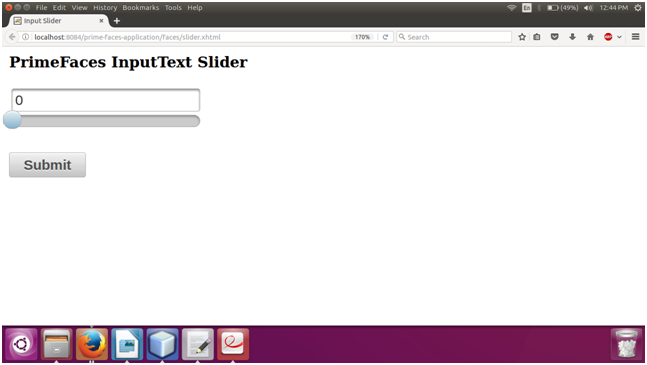 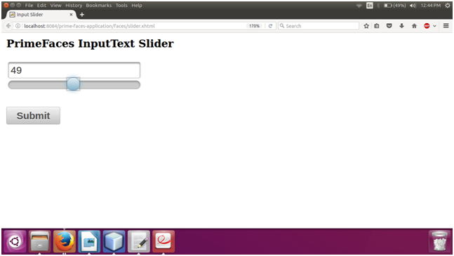
Next TopicPrimeFaces InputSwitch
|
 For Videos Join Our Youtube Channel: Join Now
Feedback
- Send your Feedback to [email protected]
Help Others, Please Share


Like/Subscribe us for latest updates or newsletter 


