 |

PrimeFaces StepsThis components is an indicator for the steps in a workflow. It indicates that at what step we are right now. It is used to show current step in multi-steps application. The <p:steps> component is used to create steps indicator in the JSF application. It has various important attributes that are tabled below. Steps Attributes
SkinningFollowing is the table of structural style classes.
ExampleHere, in the following example, we are implementing <p:steps> component. This example contains the following files. JSF File// steps.xhtml Output: 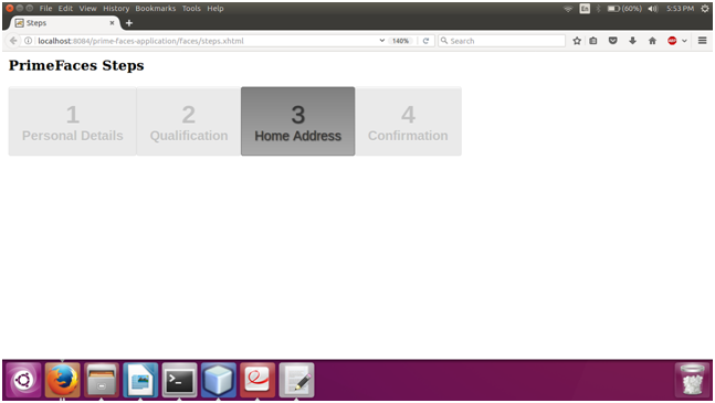
If we change activeIndex = 3, it produces the following output. 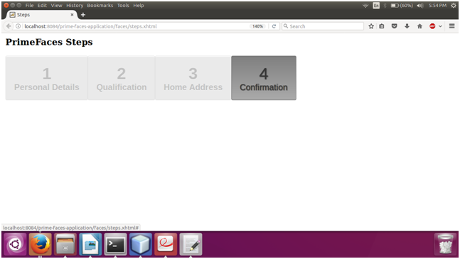
Next TopicPrimeFaces AreaChart
|
 For Videos Join Our Youtube Channel: Join Now
Feedback
- Send your Feedback to [email protected]
Help Others, Please Share


Like/Subscribe us for latest updates or newsletter 


