PrimeFaces TabView
It is a container component which is used to group content in tabs at the same web page. The <p:tabView> component is used to create container. The <p:tab> is a sub component of <p:tabView> which is used to create tab individually. It is useful when we want to show more information at the same web page.
TabView Attributes
| Attribute |
Default value |
Type |
Description |
| rendered |
true |
Boolean |
It takes boolean value to specify the rendering of the component. |
| activeIndex |
0 |
Integer |
It is used to set index of the active tab. |
| effect |
null |
String |
It is used to set name of the transition effect. |
| effectDuration |
null |
String |
It is used to set duration of the transition effect. |
| dynamic |
false |
Boolean |
It enables lazy loading of inactive tabs. |
| cache |
true |
Boolean |
It is used to set cache. |
| onTabChange |
null |
String |
It executes when a tab is clicked. |
| onTabShow |
null |
String |
It executes when a tab is shown. |
| onTabClose |
null |
String |
It executes on tab close. |
| style |
null |
String |
It is used to set inline style of the main container. |
| var |
null |
String |
It is a name of iterator to refer an item in collection. |
| value |
null |
Object |
It is a collection model to display dynamic tabs. |
| orientation |
top |
String |
It is used to set orientation of tab headers. |
| dir |
ltr |
String |
It defines text direction, valid values are ltr and rtl. |
| scrollable |
false |
Boolean |
When enabled, tab headers can be scrolled
horizontally instead of wrapping.
|
| prependId |
true |
Boolean |
It is used to prepend id. |
| tabindex |
0 |
String |
It specify position of the element in the tabbing order. |
Example
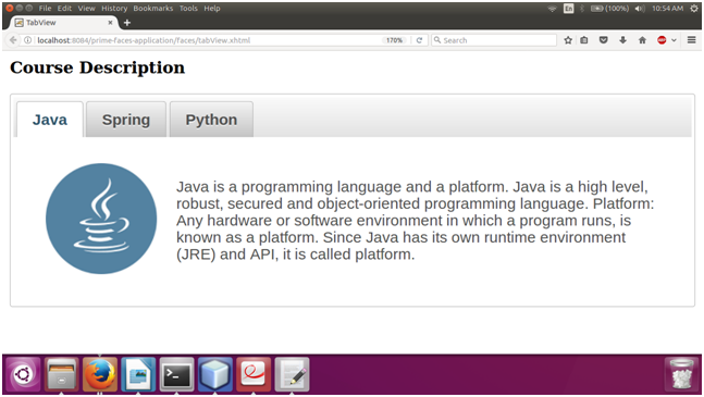
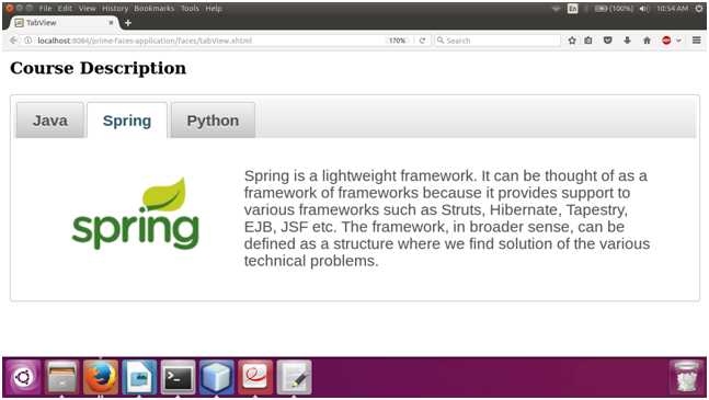
Here, in the following example, we are implementing <p:tabView> component. This example contains the following files.
JSF File
// tabView.xhtml
Output:
|

 For Videos Join Our Youtube Channel: Join Now


