 |

Pure.CSS Responsive DesignPure.CSS uses the following classes to create a responsive design.
ExampleLet's create a responsive grid with a row having four columns. The columns should stack on small screens, should take up width: 50% on medium-sized screens, and should take up width: 25% on large screens. For small screen we add: .pure-u-1 class For medium sized screens we add: .pure-u-md-1-2 and for large sized screen: .pure-u-lg-1-4 See this example: Test it NowIt will be look like this: Output: 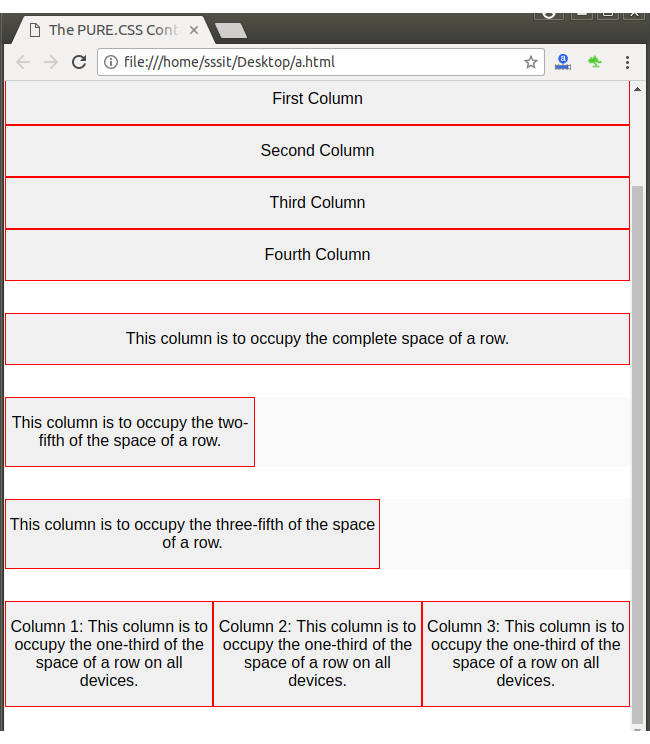
Next TopicPure.CSS Buttons
|
 For Videos Join Our Youtube Channel: Join Now
Feedback
- Send your Feedback to [email protected]
Help Others, Please Share


Like/Subscribe us for latest updates or newsletter 


