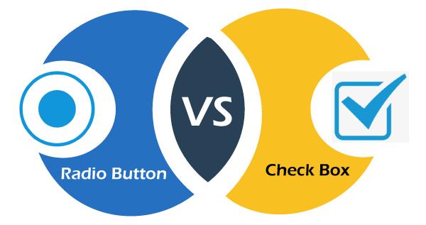
Radio Button Vs. Checkbox buttonIn this section we will learn the difference between the Radio button and the checkbox button in html. Before knowing the Radio button and Checkbox differences, we should know about the Radio button and Checkbox button separately. After that, we will see the comparison table of the Radio button and checkbox button in html. What do you mean by Radio Button?A radio button is used to display small circular buttons that can be either selected or deselected. A black dot appears in the circle if the choices are selected; otherwise, the circle remains empty. Radio buttons are mutually exclusive, i.e., the visitor can choose only one of the several options. Thus it is used when a visitor is asked a question that can only correct answers from all the choices such as gender of a person, marital status, etc. Syntax of Radio Button: The various attributes that can be specified for a checkbox are:
Example of Radio Button: In the above Example, we have created a radio button in which users can select only one option from the list of options. In this, a user can select the gender according to their choice. What do you mean by Checkbox?The Checkbox is used to display small squares boxes that offer the user several choices that can be toggled "checked" and "unchecked". You can also set the default choice for the user by passing the attribute "checked". A tiny tick is displayed if the choice is selected. There can be several checkboxes in a form, and each works independently from other options. It is used when a user is asked a question that can have more than one correct answer, such as hobbies, >reading preferences, etc. Syntax of Checkbox Button: The various attributes that can be specified for a checkbox are:
Example of Checkbox Button: In the above Example, we have created a checkbox button in which users can select one or more options from the list of checkboxes. In this, users can select as many hobbies according to their choice. Difference between a radio button and checkbox button
Next TopicDifference between
|
 For Videos Join Our Youtube Channel: Join Now
Feedback
- Send your Feedback to [email protected]
Help Others, Please Share


