 |
 Home
Home Java
Java Programs
 OOPs
OOPs String
 Exception
 Multithreading
 Collections
 JavaFX
 JSP
JSP
React Bootstrap AccordionAccordion is a series of collapsible panels which hold a container having some content. The accordion menu is widely used in web applications to manage content with a navigation list. React Bootstrap Accordion provides an easy way to manage the collapsible list without using state. The JavaScript code behind the toggle functionality is written in the Accordion component itself. We need to add and import the component from the react-bootstrap library. Let's understand how to create Accordion in a React project using React Bootstrap: How to Create Accordion in React Using React Bootstrap?To create an accordion in a React project using bootstrap; we have to use the < Accordion></Accordion> component and import it from the react-bootstrap library as follows: The Accordion component contains several sub components such as <Accordion.Item>, <Accordion.Header>, and <Accordion.Body> to define the accordion elements. Let's understand how to use these components. Consider the below example: App.js: Output: 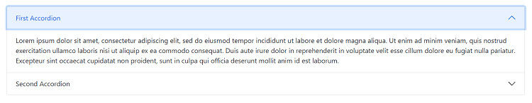
When we click on the accordion body, it will open the respective accordion content and highlight it as active. 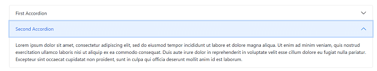
When we click on the other accordion body, it will open that accordion content and close the other one. The defaultActiveKey prop allows Accordion to be active while rendering. Let's see how to create a fully collapsed Accordion. Fully Collapsed AccordionTo create a fully collapsed accordion, avoid using defaultActiveKey prop. It will render all the Accordion without as closed. Consider the below example: Output: 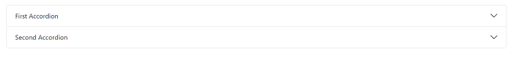
Here, we have a fully collapsed accordion. When we click on any accordion, it will open the accordion content based on the selection. The flush PropThe flush prop is used to remove the default styles such as background color, borders, and border radius from the Accordion. The Accordion will be rendered edge-to-edge with their parent container. Consider the below example: Output: 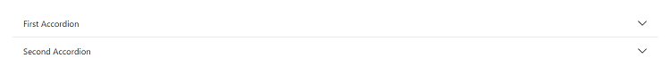
From the above output, we can see how the background color, border radius, and other styles have been removed from the Accordion. The alwaysOpen PropThe alwaysOpen prop is used to keep an accordion item active while other items are opened. We can control the component by defining the array of strings for activeKey or defaultActiveKey. Let's understand it with the below example: App.js: Output: 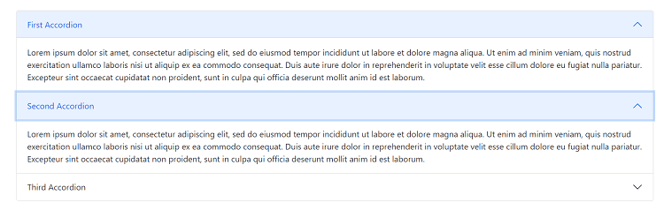
From the above output, we can see the first Accordion is always open while the other is open too. Similarly, we can use the alwaysOpen prop for other accordion items. How to Customize the Accordion in React?We can customize the accordions in React and create card-based accordions just like Bootstrap 4. To customize the Accordion, we have to use the accordion toggle functionality useAccordionButton. It will allow us to toggle the accordion content. Consider the below example: App.js: Output: 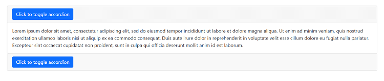
Thus, we can customize the accordions as per our requirements. We can also have different styles of the toggle button while the accordion content is visible. Let's understand how we can achieve this. Custom Accordion with Expansion AwarenessWe can apply different styles of the accordion toggle if the accordion content is expanded. We can achieve this by defining a custom toggle that is context aware by using the useAccordionButton hook. Consider the below example: App.js: Output: 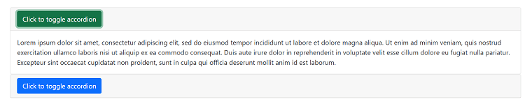
From the above output, we can see when the accordion content is expanded, the toggle button variant is successful, and when it is hidden, the accordion button variant is primary. Similarly, we can provide any style to the accordion toggle button.
Next TopicReact Bootstrap Alerts
|
 For Videos Join Our Youtube Channel: Join Now
Feedback
- Send your Feedback to [email protected]
Help Others, Please Share


