 |
 Home
Home Java
Java Programs
 OOPs
OOPs String
 Exception
 Multithreading
 Collections
 JavaFX
 JSP
JSP
React Bootstrap DropdownsDropdowns provide a toggleable sub-menu for a navigation item. It is useful for displaying the sub-categories or options for a menu item. Usually, it is used to display the options for a navigation item. For example, if you have a product menu item and want to create a sub-menu with the different products, you can use the dropdown menu for an easy layout. The bootstrap dropdown menu is built using a bootstrap JavaScript library popper.js. It automatically positions the dropdown menu and its content with the respected navigation option dynamically on all the viewports. But, in React Bootstrap, we do not need to explicitly define any JS library; all the required JavaScript for the dropdown menu is defined in the <Dropdown> component itself. Let's understand how to create dropdown in React using Bootstrap. How to Create Dropdown menu in React JS?The React Bootstrap dropdown is designed to be more generic and application friendly in different conditions. So we do not need to explicitly define the JQuery or other JavaScript libraries to the project; instead, it contains all the required JavaScript to the <Dropdown> component itself. To create a dropdown menu using React Booitstrap define the dropdown navigation button or item within the <Dropdown> and <Dropdown.toggle> component, and dropdown menu items within the <Dropdown.Item> component. Import the dropdown component as follows: Let's understand it with a basic dropdown example: App.js: Output: 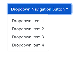
From the above output, we can see a dropdown is created. It is properly aligned with the navigation button on different viewports by default. React Bootstrap support an alternate component of the <Dropdown>, <Dropdown.Toggle>, and <Dropdown.Menu> component which is <DropdownButton>. The <DropdownButton> component combines all three components and allows us to write the minimal components. Consider the below example: Output: 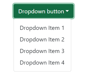
From the above output, we have created a dropdown menu using the <DropdownButton> component. It allows us to write minimum components, but we need to import it along with the Dropdown component. Dropdown menu with a Separate Dropdown IconWe can also create a separate split button for toggling the dropdown menu. To create a split dropdown menu, use the Dropdown component as the button group by specifying the as prop and use the Dropdown.Toggle component for the toggle icon. Consider the below example: Output: 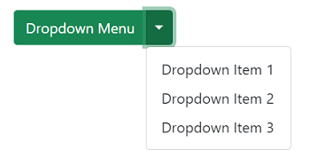
From the above output, we can see the dropdown toggle button is now separated from the navigation text. Dropdown SizesThe size prop allows us to define the size of the dropdown menu. We can use sm, lg as prop values to specify the size of the dropdown menu. Consider the below example: App.js: Output: 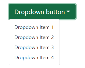
Dark BackgroundTo apply a dark background to the dropdown menu, pass the variant prop with the value dark. It will apply a dark background color to the dropdown menu. Similarly, we can use other variants such as primary, success, danger, etc., as well. Consider the below code snippet: Output: 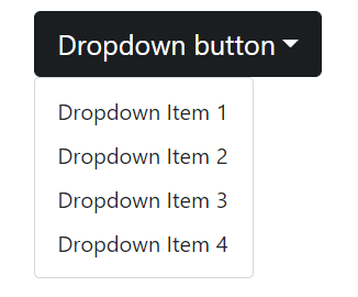
Dropdown DirectionsWe can specify the dropdown menu directions by specifying the drop prop. The drop prop allows us to specify four values up, down, start, and end. By default, it is set to down. Consider the below example: Output: 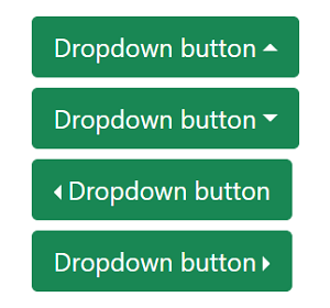
From the above output, we can see the dropdown menus are created in different directions. Their directions are indicated by the carrot icon. When we toggle the menu, it will be collapsed in the respective direction. 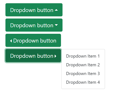
Menu AlignmentBy default, a dropdown menu starts from the left, but we can update its alignment by using the align prop. We can pass the value align="end" value to the <Dropdown>, <DropdownButton>, and <SplitButton> component to align the dropdown menu accordingly. Consider the below code snippet: Output: 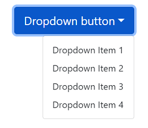
From the above output, we can see the dropdown content is aligned to the end of the component. Menu HeadersTo specify the menu header, use the <Dropdown.Header> component. It will add a header to the dropdown menu. Consider the below example: Output: 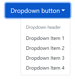
Menu DividersDividers are useful for creating a separate group of related menu items. We can add dividers to the dropdown menu by adding a <Dropdown.Divider> component. Consider below example: Output: 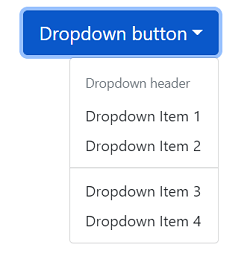
AutoClose MenuThe default behavior of the dropdown menu is it is closed when a menu item is selected, or we click outside the dropdown menu. But, we can override this behavior by specifying the autoClose property. Consider the below example: When we specify autoClose="inside" property to the dropdown menu, it will not get closed by clicking outside the dropdown menu. Similarly, we can pass the autoClose value to outside and false.
Next TopicReact Bootstrap Grid System
|
 For Videos Join Our Youtube Channel: Join Now
Feedback
- Send your Feedback to [email protected]
Help Others, Please Share


